Python Matplotlib: Find the corresponding x value of a given y value on a basic plot
Asked Answered
P

1

8

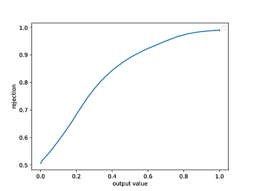
I have a plot generated using Matplotlib (it is a precision-recall curve of a histogram originally) and I need to compute the correct x value which corresponds to the y value with y = 0.9. The data are loaded from text files which are present in columns. This is the code which is used to create the plot:

import numpy as np
import matplotlib.pyplot as plt
import pylab
from sklearn import metrics

data1 = np.loadtxt('text1.txt')
data2 = np.loadtxt('text2.txt')

background = 1 - (1 + y) / 2.
signal = 1 - (1 + x) / 2.

classifier_output = np.concatenate([background,signal])
true_value = np.concatenate([np.zeros_like(background, dtype=int), np.ones_like(signal,  dtype=int)])

precision, recall, threshold = metrics.precision_recall_curve(true_value, classifier_output)
plt.plot(threshold, precision[:-1])
plt.savefig('Plot.pdf', dpi = 2000)
plt.show()

Is there any way to compute the correct value on the x axis which corresponds to y = 0.9? enter image description here
Peking answered 3/3, 2020 at 17:4 Comment(3)
You could use the find_roots function from this post. z = find_roots(threshold, precision[:-1] - 0.9)Nicolenicolea
You are plotting a function, hence you should be able to get the x value by the y valueLegaspi
numpy.interp(0.9, y, x) should give you the x value at y=0.9 in case that is desired.Fruition
A
1

Reference: https://numpy.org/doc/stable/reference/generated/numpy.interp.html

You can use np.interp() in the form of x_interp = np.interp(y_val, y, x) to interpret an x value.

If you want to interpret a y value instead, you need to switch to y_interp = np.interp(x_val, x, y).

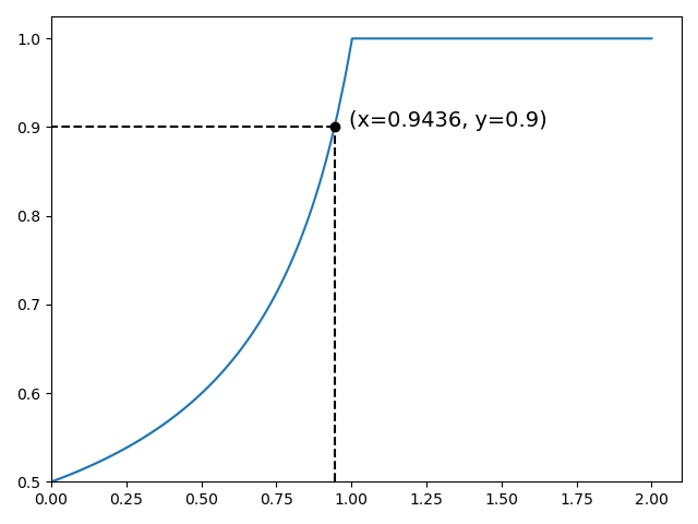
I also added dashed lines and annotations to the plot to visualize the result better. Since the data were not provided, I made up the data for demonstration purposes.

import numpy as np
import matplotlib.pyplot as plt
from sklearn import metrics

# make up some data
background = np.linspace(0, 1, 400)
signal = np.linspace(0, 2, 400)

classifier_output = np.concatenate([background, signal])
true_value = np.concatenate([np.zeros_like(background, dtype=int), np.ones_like(signal, dtype=int)])

fig, ax = plt.subplots()
precision, recall, threshold = metrics.precision_recall_curve(true_value, classifier_output)
plt.plot(threshold, precision[:-1])

# interpreting x value based on y value
y_val = 0.9
x_interp = round(np.interp(y_val, precision[:-1], threshold), 4)  # x_interp = np.interp(y_vals, y, x)

# place a marker on point (x_interp, y_val)
plt.plot(x_interp, y_val, 'o', color='k')

# draw dash lines
plt.plot([x_interp, threshold[0]], [y_val, y_val], '--', color='k')
plt.plot([x_interp, x_interp], [precision[:-1][0], y_val], '--', color='k')

# add annotation on point (x_interp, y_val)
ax.annotate(f'(x={x_interp}, y={y_val})', (x_interp, y_val), size=14, xytext=(x_interp * 1.05, y_val))

# remove the margin around the starting point (depending on the data's lower bound, adjust or remove if necessary)
ax.set_xlim(threshold[0])
ax.set_ylim(precision[:-1][0])
plt.tight_layout()
print(f'y = {y_val}, x = {x_interp}')
plt.show()

Result:

enter image description here

Amharic answered 28/12, 2022 at 11:38 Comment(0)

© 2022 - 2024 — McMap. All rights reserved.