Color for Unicode Emoji
Asked Answered
B

9

87

It's possible to include Emoji characters in modern browsers, but how can one make it a single color and choose that color?

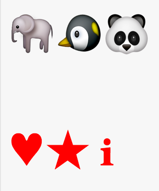
For example, here is some Emoji and some regular (plane 0) Unicode symbols. All should be red, but only the symbols are rendered in red.

Emoji color attempt

Associated HTML + CSS:

<p>
  🐘🐧🐼
</p>
<p>
  β™₯β˜…β„Ή
</div>

p {
  font-size: 3em;
  color: red
}
Birkenhead answered 5/9, 2015 at 13:40 Comment(1)
none of the below answers work in Firefox and Edge – Secundine
A
200

Yes, you can color them!

div {
  color: transparent;  
  text-shadow: 0 0 0 red;
}
<div>πŸš€πŸŽ­πŸ˜»</div>
Aleasealeatory answered 29/9, 2016 at 17:13 Comment(23)
Nice one! I converted it to a stack snippet. Unfortunately this can only do silhouettes as there's no real encoding for transparency. So e.g. smiley renders same as grimace. Doubt there's much we can do about that. – Birkenhead
Is this a a Mac exclusive :-P, because it doesn’t work on Windows 10 (in any browser). – Wasting
Thanks, mahemoff. You're right, some of the more intricate emoticons will look poor, but for most of them it makes little or no difference. And after all, that's the best we can do. @Ε imeVidas, I'm on Windows 10 myself, Chrome 53. – Aleasealeatory
In Chrome 53 it works for the outlines, yes. But this does not work in Firefox 49 (emojis stay the same) – Unintelligible
Thx, @nylki. Comes out there was a bug report on the topic - bugzilla.mozilla.org/show_bug.cgi?id=1128190 , which was for some reason marked as resolved. I added a comment there. Let's wait for Mozilla's response. – Aleasealeatory
@Aleasealeatory My mistake; it works in Chrome and Edge; I was confused by the way the demo in your answer works πŸ˜… – Wasting
@Ε imeVidas, on the contrary, your remark gave birth to this bug report, which will hopefully lead to fixing that issue with Firefox soon: bugzilla.mozilla.org/show_bug.cgi?id=1306585 . Nothing in this universe goes in vein. πŸ™‚ – Aleasealeatory
The issue with text-shadow is the emoji cover it up, so building on this answer you could hide the actual emoji by combining the classic large negative margin-left and an equal positive shadow x offset + margin-right (with the unfortunate downside that text selection breaks). div { text-shadow: 100em 0px 0px red; margin-left: -100em; margin-right: 100em; } – Pyrrolidine
@PatrickHorn, doesn't setting color: transparent work for you? – Aleasealeatory
color: transparent does not work on Firefox version 61.0.1 (on Ubuntu Linux). All normal text becomes transparent but the full color emoji are unaffected. – Pyrrolidine
@Aleasealeatory Can you blur them? – Opah
@mesqueeb, yes, you can, by changing the third value like so: text-shadow: 0 0 5px red;. – Aleasealeatory
This appears black, not red, on my Chrome 78.0.3904.108, Windows 10 – Cardiogram
@Betty, shows red for me. Are you still seeing black on Chrome 79? – Aleasealeatory
@Tigran, yes, I'm on Chrome 79.0.3945.88 now and it's still black. – Cardiogram
@Betty, that's weird. I'm also on Chrome 79.0.3945.88 on Windows 10, and it's red for me. – Aleasealeatory
It is important to note, that if you are using ::first-letter and the emoji is the "first letter" - this will not work, even though developer tools will still show correct CSS for the emoji. Most likely will be the same for ::first-line and maybe some other pseudo elements. This can be worked around, though, obviously by styling the pseudo-elements respectively, but this is not an obvious behavior. – Forwarding
Can somebody color emojis using SVG? – Atmometer
@RixTheTyrunt, what do you mean? Color emojis in <text> elements inside SVG? – Aleasealeatory
@Atmometer text-shadow is not applicable to SVG elements. You will have to use SVG filters. – Aleasealeatory
What are those? – Atmometer
@RixTheTyrunt, please read the MDN guide I linked in my previous comment. That will hopefully give you a good introduction to SVG filters – Aleasealeatory
So how do you use it? 😡 – Atmometer
H
55

Not every emoji works the same. Some are old textual symbols that now have an (optional or default) colorful representation, others were explicitly (only) as emojis. That means, some Unicode codepoints should have two possible representations, text and emoji. Authors and users should be able to express their preference for one or the other. This is currently done with otherwise invisible variation selectors U+FE0E (text, VS-15) and U+FE0F (emoji, VS-16), but higher-level solutions (e.g. for CSS) have been proposed.

The text-style emojis are monochromatic and should be displayed in the foreground color, i.e. currentcolor in CSS, just like any other glyph. The Unicode Consortium provides an overview of emojis by style (beta version). You should be able to append &#xFE0E; in HTML to select the textual variant with anything in the columns labeled β€œDefault Text Style; has VSs” and β€œDefault Emoji Style; has VSs”. This doesn’t include the example emojis 🐘🐧🐼 and many others, though.

p {
  color: red; font-size: 3em; margin: 0;
  text-transform: text;           /* proposed */
  font-variant-emoji: text;       /* proposed */
  font-variant-color: monochrome; /* proposed */
  font-color: monochrome;         /* proposed */
  font-palette: dark;             /* drafted for CSS Fonts Level 4 */
}
p.hack {
  color: rgba(100%, 0%, 0%, 0);
  text-shadow: 0 0 0 red;
}
p.font {
  font-family: Emojione, Noto, Twemoji, Symbola;
}
@font-face { /* http://emojione.com/developers/ */
  font-family: Emojione;
  src: local("EmojiOne BW"), local("EmojiOne"), local("Emoji One"), 
       /*   https://cdn.rawgit.com/Ranks/emojione/master/assets/fonts/emojione-bw.otf – monochrome only, deprecated, removed
            https://cdn.rawgit.com/Ranks/emojione/master/assets/fonts/emojione-android.ttf – with hack
            https://cdn.rawgit.com/Ranks/emojione/master/assets/fonts/emojione-apple.ttf – with hack */
       url("https://cdn.rawgit.com/Ranks/emojione/master/assets/fonts/emojione-svg.woff2") format("woff2"),
       url("https://cdn.rawgit.com/Ranks/emojione/master/assets/fonts/emojione-svg.woff") format("woff"),
       url("https://cdn.rawgit.com/Ranks/emojione/master/assets/fonts/emojione-svg.otf") format("truetype");
}
@font-face { /* https://www.google.com/get/noto/#noto-emoji-zsye */
  font-family: Noto;
  src: local("Noto Emoji"), local("Noto Color Emoji"), local("Noto"), 
       url("https://cdn.rawgit.com/googlei18n/noto-emoji/master/fonts/NotoEmoji-Regular.ttf");
}
@font-face { /* https://github.com/eosrei/twemoji-color-font/releases */
  font-family: Twemoji;
  src: local("Twemoji");
}
@font-face { /* http://users.teilar.gr/~g1951d/ */
  font-family: Symbola;
  src: local("Symbola");
}
<p title="🐘🐧🐼β™₯β˜…β„ΉπŸ’€πŸ‘Œ without variation selectors">&#x1F418; &#x1F427; &#x1F43C; &#x2665; &#x2605; &#x2139; &#x1F480; &#x1F44C;</p>
<p title="🐘🐧🐼β™₯β˜…β„ΉπŸ’€πŸ‘Œ with text variation selector 15">&#x1F418;&#xFE0E; &#x1F427;&#xFE0E; &#x1F43C;&#xFE0E; &#x2665;&#xFE0E; &#x2605;&#xFE0E; &#x2139;&#xFE0E; &#x1F480;&#xFE0E; &#x1F44C;&#xFE0E;</p>
<p title="🐘🐧🐼β™₯β˜…β„ΉπŸ’€πŸ‘Œ with emoji variation selector 16">&#x1F418;&#xFE0F; &#x1F427;&#xFE0F; &#x1F43C;&#xFE0F; &#x2665;&#xFE0F; &#x2605;&#xFE0F; &#x2139;&#xFE0F; &#x1F480;&#xFE0F; &#x1F44C;&#xFE0F;</p>
<p title="🐘🐧🐼β™₯β˜…β„ΉπŸ’€πŸ‘Œ with `text-shadow` hack" class="hack">&#x1F418; &#x1F427; &#x1F43C; &#x2665; &#x2605; &#x2139; &#x1F480; &#x1F44C;</p>
<p title="🐘🐧🐼β™₯β˜…β„ΉπŸ’€πŸ‘Œ with custom font" class="font">&#x1F418; &#x1F427; &#x1F43C; &#x2665; &#x2605; &#x2139; &#x1F480; &#x1F44C;</p>

I’ve added πŸ’€ U+1F480 Skull and πŸ‘Œ U+1F44C OK Hand Sign because the background should show through their β€œeyes” and I’ve used numeric character references just to make the code more obvious and more robust against copy-and-paste errors.

It has been proposed, however, that both variation selectors can be applied to any character, which would have no effect in most cases. Note that some vendors, especially Samsung, are already shipping (default) emoji glyphs for several other characters (goo.gl/a4yK6p or goo.gl/DqtHcc).

Hyperthermia answered 13/10, 2016 at 12:8 Comment(3)
Text variation selector is definitely the best answer for the original question! πŸ‘ – Riojas
The link to the variation selector doc on unicode.org seems to be down, although unicode.org/faq/vs.html is now the official FAQ page. – Faveolate
Can somebody please do this in SVG? – Atmometer
W
34

I wanted to do this myself so I've recently come up with a solution using newer CSS effects that works on Firefox and Edge as well.

Using filter, you first normalize the color by using sepia(1), you then saturate the heck out of it to get a pure red. If you want to get rid of black lines, suck the contrast out of the emoji before applying other filters using contrast(0). After that you just spin the colour wheel from red to whatever color you'd like using hue-rotate(). Note that because I used decimal values instead of %'s, a value of 100 means 10000%.

Hue offsets are defined as beginning at red. We are lucky that sepia is mostly red so the wheel starts off perfectly at 0-degrees. You can calculate what offset you want using a RGB to HSL converter. I found a nice one written in Javascript here: https://web.archive.org/web/20180808220922/http://axonflux.com/handy-rgb-to-hsl-and-rgb-to-hsv-color-model-c

You must multiply the hue value by 360 to get the desired result from that function. An example would be rgbToHsl(0,100,100)[0]*360. Which would return 180. Since there is no red, this would be the expected result, you would be spinning 180 degrees away from red.

As Litherium an Crissov pointed out, there are text emojis as well. These work better with transformations and often look better. You can't apply the method I have described above however, until you first apply invert(.5) on the text emojis, this is because the functions need some sort of shade to operate on. So simply adding invert(.5) to the beginning of each formula, allows for them to operate on both code points on all browsers.

.a { /* Normalize colour to a primary red */
    filter: sepia(1) saturate(100);
}
.b { /* Less saturation so more features, shifted colour 90-degrees */
    filter: sepia(1) saturate(5)  hue-rotate(90deg);
}
.c { /* Remove black outlines if desired by removing contrast */
    filter: contrast(0) sepia(1) saturate(100) hue-rotate(180deg);
}
.d { /* Other shades possible by lowering brightness */
    filter: contrast(0) sepia(1) saturate(100) brightness(.05) hue-rotate(180deg);
}
.e { /* Weird possibilities with no colour normalization */
    filter: contrast(100) hue-rotate(180deg);
}
.ma { /* Invert to provide a gray shade to apply sepia*/
    filter: invert(.5) sepia(1) saturate(100);
}
div {
    font-size: 25px;
}
.emo > div::after {
    content: "πŸŒβ›„πŸ˜πŸ±";
}
.mono > div::after {
    content: "\1F30D\FE0E\26C4\FE0E\1F60D\FE0E\1F431\FE0E";
}
<div class="emo">
    <div>-:</div>
    <div class="a">a:</div>
    <div class="b">b:</div>
    <div class="c">c:</div>
    <div class="d">d:</div>
    <div class="e">e:</div>
</div>
<span>Change the code point to text mode:</span>
<div class="mono">
    <div class="a">a:</div>
    <div class="ma">ma:</div>
</div>

Update: There are newer packages available on npm now that can calculate hues etc. You don't need to use that snippet on the website I had previously linked. Here's an example: https://mcmap.net/q/138359/-how-do-you-get-the-hue-of-a-xxxxxx-colour

Whereunto answered 23/5, 2018 at 1:30 Comment(2)
@Mas Glad I could help. Because this technique requires css filter effects, please check to make sure the browsers that you want to be supported are supported: caniuse.com/#search=filter That being said, specifying the text variant by appending the unicode FE0E and then applying a text-shadow as Crissov mentions, is also effective. If you only want to support modern browsers however, the method using filters allows you to use the emoji format, which may be useful if you are applying it to dynamic text. – Whereunto
It looks like Edge now supports coloring them via text-shadow now as well... So I guess you can disregard all this voodoo that I did here if you're only supporting the the latest browsers. – Whereunto
P
28

You can fill them with a solid color:

solid

p {
  font-size: 20px;
  color: transparent;
  text-shadow: 0 0 0 blue;
}
<p>πŸš€</p>
<p>🎭</p>
<p>😻</p>

Or you can outline them:

outline

body {
  background: #fff;
}

p {
  margin: 0;
  color: transparent;
  text-shadow: 0 0 3px blue;
  font-size: 20px;
  position: relative;
}

p::before {
  content: attr(title);
  position: absolute;
  text-shadow: 0 0 0 #fff;
}
<p title="πŸš€">πŸš€</p>
<p title="🎭">🎭</p>
<p title="😻">😻</p>
Presurmise answered 30/9, 2016 at 15:55 Comment(1)
I prefer to use another attribute such as name for the outline so that when users have the emoji it doesn't show in a tooltip. Great answer! – Rubinrubina
O
19

If you want to keep the details within the emoji you can use filter: url(svg) where url() will take an svg filter

svg {
  display: none;
}

div {
  -webkit-filter: url(#red);
  filter: url(#red);
}
<svg>
  <filter id="red">
    <feColorMatrix type="matrix" values="
      1 0 0 0 0
      0 0 0 0 0
      0 0 0 0 0
      0 0 0 1 0" />
  </filter>
</svg>

<div>🐘🐧🐼</div>

While the use of feColorMatrix may seem daunting at first, it is actually straight forward to define your own colors. Take the following example which represents the color red:

1 0 0 0 0 
0 0 0 0 0
0 0 0 0 0
0 0 0 1 0 

If you grab the bold values from above, we can see how they relate to the RGBA color mode:

1 - red   (r)
0 - green (g)
0 - blue  (b)
1 - alpha (a)

Here each color relates to a value from 0 to 255 divided by 255. Thus, if you had the color green, which has a RGBA of:

 R   G   B  A
(0, 255, 0, 1)

Then your values would be:

0/255   -> 0 (r)
255/255 -> 1 (g)
0/255   -> 0 (b)
1       -> 1 (a) - don't divide

And so, using these values in our matrix we get:

0 0 0 0 0 
0 1 0 0 0
0 0 0 0 0
0 0 0 1 0 

You can now add this as an additional filter (or remove the old one) and give it an id so that it can be referenced within css filter: url(#filterID)

See implemented version below:

svg {
  display: none;
}

.red {
  -webkit-filter: url(#red);
  filter: url(#red);
}

.green {
  -webkit-filter: url(#green);
  filter: url(#green);
}
<svg>
  <filter id="red">
    <feColorMatrix type="matrix" values="
      1 0 0 0 0
      0 0 0 0 0
      0 0 0 0 0
      0 0 0 1 0" />
  </filter>
  
  <!--         \/ --- change id to be referenced within css -->
  <filter id="green">
    <feColorMatrix type="matrix" values="
      0 0 0 0 0
      0 1 0 0 0
      0 0 0 0 0
      0 0 0 1 0" />
  </filter>
</svg>

<div class="red">🐘🐧🐼</div>
<div class="green">🐘🐧🐼</div>

<feColorMatrix /> color matrix generator:

For convenience, I've made a feColorMatrix generator, which allows you to pick or enter a color as well as an opacity and generate a feColorMatrix from that color:

const colorPicker = document.getElementById("color-picker");
const alphaPicker = document.getElementById("alpha-picker");
const codeOutput = document.getElementById("code-output");
const alphaValue = document.getElementById("alpha-value");
const pickedFilter = document.getElementById("picked-filter");
let r=0, g=0, b=0, a=1;

const generateFeColorMatrix = () => `<feColorMatrix type="matrix" values="
  ${r} 0 0 0 0
  0 ${g} 0 0 0
  0 0 0 ${b} 0
  0 0 0 ${a} 0" 
/>
`;

const update = () => {
  const feColorMatrixStr = generateFeColorMatrix();
  codeOutput.textContent = feColorMatrixStr;
  pickedFilter.innerHTML = feColorMatrixStr;
}

colorPicker.addEventListener("input", (e) => {
  const hexparts = e.target.value.match(/(\w{1,2})/g);
  ([r,g,b] = hexparts.map(hex => (parseInt(hex, 16) / 255).toFixed(2))); 
  update();
});

alphaPicker.addEventListener("input", e => {
  a = e.target.value;
  alphaValue.textContent = a;
  update();
});
alphaValue.textContent = a;
svg {
  display: none;
}

#color-picker {
  float: right;
}

#code-output {
  background-color: #f6f6f6; 
}

#emojis {
  -webkit-filter: url(#picked-filter);
  filter: url(#picked-filter);
  font-size: 30px;
}
<input type="color" id="color-picker" />
<input type="range" id="alpha-picker" value="1" min="0" max="1" step="0.01"/><span id="alpha-value">1</span>
<pre id="code-output">
</pre>
<svg>
  <filter id="picked-filter"></filter>
</svg>
<p id="emojis">🐘🐧🐼</p>

Please note Currently, this solution has very limited browser support. To see a full list of browsers supported by this feature please see here.

Ova answered 18/3, 2019 at 12:50 Comment(0)
G
9

Some, but not all, code points can be drawn in either text form (non-picture-based glyph) or emoji form (picture-based glyph). Unicode describes that these two forms can be selected by using one of two variation selectors: either U+FE0E (VARIATION SELECTOR-15) or U+FE0F (VARIATION SELECTOR-16). When drawn in non-picture-based form, the color CSS property should apply.

Example:

U+2603 (SNOWMAN) is drawn this way: β˜ƒ

The sequence of code points U+2603 U+FE0E is drawn this way: β˜ƒοΈŽ

The sequence of code points U+2603 U+FE0F is drawn this way: β˜ƒοΈ

More information, along with a full list of the code points which participate in these variation sequences, can be found at http://unicode.org/emoji/charts/emoji-variants.html

(Note that different operating systems may choose a different default when the bare code point is used. For example, try viewing this post in macOS and iOS - the bare code point above looks different!)

Glum answered 15/10, 2016 at 16:51 Comment(2)
How do you use a sequence of code points? &#x2603; shows the plain one. How to I show the color one? – Jukebox
Just put the two characters next to each other. – Glum
L
3

The SVG matrix solution by Nick Parsons can be also converted to an in-line solution using the data: scheme:

filter: url("data:image/svg+xml,<svg xmlns='http://www.w3.org/2000/svg'><filter id='f'><feColorMatrix color-interpolation-filters='sRGB' type='matrix' values='0 0 0 0 0  0 1 0 0 0  0 0 0 0 0  0 0 0 1 0'/></filter></svg>#f");

color-interpolation-filters='sRGB' is there since some browsers use a different default color space.

I also recommend adding a grayscale filter, since otherwise some emojis will lose contrast if pure colors are used:

filter: grayscale(100%) url("data:image/svg+xml,<svg xmlns='http://www.w3.org/2000/svg'><filter id='f'><feColorMatrix color-interpolation-filters='sRGB' type='matrix' values='0 0 0 0 0  0 1 0 0 0  0 0 0 0 0  0 0 0 1 0'/></filter></svg>#f");

The grayscale filter may also be represented by a matrix and incorporated into the SVG data. Here is one that should match human perception better than what CSS offers:

filter: url("data:image/svg+xml,<svg xmlns='http://www.w3.org/2000/svg'><filter id='f'><feColorMatrix color-interpolation-filters='linearRGB' type='matrix' values='0.2126 0.7152 0.0722 0 0  0.2126 0.7152 0.0722 0 0  0.2126 0.7152 0.0722 0 0  0 0 0 1 0'/><feColorMatrix color-interpolation-filters='sRGB' type='matrix' values='0 0 0 0 0  0 1 0 0 0  0 0 0 0 0  0 0 0 1 0'/></filter></svg>#f");

Lastly, here is some PHP code that generates the matrix from a given color (entered as a CSS hex-based color code):

function matrixcolor($hex)
{
  list($r, $g, $b) = array_map(function($c) {return $c / 255 / 3;}, sscanf($hex, "#%02x%02x%02x"));
  return "$r $r $r 0 0  $g $g $g 0 0  $b $b $b 0 0";
}

function colormatrix($col)
{
  return "url(\"data:image/svg+xml,<svg xmlns='http://www.w3.org/2000/svg'><filter id='f'><feColorMatrix color-interpolation-filters='linearRGB' type='matrix' values='0.2126 0.7152 0.0722 0 0  0.2126 0.7152 0.0722 0 0  0.2126 0.7152 0.0722 0 0  0 0 0 1 0'/><feColorMatrix color-interpolation-filters='sRGB' type='matrix' values='".matrixcolor($col)."  0 0 0 1 0'/></filter></svg>#f\")";
}
Laurelaureano answered 8/3, 2022 at 14:15 Comment(0)
B
2

As Emoji is quite new, styling it is not yet supported natively.

The workaround is to use an Emoji font such as Twitter's Twemoji. Then it can be styled much the same way Font Awesome or native Unicode can be styled.

Birkenhead answered 5/9, 2015 at 13:42 Comment(0)
P
-3

IF YOU NEED TO USE CSS AFTER,BEFORE PSEUDO ELEMENT YOU CAN PROCED LIKE THIS

<span class="react-thumb-fly" title="AimΓ©">
   <button class="react-toggle-icon-thumb"></button>
</span>

THEN WRITE THIS FOR CSS

.react-toggle-icon-thumb {
  width: 20pt;
  height: 20pt;
  font-size: 30pt;
  position: relative;
  color: gray;
  cursor: pointer;
  border: none;
  background: transparent;
  margin-left: 0px;
  margin-right: 8px;
  top: -0px;
}
.react-toggle-icon-thumb:before, .react-toggle-icon-thumb:after {
  position: absolute;
  top: 0;
  left: 0;
  transition: all .3s ease-out;
  content: "πŸ‘";
  font-family: fontawesome;
  color: transparent;  
 text-shadow: 0 0 0 #3498db;
}

.react-toggle-icon-thumb:hover:before {
  transform: scale(1.2);
  animation: thumbs-up 2s linear infinite;
}

@keyframes thumbs-up {
 25% {
  transform: rotate(20deg);
 }
 50%, 100% {
   transform: rotate(5deg);
 }
}
Prawn answered 7/8, 2017 at 7:5 Comment(0)

© 2022 - 2024 β€” McMap. All rights reserved.