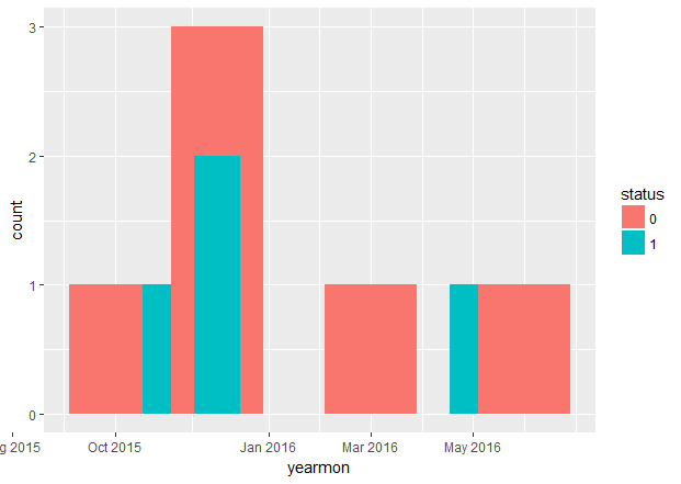
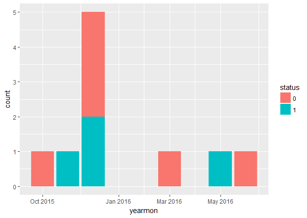
More than a solution I'd like to understand the reason why something which should be quite easy, it's actually not.
[I am borrowing part of the code from a different post which touched on the issue but it ended up with a solution I didn't like]
library(ggplot2)
library(xts)
library(dplyr)
library(scales)

csvData <- "dt,status
2015-12-03,1
2015-12-05,1
2015-12-05,0
2015-11-24,1
2015-10-17,0
2015-12-18,0
2016-06-30,0
2016-05-21,1
2016-03-31,0
2015-12-31,0"

tmp <- read.csv(textConnection(csvData))
tmp$dt <- as.Date(tmp$dt)
tmp$yearmon <- as.yearmon(tmp$dt)
tmp$status <- as.factor(tmp$status)

### Not good. Why?
ggplot(tmp, aes(x = yearmon, fill = status)) +
  geom_bar() +
  scale_x_yearmon()

### Almost good but long-winded and ticks not great
chartData <- tmp %>%
  group_by(yearmon, status) %>%
  summarise(count = n()) %>%
  as.data.frame()
ggplot(chartData, aes(x = yearmon, y = count, fill = status)) +
  geom_col() +
  scale_x_yearmon()
The first plot is all wrong; the second is almost perfect (ticks on the X axis are not great but I can live with that). Isn't geom_bar() supposed to perform the count job I have to manually perform in the second chart?
My question is: why is the first chart so poor? There is a warning which is meant to suggest something ("position_stack requires non-overlapping x intervals") but I really fail to understand it. Thanks.
MY PERSONAL ANSWER
This is what I learned (thanks so much to all of you!):
- Even if there is a
scale_#_yearmonorscale_#_date, unfortunately ggplot treats those object types as continuous numbers. That makesgeom_barunusable. geom_histogrammight do the trick. But you lose control on relevant parts of the aestethics.- bottom line: you need to group/sum before you chart
- Not sure (if you plan to use ggplot2) xts or lubridate are really that useful for what I was trying to achieve. I suspect for any continuous case - date-wise - they will be perfect.
All in, I ended with this which does perfectly what I am after (notice how there is no need for xts or lubridate):
library(ggplot2)
library(dplyr)
library(scales)

csvData <- "dt,status
2015-12-03,1
2015-12-05,1
2015-12-05,0
2015-11-24,1
2015-10-17,0
2015-12-18,0
2016-06-30,0
2016-05-21,1
2016-03-31,0
2015-12-31,0"

tmp <- read.csv(textConnection(csvData))
tmp$dt <- as.Date(tmp$dt)
tmp$yearmon <- as.Date(format(tmp$dt, "%Y-%m-01"))
tmp$status <- as.factor(tmp$status)

### GOOD
chartData <- tmp %>%
  group_by(yearmon, status) %>%
  summarise(count = n()) %>%
  as.data.frame()

ggplot(chartData, aes(x = yearmon, y = count, fill = status)) +
  geom_col() +
  scale_x_date(labels = date_format("%h-%y"),
               breaks = seq(from = min(chartData$yearmon),
                            to = max(chartData$yearmon), by = "month"))


floor_date()is from the lubridate package, is it? Anyway: I get exactly the same result as per FIRST CHART above with that. – Systemize