Format a number with grouped thousands on Y-Axis in graph using chartist.js
Asked Answered
M

1

8

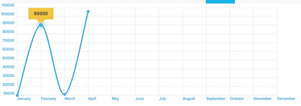
I have created graph to display value in graphical form by Chartist.js library in JavaScript (PHP). All the values of Y-Axis are coming from database. But I am not able to display Y-Axis in grouped thousands format. I want to display thousand format value even on tooltip of intersection point (Check image)

PHP Code

$clientData = $wpdb->get_results('SELECT * FROM clientsdata WHERE Client_Id = "'.$currentUser->ID.'"');
$months=array("January", "February", "March", "April", "May", "June", "July", "August", "September", "October", "November", "December");
$selectedFieldData = array();
foreach($months as $month){ 
$value = '';
    foreach($clientData as $client){
        if($client->Month == $month && $client->Year == $selectYear){
            $value = $client->$fieldValue;
            break;
        }
    }
    if(!empty($value)){ 
            $selectedFieldData[] = $value; //See below - 1
        }
        else{
            $selectedFieldData[] = null;
        }
}

JavaScript code (Graph actual code)

$data =  "<script type='text/javascript'>


  var chart = new Chartist.Line('#chart1',{
  labels: ['January', 'February', 'March','April' ,'May' ,'June' ,'July' ,'August' ,'September' ,'October' ,'November' ,'December'],
  series: [
    [$selectedFieldData[0],$selectedFieldData[1],$selectedFieldData[2],$selectedFieldData[3],$selectedFieldData[4],$selectedFieldData[5],
    $selectedFieldData[6],$selectedFieldData[7],$selectedFieldData[8],$selectedFieldData[9],$selectedFieldData[10],$selectedFieldData[11]],
  ]
},
{
  fullWidth: true,
  plugins: [
    Chartist.plugins.tooltip({
      pointClass: 'my-cool-point'
    })
  ]

  //low: 0
},
{ 
axisY: {
    labelInterpolationFnc: function(value){
        return value;
}}
}

);


// Let's put a sequence number aside so we can use it in the event callbacks
var seq = 0,
  delays = 80,
  durations = 500;

// Once the chart is fully created we reset the sequence
chart.on('created', function() {
  seq = 0;
});

// On each drawn element by Chartist we use the Chartist.Svg API to trigger SMIL animations
chart.on('draw', function(data) {
  seq++;

  if(data.type === 'line') {
    // If the drawn element is a line we do a simple opacity fade in. This could also be achieved using CSS3 animations.
    data.element.animate({
      opacity: {
        // The delay when we like to start the animation
        begin: seq * delays + 1000,
        // Duration of the animation
        dur: durations,
        // The value where the animation should start
        from: 0,
        // The value where it should end
        to: 1
      }
    });
  } else if(data.type === 'label' && data.axis === 'x') {
    data.element.animate({
      y: {
        begin: seq * delays,
        dur: durations,
        from: data.y + 100,
        to: data.y,
        // We can specify an easing function from Chartist.Svg.Easing
        easing: 'easeOutQuart'
      }
    });
  } else if(data.type === 'label' && data.axis === 'y') {
    data.element.animate({
      x: {
        begin: seq * delays,
        dur: durations,
        from: data.x - 100,
        to: data.x,
        easing: 'easeOutQuart'
      }
    });
  } else if(data.type === 'point') {
    data.element.animate({
      x1: {
        begin: seq * delays,
        dur: durations,
        from: data.x - 10,
        to: data.x,
        easing: 'easeOutQuart'
      },
      x2: {
        begin: seq * delays,
        dur: durations,
        from: data.x - 10,
        to: data.x,
        easing: 'easeOutQuart'
      },
      opacity: {
        begin: seq * delays,
        dur: durations,
        from: 0,
        to: 1,
        easing: 'easeOutQuart'
      }
    }
    );
    var circle = new Chartist.Svg('circle', {
        cx: [data.x],
      cy: [data.y],
      r: [5], 
      'ct:value': data.value.y,
      'ct:meta': data.meta,
      class: 'my-cool-point',
    }, 'ct-area');

    // With data.element we get the Chartist SVG wrapper and we can replace the original point drawn by Chartist with our newly created triangle
    data.element.replace(circle);


  } else if(data.type === 'grid') {
    // Using data.axis we get x or y which we can use to construct our animation definition objects
    var pos1Animation = {
      begin: seq * delays,
      dur: durations,
      from: data[data.axis.units.pos + '1'] - 30,
      to: data[data.axis.units.pos + '1'],
      easing: 'easeOutQuart'
    };

    var pos2Animation = {
      begin: seq * delays,
      dur: durations,
      from: data[data.axis.units.pos + '2'] - 100,
      to: data[data.axis.units.pos + '2'],
      easing: 'easeOutQuart'
    };

    var animations = {};
    animations[data.axis.units.pos + '1'] = pos1Animation;
    animations[data.axis.units.pos + '2'] = pos2Animation;
    animations['opacity'] = {
      begin: seq * delays,
      dur: durations,
      from: 0,
      to: 1,
      easing: 'easeOutQuart'
    };


    data.element.animate(animations);
  }
});

// For the sake of the example we update the chart every time it's created with a delay of 10 seconds
chart.on('created', function() {
  if(window.__exampleAnimateTimeout) {
    clearTimeout(window.__exampleAnimateTimeout);
    window.__exampleAnimateTimeout = null;
  }
  window.__exampleAnimateTimeout = setTimeout(chart.update.bind(chart), 1200000);
});

  </script>";

  echo $data;

1 - If I use number_format here, then it convert value in thousand format, But array takes value in separate position, So actual value breaks.

enter image description here

Can anyone try to solve this problem?
Marandamarasca answered 10/8, 2016 at 7:58 Comment(2)
after using number format at PHP side may be wrapping your Y axes series in quote can help. something like ['".$selectedFieldData[0]."','".$selectedFieldData[1]."']Crepe
All values are dynamic. So how would i know, value will be in two position after using number format. Ex. suppose value - 10000. after number_format, array[0] - 10, array[1] - 000. but if no of digit decreases or increased then what. If you are sure then write exact answer and post it.Marandamarasca
M
4

Finally, one of my friend has fixed this issue.

  1. Fixed by Jquery - number with grouped thousands on Y-Axis in graph. Number with grouped thousand on tooltip fixed by "currency :' '".

Here is complete code. PHP Code

$clientData = $wpdb->get_results('SELECT * FROM clientsdata WHERE Client_Id = "'.$currentUser->ID.'"');
$months=array("January", "February", "March", "April", "May", "June", "July", "August", "September", "October", "November", "December");
$selectedFieldData = array();
foreach($months as $month){ 
$value = '';
    foreach($clientData as $client){
        if($client->Month == $month && $client->Year == $selectYear){
            $value = $client->$fieldValue;
            break;
        }
    }
    if(!empty($value)){ 
            $selectedFieldData[] = $value;
        }
        else{
            $selectedFieldData[] = null;
        }
}

JavaScript code

$data =  "<script type='text/javascript'>


  var chart = new Chartist.Line('#chart1',{
  labels: ['January', 'February', 'March','April' ,'May' ,'June' ,'July' ,'August' ,'September' ,'October' ,'November' ,'December'],
  series: [
    [$selectedFieldData[0],$selectedFieldData[1],$selectedFieldData[2],$selectedFieldData[3],$selectedFieldData[4],$selectedFieldData[5],
    $selectedFieldData[6],$selectedFieldData[7],$selectedFieldData[8],$selectedFieldData[9],$selectedFieldData[10],$selectedFieldData[11]],
  ]
},
{
  fullWidth: true,
  plugins: [
    Chartist.plugins.tooltip({
      pointClass: 'my-cool-point',
      currency :' ' //Used for display grouped thousand format value on toolip
    })
  ]

  //low: 0
},
{ 
axisY: {
    labelInterpolationFnc: function(value){
        return value;
}}
}

);


// Let's put a sequence number aside so we can use it in the event callbacks
var seq = 0,
  delays = 80,
  durations = 500;

// Once the chart is fully created we reset the sequence
chart.on('created', function() {
  seq = 0;
});

// On each drawn element by Chartist we use the Chartist.Svg API to trigger SMIL animations
chart.on('draw', function(data) {
  seq++;

  if(data.type === 'line') {
    // If the drawn element is a line we do a simple opacity fade in. This could also be achieved using CSS3 animations.
    data.element.animate({
      opacity: {
        // The delay when we like to start the animation
        begin: seq * delays + 1000,
        // Duration of the animation
        dur: durations,
        // The value where the animation should start
        from: 0,
        // The value where it should end
        to: 1
      }
    });
  } else if(data.type === 'label' && data.axis === 'x') {
    data.element.animate({
      y: {
        begin: seq * delays,
        dur: durations,
        from: data.y + 100,
        to: data.y,
        // We can specify an easing function from Chartist.Svg.Easing
        easing: 'easeOutQuart'
      }
    });
  } else if(data.type === 'label' && data.axis === 'y') {
    data.element.animate({
      x: {
        begin: seq * delays,
        dur: durations,
        from: data.x - 100,
        to: data.x,
        easing: 'easeOutQuart'
      }
    });
  } else if(data.type === 'point') {
    data.element.animate({
      x1: {
        begin: seq * delays,
        dur: durations,
        from: data.x - 10,
        to: data.x,
        easing: 'easeOutQuart'
      },
      x2: {
        begin: seq * delays,
        dur: durations,
        from: data.x - 10,
        to: data.x,
        easing: 'easeOutQuart'
      },
      opacity: {
        begin: seq * delays,
        dur: durations,
        from: 0,
        to: 1,
        easing: 'easeOutQuart'
      }
    }
    );
    var circle = new Chartist.Svg('circle', {
        cx: [data.x],
      cy: [data.y],
      r: [5], 
      'ct:value': data.value.y,
      'ct:meta': data.meta,
      class: 'my-cool-point',
    }, 'ct-area');

    // With data.element we get the Chartist SVG wrapper and we can replace the original point drawn by Chartist with our newly created triangle
    data.element.replace(circle);


  } else if(data.type === 'grid') {
    // Using data.axis we get x or y which we can use to construct our animation definition objects
    var pos1Animation = {
      begin: seq * delays,
      dur: durations,
      from: data[data.axis.units.pos + '1'] - 30,
      to: data[data.axis.units.pos + '1'],
      easing: 'easeOutQuart'
    };

    var pos2Animation = {
      begin: seq * delays,
      dur: durations,
      from: data[data.axis.units.pos + '2'] - 100,
      to: data[data.axis.units.pos + '2'],
      easing: 'easeOutQuart'
    };

    var animations = {};
    animations[data.axis.units.pos + '1'] = pos1Animation;
    animations[data.axis.units.pos + '2'] = pos2Animation;
    animations['opacity'] = {
      begin: seq * delays,
      dur: durations,
      from: 0,
      to: 1,
      easing: 'easeOutQuart'
    };


    data.element.animate(animations);
  }
});

// For the sake of the example we update the chart every time it's created with a delay of 10 seconds
chart.on('created', function() {
  if(window.__exampleAnimateTimeout) {
    clearTimeout(window.__exampleAnimateTimeout);
    window.__exampleAnimateTimeout = null;
  }
  window.__exampleAnimateTimeout = setTimeout(chart.update.bind(chart), 1200000);
});


//Below code is for display grouped thousand format value on Y-AXIS   
      </script><script>
      function commaSeparateNumberr(val){
        while (/(\d+)(\d{3})/.test(val.toString())){
          val = val.toString().replace(/(\d+)(\d{3})/, '$1'+','+'$2');
        }
        return val;
      }
     setTimeout(function(){ jQuery('.ct-vertical').each(function(){  
        var ab =jQuery(this).html();
        jQuery(this).html(commaSeparateNumberr(ab));
        }); }, 2000);
      </script>";

      echo $data;
Marandamarasca answered 19/8, 2016 at 6:5 Comment(0)

© 2022 - 2024 — McMap. All rights reserved.