Is there a way in R to plot a legend with two axes?
Asked Answered
F

1

8

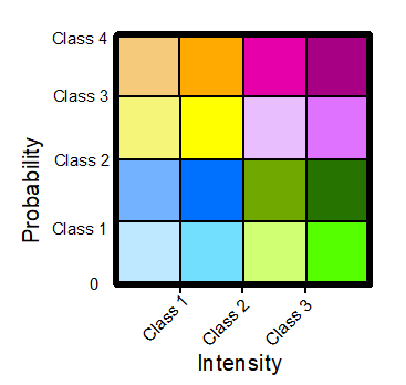
I would like to plot a legend with two axes. Specifically, I have combined two spatial objects that have been classified, the first showing intensity of an event and the second showing the probability of the event at that location. I want to create a legend that shows where the pixels of the combined raster fall in each category. The legend I'd like to create would look something like this: Legend with two axes.

enter image description here

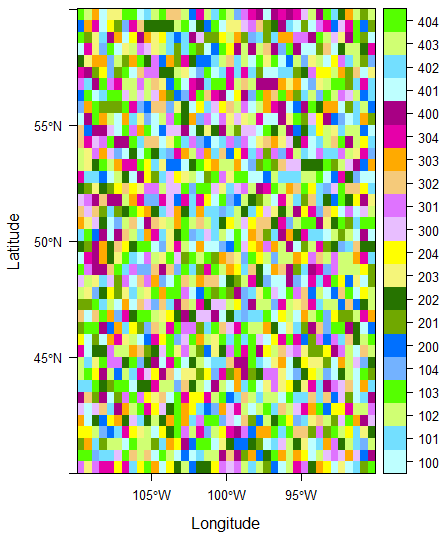
The normal legend of the classified data looks like this: Original legend

enter image description here

Here is a reproducible example of the type of data I'm using:

library(raster)
library(rasterVis)

# setseed
set.seed(999)

# create raster (example of what would be the outcome of combining intensity and probability rasters)
plot.me<- raster(xmn=-110, xmx=-90, ymn=40, ymx=60, ncols=40, nrows=40)
val <- c(100:104, 200:204, 300:304, 400:404)
plot.me<- setValues(plot.me, sample(val,ncell(plot.me),replace=T))


######  Plotting

plot.me <- ratify(plot.me)
levelplot(plot.me,att="ID" ,
          col.regions=c("#beffff","#73dfff","#d0ff73","#55ff00",
                        "#73b2ff","#0070ff","#70a800","#267300",
                        "#f5f57a","#ffff00","#e8beff","#df73ff",
                        "#f5ca7a","#ffaa00","#e600a9","#a80084"))

Plot output from above

enter image description here

The easiest way would be to create the plot and add the legend later in a graphics editor.... but I'm sure there must be a way to do this in R itself! I'm currently plotting with the rasterVis package, but if there are answers in ggplot or base R, these are equally welcome.

If it would be more useful to have a reproducible example of the intermediate steps (ie with the intensity/ probability rasters) let me know and I can produce those.

Filomena answered 6/3, 2020 at 23:21 Comment(4)
Closest I've seen living on github is github.com/clauswilke/multiscales, but it is not exactly your example.Bales
Using rasterVis I produced this image. If this is what you are looking for, try the code available here (section "Bivariate legend).Nitroparaffin
@OscarPerpiñán I feel like your example is nearest what I'm hoping for (able to plot legend on top of map). I'm having difficulty understanding one part of your code-what is the purpose of the pList step? Is that necessary to make subsequent steps function correctly, or is it specific to the map you were creating?Filomena
@Filomena This step produces a list of level plots, each of them corresponding to a class (see code above, in section "Categorical data"). This list is collapsed to a global plot with Reduce and +.trellis.Nitroparaffin
S
5

One solution will be to make two plots and combine them using grid.arrange function from gridExtra package for example

First, I convert your rasterLayer into a tibble by using the function posted on this post: Overlay raster layer on map in ggplot2 in R?

(PS: I modified your val object in order to make only 16 different colors matching the color pattern you provided. In your example, val has 20 different values)

val <- c(101:104, 201:204, 301:304, 401:404) # correction from OP's question to match 16 different values

library(raster)
gplot_data <- function(x, maxpixels = 50000)  {
  x <- raster::sampleRegular(x, maxpixels, asRaster = TRUE)
  coords <- raster::xyFromCell(x, seq_len(raster::ncell(x)))
  ## Extract values
  dat <- utils::stack(as.data.frame(raster::getValues(x))) 
  names(dat) <- c('value', 'variable')

  dat <- dplyr::as.tbl(data.frame(coords, dat))

  if (!is.null(levels(x))) {
    dat <- dplyr::left_join(dat, levels(x)[[1]], 
                            by = c("value" = "ID"))
  }
  dat
}

df <- gplot_data(plot.me)

Then, I create the fist plot, the heatmap using geom_tile:

library(ggplot2)
plot <- ggplot(df, aes(x = x, y = y, fill = as.factor(value)))+
  geom_tile(show.legend = FALSE)+
  coord_fixed(ratio = 20/20)+
  scale_fill_manual(values = c("#beffff","#73dfff","#d0ff73","#55ff00",
                               "#73b2ff","#0070ff","#70a800","#267300",
                               "#f5f57a","#ffff00","#e8beff","#df73ff",
                               "#f5ca7a","#ffaa00","#e600a9","#a80084"))+
  scale_y_continuous(name = "Latitude",labels = paste(c(40,45,50,55,60),"°N"))+
  scale_x_continuous(name = "Longitude",labels = paste(c(-110,-105,-100,-95,-90),"°W"))+
  theme_linedraw()+
  theme(panel.border = element_rect(size = 2),
        axis.text = element_text(size = 10),
        axis.title = element_text(size = 10),
        panel.grid.major = element_blank(),
        panel.grid.minor = element_blank())

Then, I create a separate dataframe for the legend:

library(tidyverse)
df_legend <- data.frame(value = unique(df$value))
df_legend <- df_legend %>% rowwise() %>% 
  mutate(Dim1 = unlist(strsplit(as.character(value),""))[1],
         Dim3 = unlist(strsplit(as.character(value),""))[3])

Source: local data frame [16 x 3]
Groups: <by row>

# A tibble: 16 x 3
   value Dim1  Dim3 
   <int> <chr> <chr>
 1   404 4     4    
 2   204 2     4    
 3   304 3     4    
 4   104 1     4    
 5   202 2     2    
 6   302 3     2    
 7   203 2     3    
 8   301 3     1    
 9   402 4     2    
10   401 4     1    
11   303 3     3    
12   102 1     2    
13   201 2     1    
14   103 1     3    
15   403 4     3    
16   101 1     1    

Now, I made the plot for the legend:

legend <- ggplot(df_legend, aes(x = as.factor(Dim1), y = as.factor(Dim3), fill = as.factor(value)))+
  geom_tile(show.legend = FALSE, color = "black")+
  coord_fixed(ratio = 1)+
  scale_fill_manual(values = c("#beffff","#73dfff","#d0ff73","#55ff00",
                               "#73b2ff","#0070ff","#70a800","#267300",
                               "#f5f57a","#ffff00","#e8beff","#df73ff",
                               "#f5ca7a","#ffaa00","#e600a9","#a80084"))+
  theme_linedraw()+
  labs(x = "Dim1", y = "Dim3")+
  theme(panel.border = element_rect(size = 2),
        axis.text = element_text(size = 10),
        axis.title = element_text(size = 10))

And finally, I combine them:

library(gridExtra)
grid.arrange(plot, legend, layout_matrix = rbind(c(1,1,2),c(1,1,3)))

enter image description here

Does it look what you are trying to get ?


NB: You can probably plot directly your raster object into ggplot2 but I was not sure of the exact procedure. Also, you can play with the layout of grid.arrange in order to make the plot look exactly what you want

Sakti answered 7/3, 2020 at 4:3 Comment(0)

© 2022 - 2024 — McMap. All rights reserved.