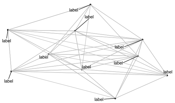
As far as I understand the problem here, ggrepel, which is the package used by geom_node_text, only has access to the layer on which the nodes are and does not 'see' the edges. This makes ggrepel not very suitable for networks (or I'm missing something).
Unfortunately, I don't have a very good solution for this problem either, although I have been looking for one for a while now. Here are two suggestions how you (or anyone) could move towards a better way of labeling with ggraph():
1: text as nodes
So one idea I had was to let the network layout algorithm do the work for us. I make another set of nodes that contain only the labels. The label nodes are only connected to the one respective node in network they label. Here we go:
library(dplyr)
library(ggraph)
library(tidygraph)

set.seed(123)

reprex <- tibble(from = sample(1:10, 100, replace = TRUE),
                 to = sample(1:10, 100, replace = TRUE)) %>%
  as_tbl_graph() %>%
  activate(edges) %>%
  mutate(color = "grey")
I add the edge color grey here since we will have two different colors in the final plot.
nodes <- reprex %>%
  activate(nodes) %>%
  as_tibble() # extract data.frame of nodes

# create new graph with just the lables
labels <- tibble(from = 1:10,
                 to = 11:20) %>%
  as_tbl_graph() %>%
  activate(nodes) %>%
  mutate(label1 = "label",
         is_label = !name %in% nodes$name) %>%
  activate(edges) %>%
  mutate(color = "black")

# join graph and labels
new_graph <- graph_join(labels, reprex, by = "name")
Now that we have the new graph with label nodes, we can plot. Note, that I added a variable is_label to the new graph so we can use different node shapes and make sure only the label nodes are labeled:
reprex_plot <- new_graph %>%
  ggraph() +
  geom_edge_link(aes(color = color)) +
  geom_node_point(aes(filter = !is_label, shape = "circle"), show.legend = FALSE) +
  scale_edge_color_identity() +
  geom_node_text(aes(filter = is_label, label = label1), hjust = -0.1) +
  theme_void()
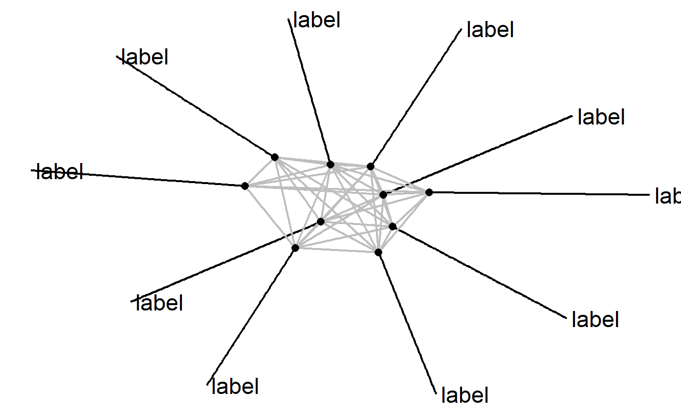
reprex_plot
![enter image description here]()
Clearly, there is A LOT of room for improvement. The labels are now very far away from the nodes. They still overlap with their own edges (though that could be solved by providing better hjust values, I think). And while this works well with the auto layout, other layouts might do strange things, depending on your data. I really hope someone else comes up with a better solution. But I thought I might as well put it out here. Maybe someone feels inspired.
2: labels instead of text
Another way to get around the problem is to use white background on the text. This solution is inspired by how GUI programs for network plotting handle the problem. We can use ggplot2's geom_label for this, although geom_node_label() would accomplish the same. This solution is a lot more straightforward, but also limited. Here is the whole thing in one pipe:
tibble(from = sample(1:10, 100, replace = TRUE),
       to = sample(1:10, 100, replace = TRUE))  %>%
  as_tbl_graph() %>%
  activate(nodes) %>%
  mutate(label1 = "label") %>%
  ggraph() +
  geom_edge_link(color = "grey") +
  geom_node_point() +
  geom_label(aes(x = x, y = y, label = label1), nudge_y = 0.1, label.size = NA) +
  theme_void()
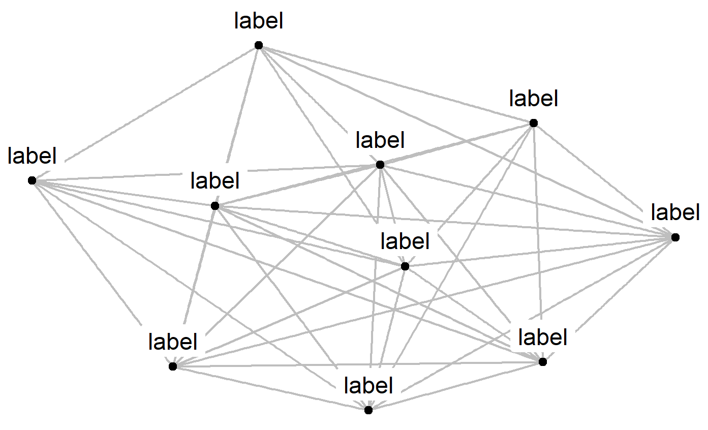
![enter image description here]()
I removed the border on the labels and placed them directly above their nodes (nudge_y = 0.1). Your results may differ depending on the size of the plot so you might need to change that value.
On larger networks, the white boxes of the labels might cover up other nodes.


