How to place icons at the edge of circle
Asked Answered
H

1

8

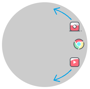
I want to place icons at the edge of their parent (the circle), like this:

enter image description here

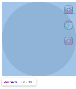
I tried some ways, but in default absolute children placed at the start position of their parent, like this:

enter image description here

Even the parent has a circle shape (border-radius: 50%;)

I don't want to use margin or position for every single child, because their number is dynamic.

Is there any way to place children at the edge of their parent?

.circle {
  position: relative;
  width: 300px;
  height: 300px;
  background: rgba(0, 0, 0, 0.2);
  display: flex;
  align-items: center;
  border-radius: 50%;
}

.menu {
  list-style-type: none;
  display: flex;
  flex-direction: column;
  justify-content: center;
  padding: 0;
  margin: 0;
  position: absolute;
  right: 5px;
}

.menu li {
  margin: 5px 0;
}

.menu li a {
  display: block;
}

.menu li a img {
  width: 50px;
}
<div class="circle">
  <ul class="menu">
    <li>
      <a href="#instagram">
        <img src="https://img.icons8.com/cotton/344/instagram-new.png" />
      </a>
    </li>
    <li>
      <a href="#chrome">
        <img src="https://img.icons8.com/cotton/344/chrome.png" />
      </a>
    </li>
    <li>
      <a href="#youtube">
        <img src="https://img.icons8.com/cotton/344/youtube.png" />
      </a>
    </li>
  </ul>
</div>
Hemihedral answered 3/4, 2021 at 10:37 Comment(0)
L
6

Consider the use of transformation. You place all the item into the center then rototate/translate them to place them on the edges. I am using CSS variables to make the code eaiser but it's not mandatory

.circle {
  width: 300px;
  height: 300px;
  background: rgba(0, 0, 0, 0.2);
  display: flex;
  border-radius: 50%;
}

.menu {
  list-style-type: none;
  padding: 0;
  display:grid; /* use grid */
  margin:auto; /* center the menu with all the items */
}

.menu li {
  --d:120px; /* distance from the center */
  grid-area:1/1; /* all of them at the same position (they overlap) */
  /* we rotate then translate to the edge then rotate again using the opposite rotation */
  transform:rotate(var(--r)) translateX(var(--d)) rotate(calc(-1*var(--r)));
}

/* adjust the angle for each icon */
.menu li:nth-child(1) { --r:  0deg} 
.menu li:nth-child(2) { --r: 40deg} 
.menu li:nth-child(3) { --r:-40deg}

.menu li a {
  display: block;
}
.menu li a img {
  width: 50px;
}
<div class="circle">
  <ul class="menu">
    <li>
      <a href="#instagram">
        <img src="https://img.icons8.com/cotton/344/instagram-new.png" />
      </a>
    </li>
    <li>
      <a href="#chrome">
        <img src="https://img.icons8.com/cotton/344/chrome.png" />
      </a>
    </li>
    <li>
      <a href="#youtube">
        <img src="https://img.icons8.com/cotton/344/youtube.png" />
      </a>
    </li>
  </ul>
</div>
Another idea using shape-outside:

.circle {
  width: 300px;
  height: 300px;
  background: rgba(0, 0, 0, 0.2);
  display: inline-flex;
  border-radius: 50%;
}

.menu {
  list-style-type: none;
  padding: 0;
  margin:0 0 0 auto;
  width:50%;
  text-align:right;
  word-spacing: 150px;
  line-height:0;
}
.menu::before {
  content:"";
  float:right;
  height:100%;
  width: 100%;
  shape-outside:radial-gradient(100% 50% at left,transparent 98%,#fff)
}

.menu li {
  display:inline-block;
}

.menu li a {
  display: block;
}
.menu li a img {
  width: 50px;
}
<div class="circle">
  <ul class="menu">
    <li>
      <a href="#instagram">
        <img src="https://img.icons8.com/cotton/344/instagram-new.png" />
      </a>
    </li>
    <li>
      <a href="#chrome">
        <img src="https://img.icons8.com/cotton/344/chrome.png" />
      </a>
    </li>
    <li>
      <a href="#youtube">
        <img src="https://img.icons8.com/cotton/344/youtube.png" />
      </a>
    </li>
  </ul>
</div>

<div class="circle">
  <ul class="menu">
    <li>
      <a href="#instagram">
        <img src="https://img.icons8.com/cotton/344/instagram-new.png" />
      </a>
    </li>
    <li>
      <a href="#chrome">
        <img src="https://img.icons8.com/cotton/344/chrome.png" />
      </a>
    </li>
    <li>
      <a href="#youtube">
        <img src="https://img.icons8.com/cotton/344/youtube.png" />
      </a>
    </li>
    <li>
      <a href="#instagram">
        <img src="https://img.icons8.com/cotton/344/instagram-new.png" />
      </a>
    </li>
  </ul>
</div>

If the number of element is limited you can optimize the first one like below:

.circle {
  width: 300px;
  height: 300px;
  background: rgba(0, 0, 0, 0.2);
  display: inline-flex;
  border-radius: 50%;
}

.menu {
  --d:120px; /* distance from the center */
  --i:30deg; /* the increment */
  list-style-type: none;
  padding: 0;
  display:grid; /* use grid */
  margin:auto; /* center the menu with all the items */
}

.menu li {
  grid-area:1/1; /* all of them at the same position (they overlap) */
  /* we rotate then translate to the edge then rotate again using the opposite rotation */
  transform:rotate(var(--r)) translateX(var(--d)) rotate(calc(-1*var(--r)));
}

/* adjust the angle for each icon */
.menu li:nth-child(1) { --r: calc( 0*var(--i))} 
.menu li:nth-child(2) { --r: calc( 1*var(--i))} 
.menu li:nth-child(3) { --r: calc(-1*var(--i))} 
.menu li:nth-child(4) { --r: calc( 2*var(--i))} 
.menu li:nth-child(5) { --r: calc(-2*var(--i))} 
.menu li:nth-child(6) { --r: calc( 3*var(--i))} 
.menu li:nth-child(7) { --r: calc(-3*var(--i))} 
.menu li:nth-child(8) { --r: calc( 4*var(--i))} 
.menu li:nth-child(9) { --r: calc(-4*var(--i))} 
.menu li:nth-child(10){ --r: calc( 5*var(--i))} 
.menu li:nth-child(11){ --r: calc(-5*var(--i))} 
.menu li:nth-child(12){ --r: calc(-6*var(--i))} 

.menu li a {
  display: block;
}
.menu li a img {
  width: 50px;
}
<div class="circle">
  <ul class="menu" style="--i:50deg">
    <li>
      <a href="#instagram">
        <img src="https://img.icons8.com/cotton/344/instagram-new.png" />
      </a>
    </li>
    <li>
      <a href="#chrome">
        <img src="https://img.icons8.com/cotton/344/chrome.png" />
      </a>
    </li>
    <li>
      <a href="#youtube">
        <img src="https://img.icons8.com/cotton/344/youtube.png" />
      </a>
    </li>
  </ul>
</div>

<div class="circle">
  <ul class="menu" style="--i:20deg;--d:130px">
    <li>
      <a href="#instagram">
        <img src="https://img.icons8.com/cotton/344/instagram-new.png" />
      </a>
    </li>
    <li>
      <a href="#chrome">
        <img src="https://img.icons8.com/cotton/344/chrome.png" />
      </a>
    </li>
    <li>
      <a href="#youtube">
        <img src="https://img.icons8.com/cotton/344/youtube.png" />
      </a>
    </li>
    <li>
      <a href="#instagram">
        <img src="https://img.icons8.com/cotton/344/instagram-new.png" />
      </a>
    </li>
    <li>
      <a href="#chrome">
        <img src="https://img.icons8.com/cotton/344/chrome.png" />
      </a>
    </li>
    <li>
      <a href="#youtube">
        <img src="https://img.icons8.com/cotton/344/youtube.png" />
      </a>
    </li>
  </ul>
</div>

<div class="circle">
  <ul class="menu" style="--d:100px">
    <li>
      <a href="#instagram">
        <img src="https://img.icons8.com/cotton/344/instagram-new.png" />
      </a>
    </li>
    <li>
      <a href="#chrome">
        <img src="https://img.icons8.com/cotton/344/chrome.png" />
      </a>
    </li>
    <li>
      <a href="#youtube">
        <img src="https://img.icons8.com/cotton/344/youtube.png" />
      </a>
    </li>
     <li>
      <a href="#instagram">
        <img src="https://img.icons8.com/cotton/344/instagram-new.png" />
      </a>
    </li>
    <li>
      <a href="#chrome">
        <img src="https://img.icons8.com/cotton/344/chrome.png" />
      </a>
    </li>
    <li>
      <a href="#youtube">
        <img src="https://img.icons8.com/cotton/344/youtube.png" />
      </a>
    </li> <li>
      <a href="#instagram">
        <img src="https://img.icons8.com/cotton/344/instagram-new.png" />
      </a>
    </li>
    <li>
      <a href="#chrome">
        <img src="https://img.icons8.com/cotton/344/chrome.png" />
      </a>
    </li>
    <li>
      <a href="#youtube">
        <img src="https://img.icons8.com/cotton/344/youtube.png" />
      </a>
    </li>
     <li>
      <a href="#chrome">
        <img src="https://img.icons8.com/cotton/344/chrome.png" />
      </a>
    </li>
    <li>
      <a href="#youtube">
        <img src="https://img.icons8.com/cotton/344/youtube.png" />
      </a>
    </li>
     <li>
      <a href="#chrome">
        <img src="https://img.icons8.com/cotton/344/chrome.png" />
      </a>
    </li>
  </ul>
</div>

The above cover up to 12 icons and you can easily extend to the code to cover more. Then all you have to do is to adjust the variable i and d

Another kind of configuration:

.circle {
  width: 300px;
  height: 300px;
  background: rgba(0, 0, 0, 0.2);
  display: inline-flex;
  border-radius: 50%;
}

.menu {
  --d:120px; /* distance from the center */
  --i:30deg; /* the increment */
  list-style-type: none;
  padding: 0;
  display:grid; /* use grid */
  margin:auto; /* center the menu with all the items */
}

.menu li {
  grid-area:1/1; /* all of them at the same position (they overlap) */
  /* we rotate then translate to the edge then rotate again using the opposite rotation */
  transform:rotate(var(--r)) translateX(var(--d)) rotate(calc(-1*var(--r)));
}

/* adjust the angle for each icon */
.menu li:nth-child(1) { --r: calc( 0*var(--i))} 
.menu li:nth-child(2) { --r: calc( 1*var(--i))} 
.menu li:nth-child(3) { --r: calc( 2*var(--i))} 
.menu li:nth-child(4) { --r: calc( 3*var(--i))} 
.menu li:nth-child(5) { --r: calc( 4*var(--i))} 
.menu li:nth-child(6) { --r: calc( 5*var(--i))} 
.menu li:nth-child(7) { --r: calc( 6*var(--i))} 
.menu li:nth-child(8) { --r: calc( 7*var(--i))} 
.menu li:nth-child(9) { --r: calc( 8*var(--i))} 
.menu li:nth-child(10){ --r: calc( 9*var(--i))} 
.menu li:nth-child(11){ --r: calc(10*var(--i))} 
.menu li:nth-child(12){ --r: calc(11*var(--i))} 

.menu li a {
  display: block;
}
.menu li a img {
  width: 50px;
}
<div class="circle">
  <ul class="menu" style="--i:50deg">
    <li>
      <a href="#instagram">
        <img src="https://img.icons8.com/cotton/344/instagram-new.png" />
      </a>
    </li>
    <li>
      <a href="#chrome">
        <img src="https://img.icons8.com/cotton/344/chrome.png" />
      </a>
    </li>
    <li>
      <a href="#youtube">
        <img src="https://img.icons8.com/cotton/344/youtube.png" />
      </a>
    </li>
  </ul>
</div>

<div class="circle">
  <ul class="menu" style="--i:20deg;--d:130px">
    <li>
      <a href="#instagram">
        <img src="https://img.icons8.com/cotton/344/instagram-new.png" />
      </a>
    </li>
    <li>
      <a href="#chrome">
        <img src="https://img.icons8.com/cotton/344/chrome.png" />
      </a>
    </li>
    <li>
      <a href="#youtube">
        <img src="https://img.icons8.com/cotton/344/youtube.png" />
      </a>
    </li>
    <li>
      <a href="#instagram">
        <img src="https://img.icons8.com/cotton/344/instagram-new.png" />
      </a>
    </li>
    <li>
      <a href="#chrome">
        <img src="https://img.icons8.com/cotton/344/chrome.png" />
      </a>
    </li>
    <li>
      <a href="#youtube">
        <img src="https://img.icons8.com/cotton/344/youtube.png" />
      </a>
    </li>
  </ul>
</div>

<div class="circle">
  <ul class="menu" style="--d:100px">
    <li>
      <a href="#instagram">
        <img src="https://img.icons8.com/cotton/344/instagram-new.png" />
      </a>
    </li>
    <li>
      <a href="#chrome">
        <img src="https://img.icons8.com/cotton/344/chrome.png" />
      </a>
    </li>
    <li>
      <a href="#youtube">
        <img src="https://img.icons8.com/cotton/344/youtube.png" />
      </a>
    </li>
     <li>
      <a href="#instagram">
        <img src="https://img.icons8.com/cotton/344/instagram-new.png" />
      </a>
    </li>
    <li>
      <a href="#chrome">
        <img src="https://img.icons8.com/cotton/344/chrome.png" />
      </a>
    </li>
    <li>
      <a href="#youtube">
        <img src="https://img.icons8.com/cotton/344/youtube.png" />
      </a>
    </li> <li>
      <a href="#instagram">
        <img src="https://img.icons8.com/cotton/344/instagram-new.png" />
      </a>
    </li>
    <li>
      <a href="#chrome">
        <img src="https://img.icons8.com/cotton/344/chrome.png" />
      </a>
    </li>
    <li>
      <a href="#youtube">
        <img src="https://img.icons8.com/cotton/344/youtube.png" />
      </a>
    </li>
     <li>
      <a href="#chrome">
        <img src="https://img.icons8.com/cotton/344/chrome.png" />
      </a>
    </li>
    <li>
      <a href="#youtube">
        <img src="https://img.icons8.com/cotton/344/youtube.png" />
      </a>
    </li>
     <li>
      <a href="#chrome">
        <img src="https://img.icons8.com/cotton/344/chrome.png" />
      </a>
    </li>
  </ul>
</div>

By adjusting the nth-child logic you control how your element will get placed.

Lallans answered 3/4, 2021 at 11:17 Comment(2)
Thank you, but as I said, I don't want to use CSS property for every single item. Because the number of icons is dynamic.Hemihedral
@AbolfazlPanbehkar added another idea. Still not perfect but a good starting point (will optimize it later)Lallans

© 2022 - 2024 — McMap. All rights reserved.