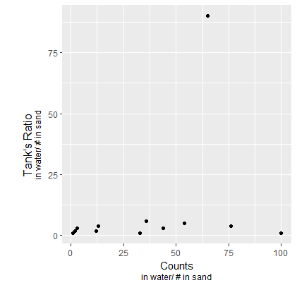
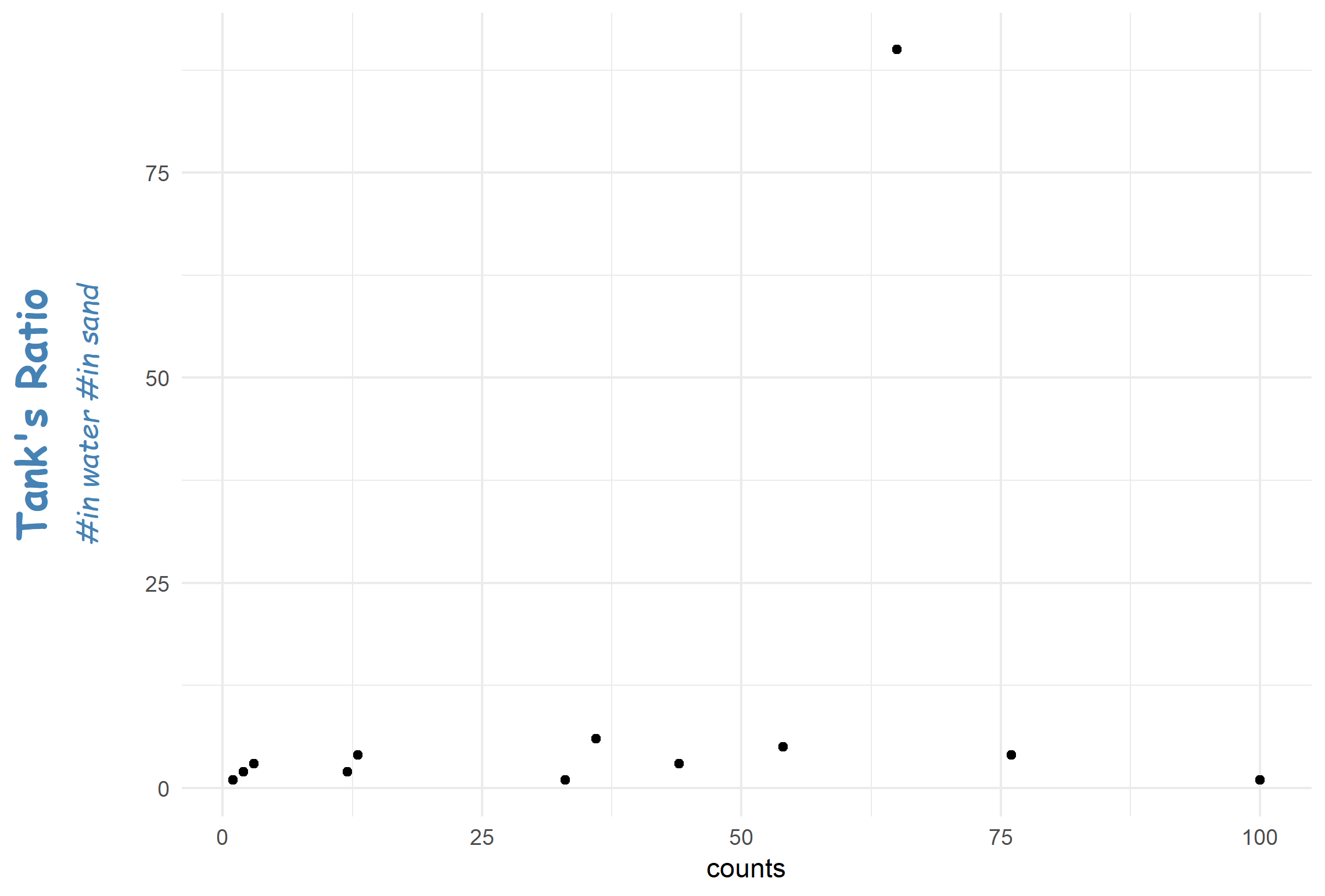
You could use the following code, defining the margins, the axis titles and sub-titles yourself:
We use theme to increase the bottom and left margin, and to suppress the automatically generated axis titles.
We use annotate to generate the text that serves as axis title and sub-title, if necessary, the text is rotated.
We generate the plot, turn it in a grob, and with this grob we can turn of clipping, and show the plot.
g1 <- ggplot(data = data, aes(x = counts, y = ratio, group = 1)) +
  geom_point()  +

  ## increase margin size for left and bottom and
  ## remove the axis titles
  theme(plot.margin = unit(c(1, 1, 4, 4), "lines"),
        axis.title.y = element_blank(),
        axis.title.x = element_blank() ) +

  ## define the plotting area to NOT include the annotations
  coord_cartesian(xlim = c(0, 100), ylim= c(0, 100), expand = FALSE) +

  ## annotate y axis
  annotate(geom = "text", x = -9, y = 50, label = "Tank's Ratio", angle = 90, size = 5) +
  annotate(geom = "text", x = -5, y = 50, label = "#in water/#in sand", angle = 90, size = 4) +

  ## annotate x axis
  annotate(geom = "text", x = 50, y = -5, label = "Counts", size = 5) +
  annotate(geom = "text", x = 50, y = -9, label = "#in water/#in sand", size = 4)

## turn off  clipping for axis extra labels
g2 <- ggplot_gtable(ggplot_build(g1))
g2$layout$clip[g2$layout$name == "panel"] <- "off"
grid::grid.draw(g2)
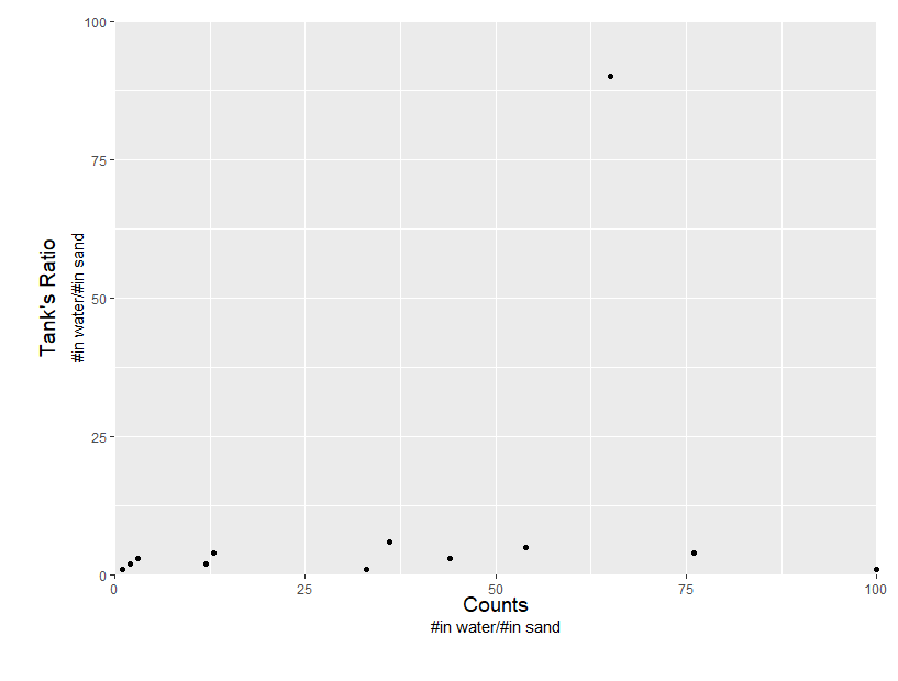
This yields the following picture:
![enter image description here]()
Please let me know whether this is what you want.


ggplot(data,aes(x=counts, y=ratio)) + geom_point() +ylab("Tank's Ratio \n#in water/# in sand") + xlab("Counts")– Chucklehead