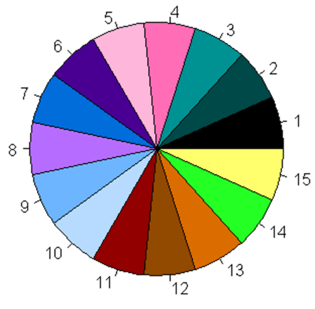
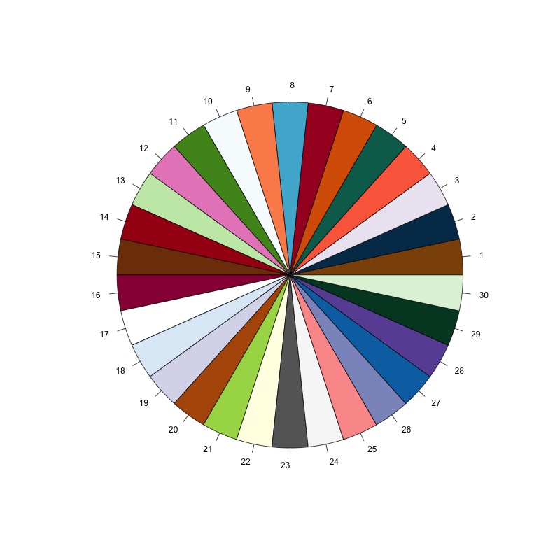
As another voice from the peanut gallery, I cannot differentiate several of the colors in that supposed color-blind safe palette. I also think expecting anyone to try and pick out the difference, esp. in line plots or small dot plots, or any other time there either low color to background ratio, or a lot of adjacent/overlapping data points, in larger palettes is pushing it.
I would really encourage use of different data point markers (finally, a use for emojis), different patterns of lines, etc. to accentuate esp. key points.
[#26, #12, #8]; [#14, #7, #29, #15]; [#1, #4, #6, #11, #20]; [#5, #23]; [#3, #30, #17, #18, #22, #24].
Another tip: Never use a combination of text and backgrounds (e.g. slides--what is wrong w/ black or white???) of dark red, dark green, and black. Same for blue/purple combinations, which are less common.
Also, if you slides are just an outline of your talk, just hand out an outline and skip the slides. Check out Visual Display of Quantitative Information Second to using color-blind safe palettes, its probably the best thing you can do for your data displays/talks.
I know, it is an over-priced, old, on-paper only book. I think there is a three book set, the other two books are also very good. Anyone in data science, UX in a technical field, or into design really should be familiar.


