Plotting means on histograms created with facet_wrap
Asked Answered
O

2

8

I'm making a several histograms using ggplot2 and facet_wrap and would like to plot the mean value on each panel. Below, I create a dummy data frame, find the mean of each facet, and then create the plots adding the mean using geom_point.

# Load libraries 
library(tidyverse)

# Toy data frame
df <- data.frame(ID = sample(letters[1:3], 100, replace = TRUE), n = runif(100))

# Mean value of each group
df_mean <- df %>% group_by(ID) %>% summarise(mean = mean(n))

# Plot histograms
ggplot(df) + 
  geom_histogram(aes(n)) + 
  facet_wrap(~ID) +
  geom_point(data = df_mean, aes(x = mean, y = Inf))

enter image description here

I used y = Inf to place the point at the top of each facet, but – as you can see – it is cropped somewhat. I'd like to nudge it downwards so that it is completely visible. To my knowledge, geom_point doesn't have a nudge_y or vadj argument and 0.7 * Inf is obviously nonsensical. I also tried adding position = position_nudge(y = -5) as an argument to geom_point, but this doesn't appear to have any effect. As a workaround, I even tried using geom_text and specifying nudge_y, but – like the position_nudge solution – it did not have any noticeable effect. Is there an easy way of doing this whilst plotting or do I simply need to calculate the y value prior to plotting?

Original answered 23/5, 2018 at 11:40 Comment(2)
Do you really want it on the top? You can use something like ...+geom_point(data = df_mean, aes(x = mean, y = 0), col="red") to place in on the x axis using a different colour.Lansing
@Lansing Yes, I really want at the top. :) There's loads of space up there, so it's much cleaner that plotting on top of other data.Original
B
4

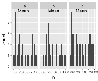
If you are ok with using geom_text/label() you can use the vjust argument to do this:

ggplot(df) + 
    geom_histogram(aes(n)) + 
    facet_wrap(~ID) +
    geom_text(data = df_mean, aes(x = mean, y = Inf),
              label = "Mean", vjust = 1)

enter image description here

I use it all the time for floating percent change or p-values at the top of a panel and you don't have to calculate anything, ggplot has got you.

Behlke answered 23/5, 2018 at 12:31 Comment(1)
I went with this solution using label = "\U2022" to produce a point.Original
L
4
# Load libraries 
library(tidyverse)

# Toy data frame
df <- data.frame(ID = sample(letters[1:3], 100, replace = TRUE), n = runif(100))

# Mean value of each group
df_mean <- df %>% group_by(ID) %>% summarise(mean = mean(n))

# Get max count using the dataframe that stores ggplot info
ggplot(df) + 
  geom_histogram(aes(n)) + 
  facet_wrap(~ID) -> p

# Plot histograms and plot mean in the right place
p + geom_point(data = df_mean, aes(x = mean, y = max(ggplot_build(p)$data[[1]]$count)))

enter image description here

The key here is to know the maximum count value, because that will be your top y axis value for your histograms. You can get that info using ggplot_build function and use that to plot your points in the right place.

Of course, you can go a bit higher than the max count in case the point falls on one of the bars, like this y = 0.2 + max(ggplot_build(p)$data[[1]]$count))

Lansing answered 23/5, 2018 at 11:56 Comment(0)
B
4

If you are ok with using geom_text/label() you can use the vjust argument to do this:

ggplot(df) + 
    geom_histogram(aes(n)) + 
    facet_wrap(~ID) +
    geom_text(data = df_mean, aes(x = mean, y = Inf),
              label = "Mean", vjust = 1)

enter image description here

I use it all the time for floating percent change or p-values at the top of a panel and you don't have to calculate anything, ggplot has got you.

Behlke answered 23/5, 2018 at 12:31 Comment(1)
I went with this solution using label = "\U2022" to produce a point.Original

© 2022 - 2024 — McMap. All rights reserved.