Create wavy borders in CSS for top and bottom borders
Asked Answered
R

2

8

I'm trying to create a wavy top and bottom border like the image here

enter image description here

I tried recreating the same effect using the following code

.wave{
  background: white;
  height: 25px;
  position: relative;  
}
.wave::before, .wave::after{
  border-bottom: 5px solid rgba(237, 30, 30, 1);
}
.wave::before{
  content: "";
  position: absolute;
  left: 0;
  right: 0;
  bottom: 0;
  height: 12px;
  background-size: 20px 40px;
  background-image:
    radial-gradient(circle at 10px -15px, transparent 20px, rgba(237, 30, 30, 1) 21px);
}
.wave::after{
  content: "";
  position: absolute;
  left: 0;
  right: 0;
  bottom: 0;
  height: 18px;
  background-size: 40px 40px;
  background-image:
    radial-gradient(circle at 10px 26px, rgba(237, 30, 30, 1) 20px, transparent 21px);
}


.wavebottom{
  background: rgba(237, 30, 30, 1);
  height: 25px;
  position: relative;  
}
.wavebottom::before, .wave::after{
  border-bottom: 5px solid rgba(237, 30, 30, 1);
}
.wave::before{
  content: "";
  position: absolute;
  left: 0;
  right: 0;
  bottom: 0;
  height: 12px;
  background-size: 20px 40px;
  background-image:
    radial-gradient(circle at 10px -15px, transparent 20px, white 21px);
}
.wavebottom::after{
  content: "";
  position: absolute;
  left: 0;
  right: 0;
  bottom: 0;
  height: 18px;
  background-size: 40px 40px;
  background-image:
    radial-gradient(circle at 10px 26px, white 20px, transparent 21px);
}

Where I have the code in 3 divs.. first div has the wave class

second div has the background color and the content

and the third div has the wavebottom class

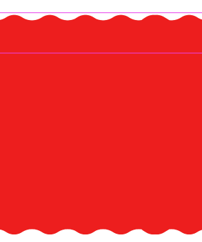
but I'm getting the results of the waves looking like that

enter image description here

I'm working on a page with the width of 1920px, I'm not sure how can I make this look the same like the first image

Remington answered 1/6, 2019 at 13:8 Comment(0)
C
5

Try using this:

.wave-top {
  position: relative;
  margin-top: 20px;
}

.wave-top::before,
.wave-top::after {
  border-bottom: 5px solid rgba(237, 30, 30, 1);
}

.wave-top::before {
  content: "";
  position: absolute;
  left: 0;
  right: 0;
  bottom: 0;
  height: 10px;
  background-size: 20px 40px;
  background-image: radial-gradient(circle at 10px -15px, transparent 20px, rgba(237, 30, 30, 1) 21px);
}

.wave-top::after {
  content: "";
  position: absolute;
  left: 0;
  right: 0;
  bottom: 0;
  height: 15px;
  background-size: 40px 40px;
  background-image: radial-gradient(circle at 10px 26px, rgba(237, 30, 30, 1) 20px, transparent 21px);
}

.wave-mid {
  background-color: rgba(237, 30, 30, 1);
  height: 50px;
}

.wave-bottom {
  position: relative;
}

.wave-bottom::before,
.wave-bottom::after {
  border-top: 5px solid rgba(237, 30, 30, 1);
}

.wave-bottom::before {
  content: "";
  position: absolute;
  left: 0;
  right: 0;
  bottom: 0;
  height: 10px;
  background-size: 20px 40px;
  background-image: radial-gradient(circle at 10px -15px, transparent 20px, #fff 21px);
}

.wave-bottom::after {
  content: "";
  position: absolute;
  left: 0;
  right: 0;
  bottom: 0;
  height: 15px;
  background-size: 40px 40px;
  background-image: radial-gradient(circle at 10px 26px, #fff 20px, transparent 21px);
}
<div class='wave-top'></div>
<div class="wave-mid"></div>
<div class="wave-bottom"></div>

You can increase the height of the middle-div according to your need. Here I have kept it 50px

Cacology answered 1/6, 2019 at 13:54 Comment(0)
D
3

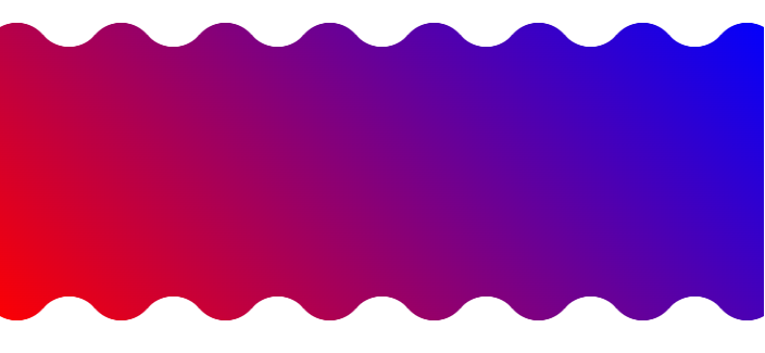
I made an online generator for wavy shapes from where you can easily get the code: https://css-generators.com/wavy-shapes/

CSS-only wavy top and bottom border

Select your configuration and get the code. It relies on CSS mask so you can have any background coloration you want:

.box {
  --mask:
    radial-gradient(31.50px at 50% 44.40px,#000 99%,#0000 101%) calc(50% - 48px) 0/96px 51% repeat-x,
    radial-gradient(31.50px at 50% -20.4px,#0000 99%,#000 101%) 50% 24px/96px calc(51% - 24px) repeat-x,
    radial-gradient(31.50px at 50% calc(100% - 44.40px),#000 99%,#0000 101%) calc(50% - 48px) 100%/96px 51% repeat-x,
    radial-gradient(31.50px at 50% calc(100% + 20.40px),#0000 99%,#000 101%) 50% calc(100% - 24px)/96px calc(51% - 24px) repeat-x;
  -webkit-mask: var(--mask);
          mask: var(--mask);
   height: 300px;
   background: linear-gradient(45deg,red,blue);
}
<div class="box"></div>
Drool answered 14/11, 2022 at 15:46 Comment(1)
Excellent tool...Thiol

© 2022 - 2024 — McMap. All rights reserved.