I've got a directory listing that uses CSS columns but behaves differently in Chrome and Safari. Each section of the directory has a wrapper that arranges the listings into two columns.
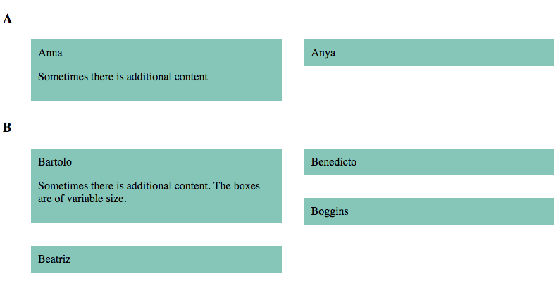
I've got the CSS so Chrome renders it the way I want:
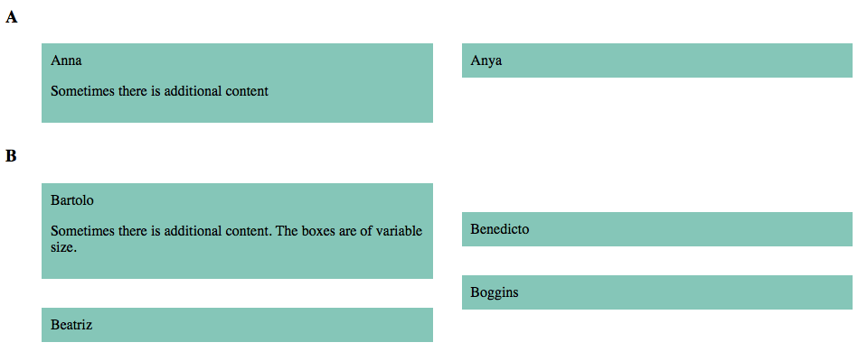
In Safari, the first item in the second column sometimes has an apparent margin above it.
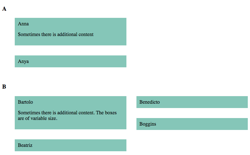
I can fix this in Safari by adding display: inline-block; to the list elements. This breaks the layout in Chrome, as sections which have only two items list both items in the first column.
Snippet:
ul {
	moz-column-count:2;
	-webkit-column-count:2;
	column-count:2;
  column-gap: 2em;
}

li {
   -webkit-column-break-inside: avoid;
  page-break-inside: avoid;
  break-inside: avoid;
  width:100%;
	list-style-type:none;
	padding:10px;
  box-sizing:border-box;
  background-color: #90cdc0;
  margin-bottom: 2em;
}
<h3>
A
</h3>
<ul>
<li>Anna<p>Sometimes there is additional content</p></li>
<li>Anya</li>
</ul>
<h3>
B
</h3>
<ul>
<li>Bartolo <p>Sometimes there is additional content. The boxes are of variable size.</p></li>
<li>Beatriz</li>
<li>Benedicto</li>
<li>Boggins</li>
</ul>Is it possible to style this two-column directory in such away that it displays correctly in all browsers?


