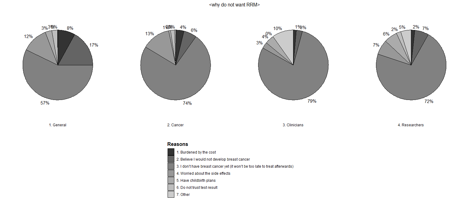
I have a problem with labeling percent in pie charts. Some labels are overlapped since the space is not enough to distinctively show them. Could you give me any solution? Also, I don't want to label zero percents.
data is like this:
  BRCA_R_Y_4<-          structure(list(Group = c("1. General", "1. General", "1. General",
                            "1. General", "1. General", "1. General", "1. General", "2. Cancer",
                            "2. Cancer", "2. Cancer", "2. Cancer", "2. Cancer", "2. Cancer",
                            "2. Cancer", "3. Clinicians", "3. Clinicians", "3. Clinicians",
                            "3. Clinicians", "3. Clinicians", "3. Clinicians", "3. Clinicians",
                            "4. Researchers", "4. Researchers", "4. Researchers", "4. Researchers",
                            "4. Researchers", "4. Researchers", "4. Researchers"),


           Reasons = c( "1. Burdened by the cost", "2. Believe I would not develop breast cancer ",
                        "3. I don’t have breast cancer yet (it won’t be too late to treat afterwards)",
                        "4. Worried about the side effects", "5. Have childbirth plans",
                        "6. Do not trust test result", "7. Other", "1. Burdened by the cost",
                        "2. Believe I would not develop breast cancer ", "3. I don’t have breast cancer yet (it won’t be too late to treat afterwards)",
                        "4. Worried about the side effects", "5. Have childbirth plans",
                        "6. Do not trust test result", "7. Other", "1. Burdened by the cost",
                        "2. Believe I would not develop breast cancer ", "3. I don’t have breast cancer yet (it won’t be too late to treat afterwards)",
                        "4. Worried about the side effects", "5. Have childbirth plans",
                        "6. Do not trust test result", "7. Other", "1. Burdened by the cost",
                        "2. Believe I would not develop breast cancer ", "3. I don’t have breast cancer yet (it won’t be too late to treat afterwards)",
                        "4. Worried about the side effects", "5. Have childbirth plans",
                        "6. Do not trust test result", "7. Other"),
           Percent = c(8.1130355515041,16.9553327256153, 57.0647219690064, 12.1239744758432, 2.91704649042844,
                                                                                                                                           2.73473108477666, 0.0911577028258888, 3.85304659498208, 6.00358422939068,
                                                                                                                                           73.7455197132617, 13.1720430107527, 0.896057347670251, 1.88172043010753,
                                                                                                                                           0.448028673835125, 1.40845070422535, 2.8169014084507, 78.8732394366197,
                                                                                                                                           2.8169014084507, 4.22535211267606, 0, 9.85915492957746, 1.63265306122449,
                                                                                                                                           6.53061224489796, 71.8367346938775, 6.93877551020408, 6.12244897959184,
                                                                                                                                           2.04081632653061, 4.89795918367347)) , row.names = c(NA, -28L) , class = c("tbl_df",
                                                                                                                                                                                                                    "tbl", "data.frame"))
And the code that I used for generating the pie chart is the following and reference of this code is : ggplot, facet, piechart: placing text in the middle of pie chart slices
dat_pies4 <- left_join(BRCA_R_Y_4,
                       BRCA_R_Y_4 %>%
                         group_by(Group) %>%
                         summarize(Cnt_total = sum(Percent))) %>%
  group_by(Group) %>%
  mutate(end_angle = 2*pi*cumsum(Percent)/Cnt_total, each pie slice
         start_angle = lag(end_angle, default = 0),  each pie slice
         mid_angle = 0.5*(start_angle + end_angle))

rpie = 1
rlabel = 0.6

 dat_pies4 <- mutate(dat_pies4,
                    hjust = ifelse(mid_angle>pi, 1, 0),
                    vjust = ifelse(mid_angle<pi/2 | mid_angle>3*pi/2, 0, 1))

rlabel = 1.05 * rpie # now we place labels outside of the pies

pie.4 <-
  ggplot(dat_pies4) +
  geom_arc_bar(aes(x0 = 0, y0 = 0, r0 = 0, r = rpie,
               start = start_angle, end = end_angle, fill = Reasons))+
  geom_text(aes(x = rlabel*sin(mid_angle), y = rlabel*cos(mid_angle), label = paste0 (round(Percent), "%"),
                hjust = hjust, vjust = vjust)) +
  coord_fixed() +
  scale_x_continuous(limits = c(-1.5, 1.5), name = "", breaks = NULL, labels = NULL) +
  scale_y_continuous(limits = c(-1.5, 1.5), name = "", breaks = NULL, labels = NULL) +
  facet_grid(.~Group, switch = "both")+
  theme_void()+
  scale_fill_grey()+
  theme(legend.position="bottom", legend.direction="vertical", legend.margin = margin(30, 0, 10, 0))+
  theme(plot.title = element_text(size = 12, hjust = 0.5))+
  labs(title = "<why do not want RRM>")+
  guides (fill =  guide_legend (title.theme = element_text (face = "bold")))

pie.4
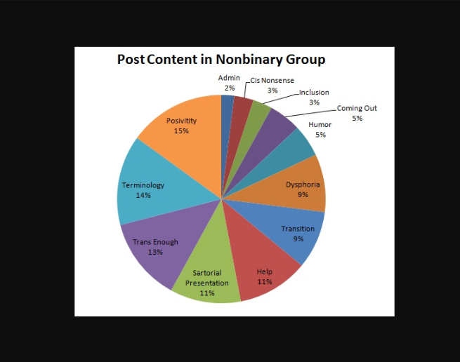
My expectation for the new pie chart is like the following but labels should be outside of the pies:


ggrepel, it extends functionality to ggplot to push labels away from each other. It can take a little trial and error to get the offsets right, but I've had good results. – Rhoden