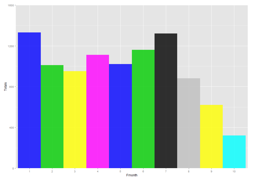
I looked for a while, and was unable to locate a post discussing a similar issue. I am having an issue with date-scaling in ggplot, which I think is related to the way ggplot is handling dates. I am trying to get rid of all of the white space in between the columns because my end result will be similar to the following, which is a capacity planning chart showing projects spanning the months:

The gap between the columns appears inconsistent even with default scaling and width parameters, which led me to believe that that ggplot may be drawing all of the columns at a set width but placing them on the x-axis relative to the number of days in each month. However, even after creating a "month length" variable to scale each column independently, I am unable to get all of the gaps to close, without causing others to overlap. Can someone provide some insight to how ggplot is handling dates?
Here is some reproducible code to play with:
library(lubridate)
library(ggplot2)
library(scales)

Months <- c("2015-01-01", "2015-02-01", "2015-03-01", "2015-04-01", "2015-05-01",
            "2015-06-01", "2015-07-01", "2015-08-01", "2015-09-01", "2015-10-01")
Months <- as.Date(Months)
Totals <- c(1330, 1010, 950, 1110, 1020, 1160, 1320, 880, 620, 320)
df <- data.frame(Months, Totals)
df$MonthLength <- days_in_month(as.Date(df$Month))

ggplot()+
  geom_bar(data=df, aes (x = Months, y = Totals, fill = Months, width = MonthLength),
                    position = "dodge", stat = "identity", alpha = 0.80)+
  coord_cartesian(ylim = c(0, 1600))+
  scale_x_date(breaks="1 month",limits=c(as.Date("2015-01-01"),as.Date("2015-10-01")),
                                labels = date_format("%b-%Y"))


widthparameter you are setting is simply the width of the bar that is drawn. I think if you want something different than that, then you will have to program it from scratch usinggridor something. – Especially