I am currently working on a page using NextJs and TailwindCss. The user has the ability of loading an image locally and setting the number of pieces horiz/vert (rows/cols) that they wish the image to be split in. To properly display this, I need to set the grid to the proper number of columns in the parent element.
I have an API I call locally that uses sharp to perform the split and calculate the width and height and I sort the images in my array so that they are in order since it is async. I then also generate a dynamic class string that just populates the proper number of columns for later assignment to my parent grid elements class.
CLASS STRING POPULATION
const gridClass = `grid grid-cols-${numCols} gap-2 pt-2`;

//*** At this point, the value of gridClass, if columns were set to 3, using template literals is :

'grid grid-cols-3 gap-2 pt-2'

//The proper string is now populated and passed back in the API response via classCss key

res.status(200).json({ msg: 'Success splitting', tileData: tiles, classCss: gridClass})
PAGE SNIPPET:
<div id="final">
  <div className={tileCss} > //<--This is where I pull in the generated class string
    {
      imageData.map((nft, i)=>(
        <div key={i} className='border shadow rounded-x1 overflow-hidden'>
          <Image src={nft.imgSrc}  alt="image" layout="responsive" width={nft.tileDimX} height={nft.tileDimY}/>
        </div>
       ))
     }
   </div>
</div>
This sometimes works but other times it doesn't. Usually if I set the columns to 3, it seems to work properly, but if I set it to 5 lets say, regardless of the input image size, it just puts them all in a single column with large images. Oddly however, the parent grid class on the page is correct, it just seems that it isn't adhered to. I will provide some snapshots below to show what I'm talking about. I've been trying to figure this out for a couple days, however I haven't had luck and since I'm new to NextJs I thought I would share here and see if I'm just doing something stupid. Thanks!
The below results also don't seem to care if the viewing window is stretched wide or reduced in size. I just took the snapshots below so that you could see what was happening in a smaller viewing window.
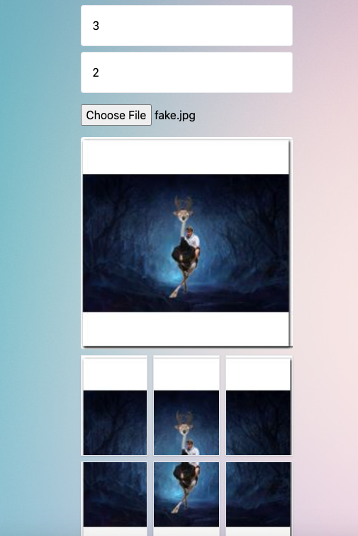
This is the expected result where the image columns should match the columns entered by the user:
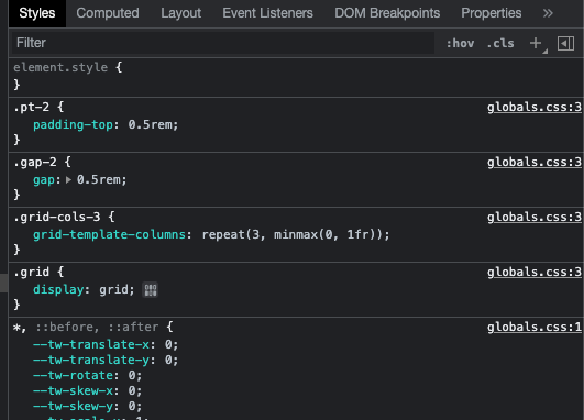
Notice how the css class shows up under styles as well:
This is the improper result, where the user selected 5 columns, the image was split into the correct number of columns, but the display of this in the front end grid does not follow the css.
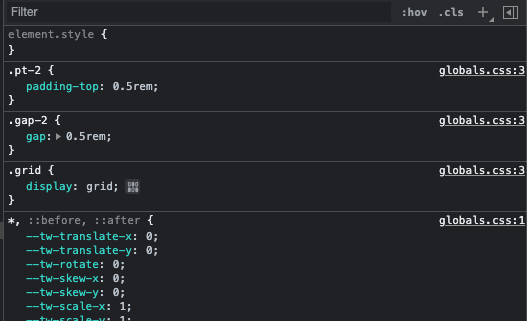
As you can see grid-cols-5 is correct from a class standpoint, but the viewed result doesn't adhere to this.
Grid-cols-5 is in html class but missing under styles applied:


grid grid-cols-${numCols} gap-2 pt-2; which then assigns "grid grid-cols-3 gap-2 pt-2" to gridClass if the columns were set to 3. So when my response is sent grid class is populated correct. res.status(200).json({ msg: 'Success splitting', tileData: tiles, classCss: gridClass}) If you look at the HTML screenshots of the class under the "final" id you will see the proper entry there. What point does tailwind process in the pipe. – Mac