Desired look
I wish to make a toolbar for my app that will contain some simple buttons, each with a single monochromatic icon. Here is an example of some toolbar buttons similar to I'm trying to achieve, from Mail's compose window:
Notice these buttons have a consistent size, inner padding, padding, and shading. This is a pretty consistent style across macOS, present in Mail, Safari, Finder, etc. This leads me to suspect there's a standardized UI component for creating such buttons.
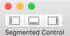
If I use a segmented control, each button looks correct, with each icon being correctly padded:
Now I would like to add individual buttons that match the style.
Attempt 1
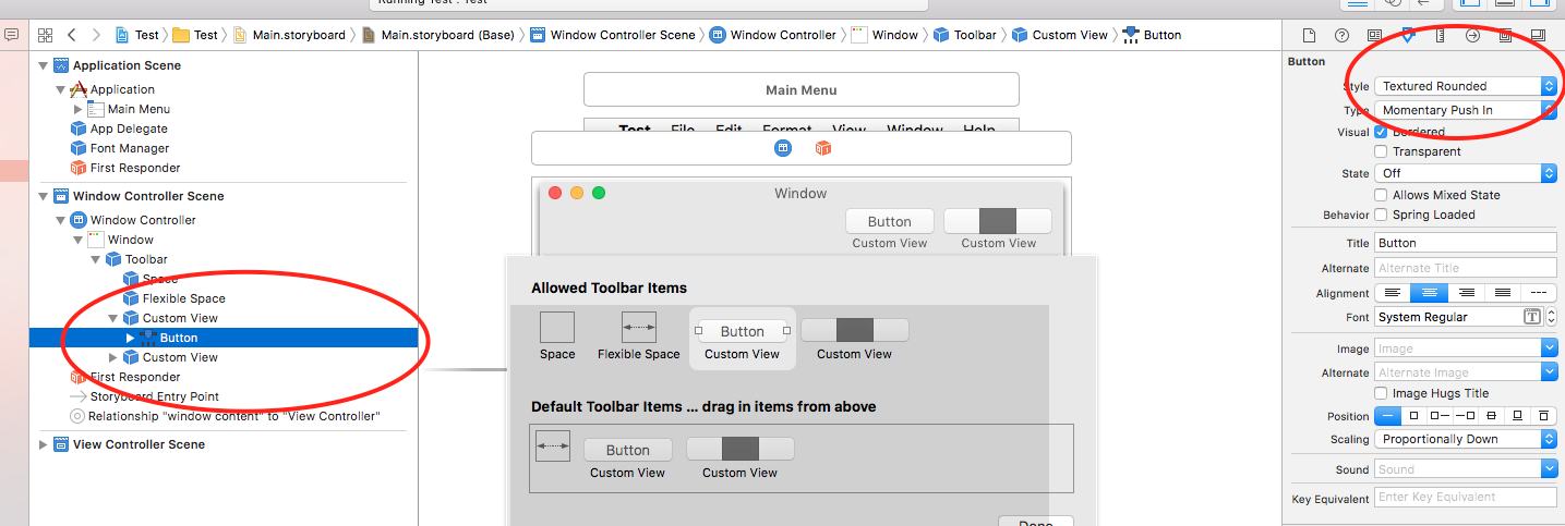
My first attempt was to add a "Push Button" (NSButton) to the toolbar:
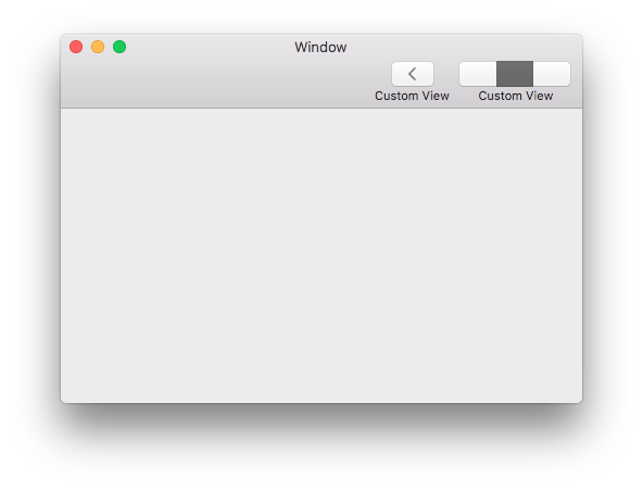
This resulted in a wide button that's a bit too short, and not lined up with the segmented control:
Attempt 2
My second attempt was to use a segmented control, with only 1 segment.
This resulted in a button that's the right shape, size, etc., but it was off center relative to its label.
Naturally, I can manually adjust the button to match the goal, but I feel like I'm missing something. What's the proper way to create these standard buttons?


