With the release of Plotly 5.2.1 (2021-08-13)using px.scatter() lets you specify:
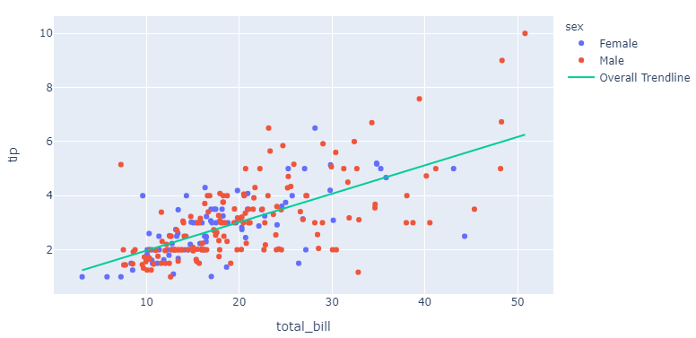
trendline_scope = 'overall'
Plot 1 - trendline_scope = 'overall'
![enter image description here]()
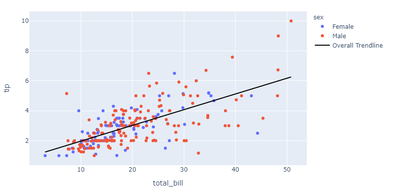
If the greenish color of the trendline is not to your liking, you can change that through:
trendline_color_override = 'black'
Plot 2 - trendline_color_override = 'black'
![enter image description here]()
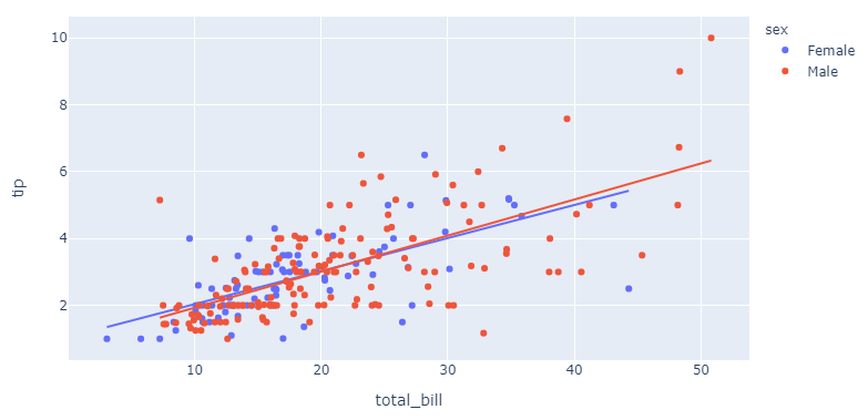
The other option for trendline_scopeis trace which produces:
Plot 3 - trendline_scope = 'trace'
![enter image description here]()
Complete code:
import plotly.express as px

df = px.data.tips()
fig = px.scatter(df, x="total_bill", y="tip",
                 color="sex",
                 trendline="ols",
                 trendline_scope = 'overall',
#                trendline_scope = 'trace'
                 trendline_color_override = 'black'
                )
fig.show()
Previous answer for older versions:
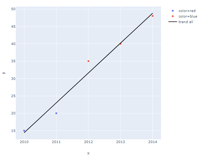
Since you're not specifically asking for a built-in plotly express feature, you can easily build on px.Scatter() and obtain what you want using statsmodels.OLS together with add_traces(go.Scatter()):
Plot:
![enter image description here]()
Code:
import plotly.express as px
import plotly.graph_objs as go
import statsmodels.api as sm

value = [15, 20, 35, 40, 48]
years = [2010, 2011, 2012, 2013, 2014]
colors = ['red', 'red', 'blue', 'blue', 'blue']

# your original setup
fig = px.scatter(
    x=years,
    y=value,
    color=colors
)

# linear regression
regline = sm.OLS(value,sm.add_constant(years)).fit().fittedvalues

# add linear regression line for whole sample
fig.add_traces(go.Scatter(x=years, y=regline,
                          mode = 'lines',
                          marker_color='black',
                          name='trend all')
                          )
fig
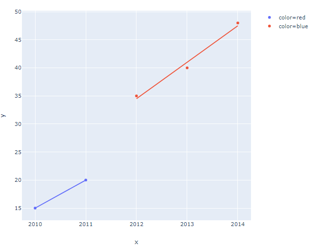
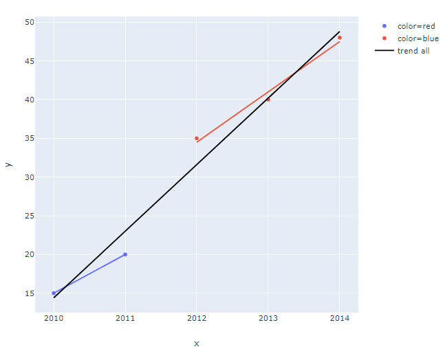
And you can have it both ways:
Plot:
![enter image description here]()
Change in code: Just add trendline='ols'
fig = px.scatter(
    x=years,
    y=value,
    trendline='ols',
    color=colors
)

