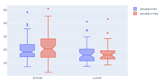
Let's jump straight to the answer and shed some light on the details afterwards. In order to set the colors for your go.box figures you'll have to split the dataset in the groups you want to study, and assign a color to each subcategory using line=dict(color=<color>). The code snippet below will show you how you can use plotlys built-in colorcycle to get the same result you would using plotly express without specifying each color for each category. You'll also have to set boxmode='group' for the figure layout to prevent the boxes from being displayed on top of eachother.
Plot 1 - Using go.box:
![enter image description here]()
Code 1 - Using go.box:
# imports
import plotly.graph_objects as go
import plotly.express as px

fig=go.Figure()
for i, smokes in enumerate(df['smoker'].unique()):
    df_plot=df[df['smoker']==smokes]
    #print(df_plot.head())

    fig.add_trace(go.Box(x=df_plot['time'], y=df_plot['total_bill'],
                         notched=True,
                         line=dict(color=colors[i]),
                         name='smoker=' + smokes))

fig.update_layout(boxmode='group', xaxis_tickangle=0)
fig.show()
Now for the...
how can you define the colors for the boxes?
...part.
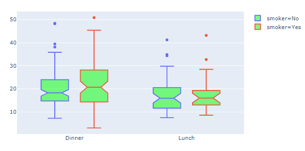
The color of the boxes are defined by the fillcolor which defaults to a half-transparent variant of the line color. In the above example you can set a transparent green to all boxes using fillcolor='rgba(0,255,0,0.5)':
Plot 2: fillcolor='rgba(0,255,0,0.5)'
![enter image description here]()
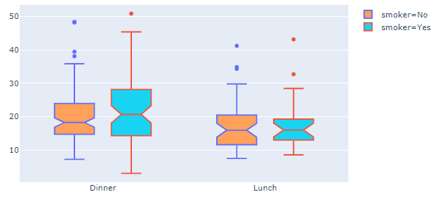
Or you can reference different colors of the same color cycle as you're using for the line colors using an offset version of the colors list like fillcolor=colors[i+4]
Plot 3: fillcolor=colors[i+4]
![enter image description here]()
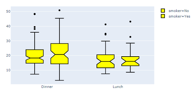
The absolutely simplest thing to do to set line and fillcolor would be to just set
line=dict(color='black') and fillcolor='yellow' for all groups:
Plot 4: Back to the basics
![enter image description here]()
Complete code:
# imports
import plotly.express as px
import plotly.graph_objects as go

# data
df = px.data.tips()

# plotly setup
fig=go.Figure()

# a plotly trace for each subcategory
for i, smokes in enumerate(df['smoker'].unique()):
    df_plot=df[df['smoker']==smokes]

    fig.add_trace(go.Box(x=df_plot['time'], y=df_plot['total_bill'],
                         notched=True,
                         line=dict(color='black'),
                         #line=dict(color=colors[i]),
                         fillcolor='yellow',
                         #fillcolor=colors[i+4],
                         name='smoker=' + smokes))

# figure layout adjustments
fig.update_layout(boxmode='group', xaxis_tickangle=0)
fig.show()
Some details about it all:
How can you achieve the same thing in Plotly Go? Because the color
property is not recognised as valid.
If you study the documentation for go.box, you'll quickly discover that go.box has no color method, while px.box has got this:
color: str or int or Series or array-like
        Either a name of a column in `data_frame`, or a pandas Series or
        array_like object. Values from this column or array_like are used to
        assign color to marks.
In other words, what color in px.Box does for you, is to split up the dataset in, for example, unique groups in a dataset of a long format such as px.data.tips()
When it comes to go.box there is no such method and you'll just have to accept the ValueError:
ValueError: Invalid property specified for object of type plotly.graph_objs.Box: 'color'


