how to set a different constraint for different size classes
Asked Answered
L

2

8

I want a view to have width 0.4 screen width in landscape and 0.5 screen width in portrait.

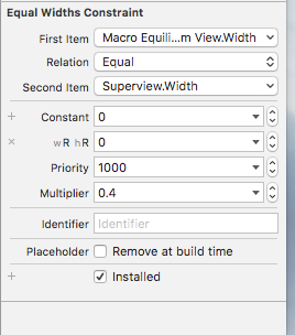
So I have tried "vary for traits". I selected wC hR and set 0.5 and clicked "done". Then I selected wR hR and set 0.4 as shown:

settings for constraint

Yet both size classes still show as 0.4.

I have also tried setting the constraints using "view as ...(wC hR) etc. without using vary for constraints.

I have also tried adding a separate size class in the box shown, but with no success.

Leech answered 2/2, 2017 at 11:5 Comment(0)
P
10

Width size class doesn't always change with the orientation - not on every device.

For example, only on the Plus devices the landscape becomes Regular width, but on other devices it's always compact.

However, the height size class changes on any iPhones (not iPads):

  • hR - for portrait and
  • hC - for landscape.

The illustrations on this page should give you more understanding how they work: http://useyourloaf.com/blog/size-classes/

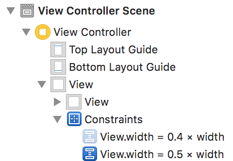
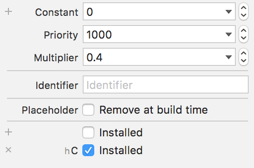
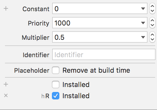
Since there is no option to change the multiplier for different size classes, you need to create two constraints, and set conditions for Installed.

enter image description here

This one for landscape:

enter image description here

And for portrait:

enter image description here

Poikilothermic answered 2/2, 2017 at 13:11 Comment(1)
what about iPad though?Donela
A
2

In I phones - 2 types size -
1. portrait mode - wC hR Landscape mode - wC hC 2. portrait mode - wC hR Landscape mode - wR hC

Steps 1.- Select 6s device portrait mode in scene : give the constraint 0.5 screen width. elect 6s device landscape mode in scene[just click landscape orientation] : go to vary for traits select both width and height. Start your work now. Remove the constraint of width. Add new constraint of width give the constraint 0.4 screen width.

2.- Select 6s Plus device landscape mode in scene[just click landscape orientation] : go to vary for traits select both width and height. Start your work now. Remove the constraint of width. Add new constraint of width give the constraint 0.4 screen width. Now its works perfect in i phone not in i pad because i pad size is different. We need to some work in i pad then it works i pad also. Try it.

Avocado answered 2/2, 2017 at 13:26 Comment(0)

© 2022 - 2024 — McMap. All rights reserved.