Mask Image, create rectangle from multiple gradients
Asked Answered
S

1

8

I have a radial gradient that used as a mask-image "fades" an image in to the background-color behind the image.

mask-image: radial-gradient(ellipse at center, rgba(255,255,255,1) 1%,rgba(255,255,255,1) 50%,rgba(255,255,255,0) 70%,rgba(255,255,255,0) 100%);

How do I get the same effect with an evenly rectangular gradient on all four sides?

I know you can combine gradients and my most current attempt does not seem to have any effect:

img
{
 mask-image: 
  linear-gradient(to top, rgba(255,255,255,1) 1%, rgba(255,255,255,1) 50%),
  linear-gradient(to right, rgba(255,255,255,1) 1%, rgba(255,255,255,1) 50%),
  linear-gradient(to bottom, rgba(255,255,255,1) 1%, rgba(255,255,255,1) 50%),
  linear-gradient(to left, rgba(255,255,255,1) 1%, rgba(255,255,255,1) 50%);
}
Sipe answered 7/3, 2020 at 3:36 Comment(0)
V
12

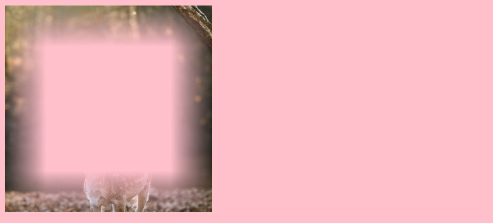
The trick with multiple mask is to control the size/position so that each one will apply to a region of your element:

.box {
  height:300px;
  width:300px;
  background: url(https://picsum.photos/id/1003/300/300);
  -webkit-mask: 
     linear-gradient(to top,    transparent,#fff) top   /100% 20%,
     linear-gradient(to bottom, transparent,#fff) bottom/100% 20%,
     linear-gradient(to left  , transparent,#fff) left  /20% 100%,
     linear-gradient(to right , transparent,#fff) right /20% 100%;
  -webkit-mask-repeat:no-repeat;
  
  mask: 
     linear-gradient(to top,    transparent,#fff) top   /100% 20%,
     linear-gradient(to bottom, transparent,#fff) bottom/100% 20%,
     linear-gradient(to left  , transparent,#fff) left  /20% 100%,
     linear-gradient(to right , transparent,#fff) right /20% 100%;
  mask-repeat:no-repeat;
}

body {
  background:pink;
}
<div class="box"></div>

CSS multiple mask to create blurry hole

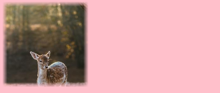
Or like this:

.box {
  height:300px;
  width:300px;
  background: url(https://picsum.photos/id/1003/300/300);
  -webkit-mask: 
    linear-gradient(to top,  transparent 10%, #fff 15% 90%, transparent 95%),
    linear-gradient(to left, transparent 10%, #fff 15% 90%, transparent 95%);
  -webkit-mask-size:110% 110%;
  -webkit-mask-position:center;
  -webkit-mask-repeat:no-repeat;
  -webkit-mask-composite: source-in;
  
  
  mask: 
    linear-gradient(to top,  transparent 10%, #fff 15% 90%, transparent 95%),
    linear-gradient(to left, transparent 10%, #fff 15% 90%, transparent 95%);
  mask-size: 110% 110%;
  mask-position: center;
  mask-repeat:no-repeat;
  mask-composite: intersect;
}

body {
  background:pink;
}
<div class="box"></div>

Multiple CSS mask for blurry edge

Related: How to make a rectangular transparency gradient CSS3?

Variscite answered 7/3, 2020 at 10:1 Comment(7)
The first one is an inverse of what I'm trying to accomplish so I'll try switching the positioning. I'm not sure what is going on with the second set. I test in Waterfox first/by default.Sipe
@Sipe I created both variant, the second one is the opposite of the first one. they should work fine in Chrome and FirefoxVariscite
Fantastic! The second one is what I'm interested in. Because I'm absolutely certain that I'll be using mask a lot in the future I've started to record what works. I even somehow generated a cross and your first one would work to censor or perhaps some game where guessing is a key component. Great stuff, thank you!Sipe
@Sipe I already provided some answers using mask trick if you are intrested ;) stackoverflow.com/search?tab=newest&q=user%3a8620333%20maskVariscite
Lol awesome! I'll edit your answer here to reflect what I was trying to do (since I didn't provide a screenshot or anything). Thank you again! :-)Sipe
@Sipe note that for the mask-composite you need intersect when using mask-composite and source-in when using -webkit-mask-compositeVariscite
There had to be something messy. 😑︎ I have it working save a small bug in my platform's preprocessor. I was actually dealing with that and was about to comment. 😄︀Sipe

© 2022 - 2024 — McMap. All rights reserved.