CSS: transform scale with position absolute
Asked Answered
M

1

8

I have a little problem with position: absolute. Let me explain.

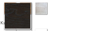
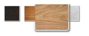
enter image description here

After hover I have something like this:

enter image description here

CSS code:

.option {
    width: 50px;
    height: 50px;
    box-shadow: 1px 1px 1px 1px  #888;
}

.option:hover {
    transform: scale(2.25, 2.25);
    transition-duration: 0.01s;
    z-index:10;
    position: absolute;
}

I used transform: scale to enlarge the element after hovering over the option. However, to achieve the desired effect I have to add the position: absolute attribute - with that, the option goes out the div after hover. Hover works fine but the rest 3 opitons goes left - is there any way to fix that? I want to still display the 4 options after hover, not to cut the rest.

Without position:absolute the element doesn't go out of div.

enter image description here

Mcfarlane answered 24/4, 2018 at 13:53 Comment(0)
L
13

By using transform-origin, you can remove the need to use absolute positioning. Move the origin of the transformation from the default (center) to the upper left corner (0 0):

.option {
  width: 50px;
  height: 50px;
  box-shadow: 1px 1px 1px 1px #888;
  display: inline-block;
}

.option:hover {
  transform: scale(2.25, 2.25);
  transition-duration: 0.01s;
  z-index: 1;
  transform-origin: top left;
}
<div>
  <div class="option"></div>
  <div class="option"></div>
  <div class="option"></div>
  <div class="option"></div>
</div>
Lynnalynne answered 24/4, 2018 at 14:11 Comment(0)

© 2022 - 2024 — McMap. All rights reserved.