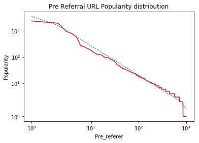
This is a network IP frequency rank plot in log scales. After completing this portion, I am trying to plot the best fit line on log-log scales using Python 2.7. I have to use matplotlib's "symlog" axis scale otherwise some of the values are not displayed properly and some values get hidden.
The X values of the data I am plotting are URLs and the Y values are the corresponding frequencies of the URLs.
My Data looks like this :
'http://www.bing.com/search?q=d2l&src=IE-TopResult&FORM=IETR02&conversationid=  123 0.00052210688591'
`http://library.uc.ca/  118 4.57782298326e-05`
`http://www.bing.com/search?q=d2l+uofc&src=IE-TopResult&FORM=IETR02&conversationid= 114 4.30271029472e-06`
`http://www.nature.com/scitable/topicpage/genetics-and-statistical-analysis-34592   109 1.9483268261e-06`
The data contains the URL in the first column, corresponding frequency (number of times the same URL is present) in the second and finally the bytes transferred in the 3rd. Firstly, I am using only the 1st and 2nd columns for this analysis. There are a total of 2,465 x values or unique URLs.
The following is my code
import os
import matplotlib.pyplot as plt
import numpy as np
import math
from numpy import *
import scipy
from scipy.interpolate import *
from scipy.stats import linregress
from scipy.optimize import curve_fit

file = open(filename1, 'r')
lines = file.readlines()

result = {}
x=[]
y=[]
for line in lines:
  course,count,size = line.lstrip().rstrip('\n').split('\t')
  if course not in result:
      result[course] = int(count)
  else:
      result[course] += int(count)
file.close()

frequency = sorted(result.items(), key = lambda i: i[1], reverse= True)
x=[]
y=[]
i=0
for element in frequency:
  x.append(element[0])
  y.append(element[1])


z=[]
fig=plt.figure()
ax = fig.add_subplot(111)
z=np.arange(len(x))
print z
logA = [x*np.log(x) if x>=1 else 1 for x in z]
logB = np.log(y)
plt.plot(z, y, color = 'r')
plt.plot(z, np.poly1d(np.polyfit(logA, logB, 1))(z))
ax.set_yscale('symlog')
ax.set_xscale('symlog')
slope, intercept = np.polyfit(logA, logB, 1)
plt.xlabel("Pre_referer")
plt.ylabel("Popularity")
ax.set_title('Pre Referral URL Popularity distribution')
plt.show()
You would see a lot of libraries imported as I have been playing with a lot of them but none of my experiments are yielding the expected result. So the code above generates the rank plot correctly. Which is the red line but the blue line in the curve which is supposed to be the best fit line is visually incorrect, as can be seen. This is the graph generated.

This is the graph I am expecting. The dotted lines in the 2nd Graph is what I am somehow plotting incorrectly.

Any ideas as to how I could solve this issue?

