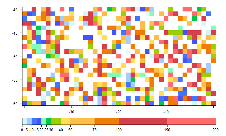
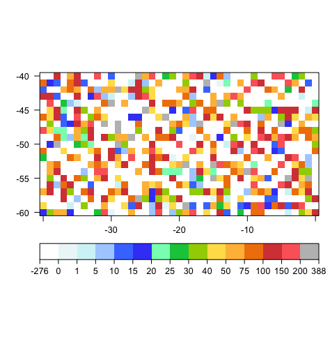
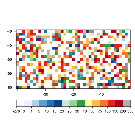
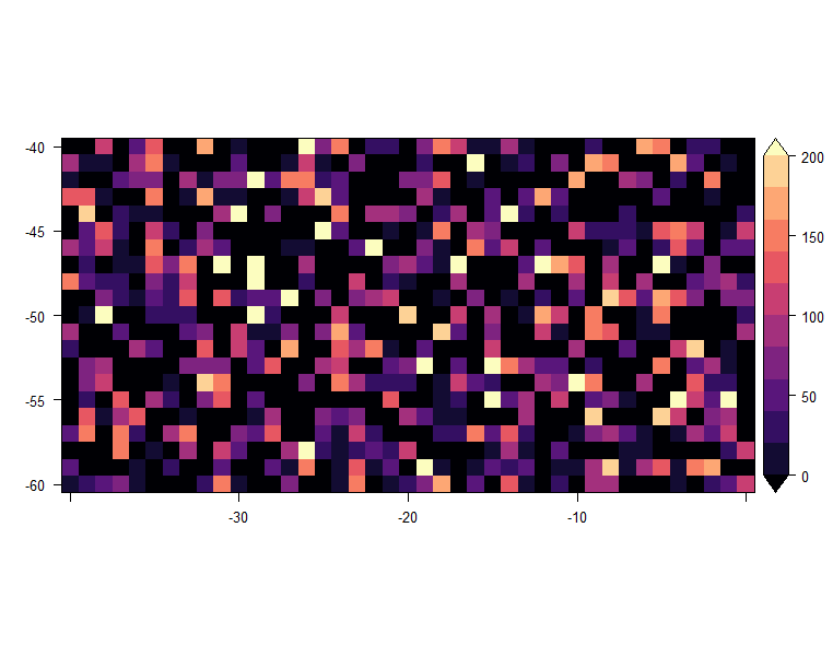
Is it possible in R to create a color key like the one below? (this one comes from the software Grid Analysis and Display System - Grads).
There are two features that I can't reproduce in R:
- The sequence is non linear however it is displayed as if
- Values bigger than 200 are grey / Values smaller than 0 are white
I'm using levelplot from rastervis that plots rasters using the lattice levelplot:
require(raster)
require(rasterVis)

set.seed(200)

X = seq(-40,0,by=1)
Y = seq(-60,-40,by=1)
grid = expand.grid(list(X=X,Y=Y))
Z = rnorm(nrow(grid),mean=10,sd=100)

data = data.frame(grid,Z)
r = rasterFromXYZ(data)
mapTheme <- rasterTheme(region=c('#EEF7FA','#D6F8F7',"#BEDAFF",'#5DA4FF',"#0000FF","#D4F9E2","#00FF7F","#008000","#FFFF00","#FFD27F", "#FFB732"    ,"#EE7600",
                                 "#D53E4F","#FF6A6A"))
my.at = c(0,1,5,10,15,20,25,30,40,50,75,100,150,200)
myColorkey <- list(at=my.at,
                   space="bottom",
                   labels=list(at=my.at))
p=levelplot(r, par.settings=mapTheme,at = my.at, colorkey=myColorkey,margin=F)
print(p)
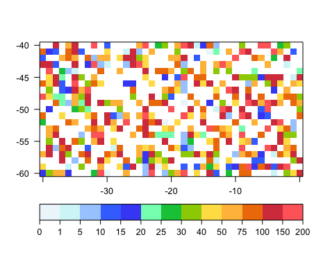
The result:
As you can see, both values smaller than 0 and bigger than 200 are white, I've no idea how to set values bigger than or smaller than a certain value to appear as a specific color. Morover, how can I make the space between consecutive thick marks in the color key to have the same size although the intervals are not the same?


