How to plot two line plots from two columns of a dataframe and also where another single column denotes the xaxis and another two columns denote the hover values(tooltip) of first two columns?
Plotly: How to plot two lines from two dataframe columns and assign hover info from two other columns?
Asked Answered
Welcome on SO. Please have a look at how-to-ask and mcve? In particular share a sample of the data you want to plot. –
Kweichow
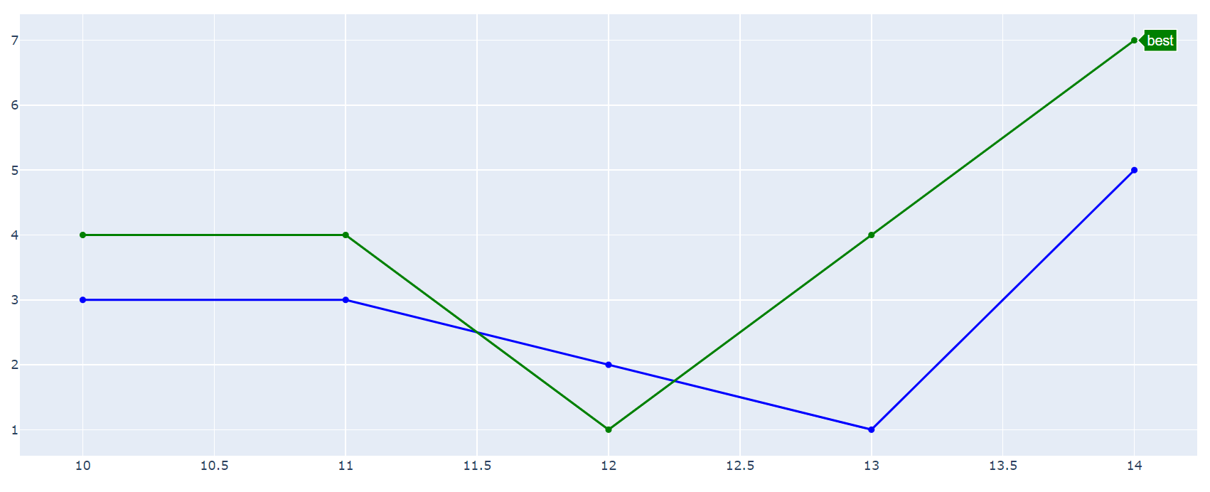
Using go.Scatter you can show any dataframe column y=df['A'] as a line with an associated index x=df.index, and assign any pandas dataframe column as the source of the hoverinfo using hovertext=df['A_info'] to get this:
Complete code:
import pandas as pd
import plotly.graph_objects as go

# sample data
d={'A':[3,3,2,1,5],
   'B':[4,4,1,4,7],
   'A_info':['nothing', '', '', 'bad', 'good'],
   'B_info':['', '', 'bad', 'better', 'best']}

# pandas dataframe
df=pd.DataFrame(d, index=[10,11,12,13,14])

# set up plotly figure
fig = go.Figure()

# add line / trace 1 to figure
fig.add_trace(go.Scatter(
    x=df.index,
    y=df['A'],
    hovertext=df['A_info'],
    hoverinfo="text",
    marker=dict(
        color="blue"
    ),
    showlegend=False
))

# add line / trace 2 to figure
fig.add_trace(go.Scatter(
    x=df.index,
    y=df['B'],
    hovertext=df['B_info'],
    hoverinfo="text",
    marker=dict(
        color="green"
    ),
    showlegend=False
))

fig.show()
Here is a much simpler way of adding multiple lines to a single plot. Use the add_scatter function to add as many lines as you want to the plot.
import plotly.express as px

fig = px.line(df, x="<col_name>", y="<line1_col>", title='<Plot_Title>')
fig.add_scatter(x=df['<col_name>'], y=df['<line2_col>'], mode='lines', hovertext=df['<hover_col>'], hoverinfo="text",)
fig.show()
© 2022 - 2024 — McMap. All rights reserved.

