Android: Add neon glow effect to button
Asked Answered
P

3

8

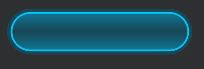
I want to have a glow effect on button (in android studio) as shown in image:

Button design image

I didn't want an image for the background, so to get this effect, I have tried to do in xml file. I have added a stroke for the button and provide a shadow to the button (with same color as stroke).

I have used a linear gradient with 90 degree angle with start and end color same as the stroke, center color same as background color. Please see the code:

<?xml version="1.0" encoding="utf-8"?>
<selector xmlns:android="http://schemas.android.com/apk/res/android">
<item>
    <layer-list>
        <item android:right="5dp" android:top="0dp">
            <shape>
                <corners android:radius="50dp" />
                <gradient
                    android:angle="45"
                    android:startColor="#8008c3fa"
                    android:endColor="#8008c3fa"
                    android:type="linear"
                    />
            </shape>
        </item>
        <item android:bottom="5dp" android:left="6dp" android:right="10dp" android:top="5dp">
            <shape xmlns:android="http://schemas.android.com/apk/res/android" android:shape="rectangle" >
                <corners
                    android:radius="50dp"
                    />
                <gradient
                    android:angle="90"
                    android:centerX="50%"
                    android:centerColor="@color/trans_parent"
                    android:startColor="#8008c3fa"
                    android:endColor="#8008c3fa"
                    android:type="linear"
                    />
                <padding
                    android:left="0dp"
                    android:top="0dp"
                    android:right="0dp"
                    android:bottom="0dp"
                    />
                <size
                    android:width="270dp"
                    android:height="60dp"
                    />
                <stroke
                    android:width="2.5dp"
                    android:color="#08c3fa"
                    />
            </shape>
        </item>
    </layer-list>
</item>

</selector>

For the above xml, I got the below result:

Result image from code

Though the design and the result images look totally different, I think if we increase the center color height and keep a fadeout effect to the shadow, it can work. But I'm not able to do the same.


Polyglot answered 20/9, 2020 at 10:28 Comment(4)
you can design one by using Figma or Adobe XD, and use the asset as a buttonGoulden
@Ali, thanks for the reply. But can't we do it using xml itself?Polyglot
I haven't tried such level of gradients in android, So to be honest I really dont know if its possileGoulden
G
8

I know it has been a while but if anyone is still interested in this effect, here is a custom view library I made which was inspired by this question:

Glowing and Neon Button

enter image description here

It also has animated disable and enable methods as seen in the photo.

It's MIT Licensed, so do whatever you want with it. hope this helps someone.

Gutow answered 10/4, 2021 at 20:58 Comment(2)
how we can we keep animating the glow ?Porringer
@ZeeshanAli You can't. this is the animation for enabling/disabling the button.Gutow
I
5

you can increase the center color height and keep a fadeout effect to the shadow by adding a nother item to the layer-list. The first item makes the gradient for the upper bound, the rest is transparent and the second item makes the gradient for the lower bound the same way.

I added two more items to fill the left and the right semicircle. I changed a few colours to enhance the effect but didnt trie too long, i think one could do alot more with more items and better colours :)

Cheers, Josh

the final result:

final button

    <?xml version="1.0" encoding="utf-8"?>
<selector xmlns:android="http://schemas.android.com/apk/res/android">
    <item>
        <layer-list>
            <item android:right="5dp" android:top="0dp">
                <shape>
                    <corners android:radius="50dp" />
                    <gradient
                        android:centerX="70%"
                        android:startColor="#804CD6FF"
                        android:centerColor="#8004485C"
                        android:endColor="#804CD6FF"
                        android:type="linear"
                        />
                </shape>
            </item>
            <item android:bottom="5dp" android:left="6dp" android:right="10dp" android:top="5dp">
                <shape xmlns:android="http://schemas.android.com/apk/res/android" android:shape="rectangle" >
                    <corners
                        android:radius="50dp"
                        />
                    <gradient
                        android:angle="90"
                        android:centerX="30%"
                        android:centerColor="@color/transparent"
                        android:startColor="#8008c3fa"
                        android:endColor="@color/transparent"
                        android:type="linear"
                        />
                    <size
                        android:width="270dp"
                        android:height="60dp"
                        />
                    <stroke
                        android:width="2.5dp"
                        android:color="#08c3fa"
                        />
                </shape>
            </item>
            <item android:bottom="5dp" android:left="6dp" android:right="10dp" android:top="5dp">
                <shape xmlns:android="http://schemas.android.com/apk/res/android" android:shape="rectangle" >
                    <corners
                        android:radius="50dp"
                        />

                    <gradient
                        android:angle="90"
                        android:centerX="70%"
                        android:centerColor="@color/transparent"
                        android:startColor="@color/transparent"
                        android:endColor="#8008c3fa"
                        android:type="linear"
                        />

                    <size
                        android:width="270dp"
                        android:height="60dp"
                        />
                </shape>
            </item>
            <!-- the glow for the half circles, possible with radius as well. I liked
                 android:type="sweep" better because radius tends to fade out.-->
            <item android:bottom="5dp" android:left="6dp" android:right="10dp" android:top="5dp">
                <shape xmlns:android="http://schemas.android.com/apk/res/android" android:shape="rectangle" >
                    <corners
                        android:radius="50dp"
                        />

                    <gradient
                        android:angle="360"
                        android:centerX="5%"
                        android:centerColor="#8008c3fa"
                        android:startColor="@color/transparent"
                        android:endColor="@color/transparent"
                        android:gradientRadius="360"
                        android:type="sweep"
                        />

                    <size
                        android:width="270dp"
                        android:height="60dp"
                        />
                </shape>
            </item>
            <item android:bottom="5dp" android:left="6dp" android:right="10dp" android:top="5dp">
                <shape xmlns:android="http://schemas.android.com/apk/res/android" android:shape="rectangle" >
                    <corners
                        android:radius="50dp"
                        />

                    <gradient
                        android:angle="360"
                        android:centerX="95%"
                        android:centerColor="@color/transparent"
                        android:startColor="#8008c3fa"
                        android:endColor="#8008c3fa"
                        android:gradientRadius="360"
                        android:type="sweep"
                        />

                    <size
                        android:width="270dp"
                        android:height="60dp"
                        />
                </shape>
            </item>
        </layer-list>
    </item>

</selector>
Inbreathe answered 13/12, 2020 at 23:16 Comment(0)
S
2

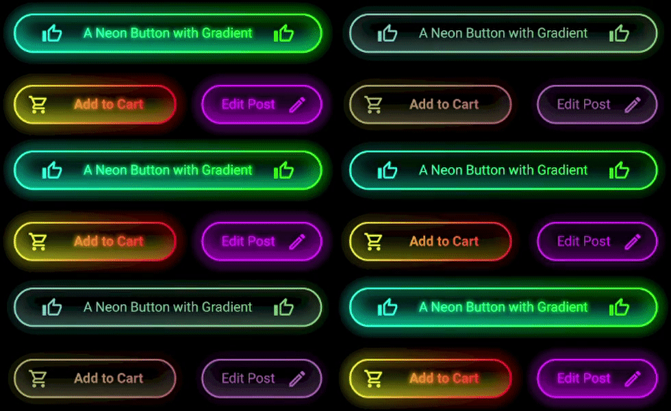
If you want to have improved neon Buttons with a solid that has different gradients too. Take a look on this related post I answered. I used the suggested library from "@Mehran B" and combined it with a custom drawable and a transparent stroke to make it more modifiable. As you can see in the samples below the gradients from the solids and shadows are separated and thus more flexible:

Sample 1

Sample 2

Serpent answered 30/7, 2021 at 0:51 Comment(0)

© 2022 - 2024 — McMap. All rights reserved.