TL;DR answer further down below
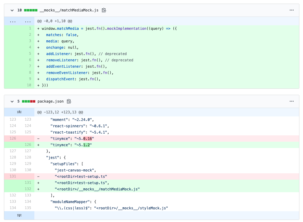
In my case, the answer was not enough, as window.matchMedia would always return false (or true if you change it). I had some React hooks and components that needed to listen to multiple different queries with possibly different matches.
What I tried
If you only need to test one query at a time and your tests don't rely on multiple matches, jest-matchmedia-mock was useful. However, from what I've understood after trying to use it for 3 hours was that when you call useMediaQuery, the previous queries you've made no longer work. In fact, the query you pass into useMediaQuery will just match true whenever your code calls window.matchMedia with that same query, regardless of the actual "window width".
Answer
After realizing I couldn't actually test my queries with jest-matchmedia-mock, I changed the original answer a bit to be able to mock the behavior of dynamic query matches. This solution requires the css-mediaquery npm package.
import mediaQuery from "css-mediaquery";

// Mock window.matchMedia's impl.
Object.defineProperty(window, "matchMedia", {
    writable: true,
    value: jest.fn().mockImplementation((query) => {
        const instance = {
            matches: mediaQuery.match(query, {
                width: window.innerWidth,
                height: window.innerHeight,
            }),
            media: query,
            onchange: null,
            addListener: jest.fn(), // Deprecated
            removeListener: jest.fn(), // Deprecated
            addEventListener: jest.fn(),
            removeEventListener: jest.fn(),
            dispatchEvent: jest.fn(),
        };

        // Listen to resize events from window.resizeTo and update the instance's match
        window.addEventListener("resize", () => {
            const change = mediaQuery.match(query, {
                width: window.innerWidth,
                height: window.innerHeight,
            });

            if (change != instance.matches) {
                instance.matches = change;
                instance.dispatchEvent("change");
            }
        });

        return instance;
    }),
});

// Mock window.resizeTo's impl.
Object.defineProperty(window, "resizeTo", {
    value: (width: number, height: number) => {
        Object.defineProperty(window, "innerWidth", {
            configurable: true,
            writable: true,
            value: width,
        });
        Object.defineProperty(window, "outerWidth", {
            configurable: true,
            writable: true,
            value: width,
        });
        Object.defineProperty(window, "innerHeight", {
            configurable: true,
            writable: true,
            value: height,
        });
        Object.defineProperty(window, "outerHeight", {
            configurable: true,
            writable: true,
            value: height,
        });
        window.dispatchEvent(new Event("resize"));
    },
});
It uses css-mediaquery with the window.innerWidth to determine if the query ACTUALLY matches instead of a hard-coded boolean. It also listens to resize events fired by the window.resizeTo mocked implementation to update the matches value.
You may now use window.resizeTo in your tests to change the window's width so your calls to window.matchMedia reflect this width. Here's an example, which was made just for this question, so ignore the performance issues it has!
const bp = { xs: 200, sm: 620, md: 980, lg: 1280, xl: 1920 };

// Component.tsx
const Component = () => {
  const isXs = window.matchMedia(`(min-width: ${bp.xs}px)`).matches;
  const isSm = window.matchMedia(`(min-width: ${bp.sm}px)`).matches;
  const isMd = window.matchMedia(`(min-width: ${bp.md}px)`).matches;
  const isLg = window.matchMedia(`(min-width: ${bp.lg}px)`).matches;
  const isXl = window.matchMedia(`(min-width: ${bp.xl}px)`).matches;

  console.log("matches", { isXs, isSm, isMd, isLg, isXl });

  const width =
    (isXl && "1000px") ||
    (isLg && "800px") ||
    (isMd && "600px") ||
    (isSm && "500px") ||
    (isXs && "300px") ||
    "100px";

  return <div style={{ width }} />;
};

// Component.test.tsx
it("should use the md width value", () => {
  window.resizeTo(bp.md, 1000);

  const wrapper = mount(<Component />);
  const div = wrapper.find("div").first();

  // console.log: matches { isXs: true, isSm: true, isMd: true, isLg: false, isXl: false }

  expect(div.prop("style")).toHaveProperty("width", "600px");
});
Note: I have not tested the behavior of this when resizing the window AFTER mounting the component

