How to change the color of the median line in boxplot
Asked Answered
H

2

8

More generally, how to change the color values for a subset of the boxes properties in a seaborn boxplot? Be that the median, the whiskers, or such. I'm particularly interested in how to change the median value, as I have to create plots which have a dark colour and the median line can't be seen against it.

Here's some example code:

import matplotlib.pyplot as plt
import seaborn as sns

fig, ax1 = plt.subplots(figsize=(15,5)

colours = ["#000184", "#834177"]
sns.set_palette(sns.color_palette(colours))
tips = sns.load_dataset("tips")
sns.boxplot(x="day", y="total_bill", hue="smoker", data=tips, ax=ax1)

Which creates:

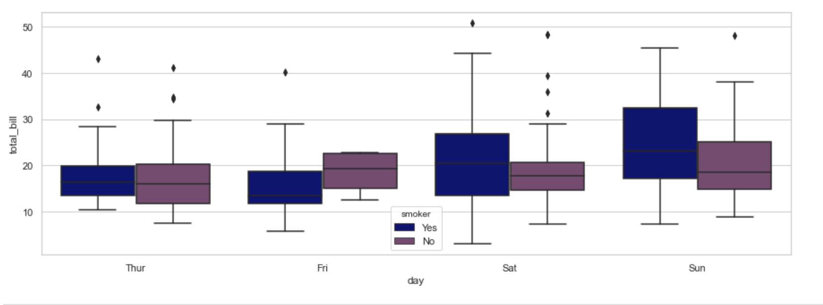
enter image description here

As can be seen, it's quite hard to see the median line against the blue here.

Note - I don't want to change the entire boxplot colour, just a subsection of the lines (in this case the median). Also - the option of changing it for a particular group (in this case the Yes smokers) is needed, as the colour might not apply to both groups.

Handlebar answered 12/5, 2020 at 14:48 Comment(0)
A
4

Update: the old version of this answer used the index in the generated lines to guess which line of the plot corresponds to a median line. The new version attaches a special label to each of the means, that can be retrieved later to filter out only those lines.

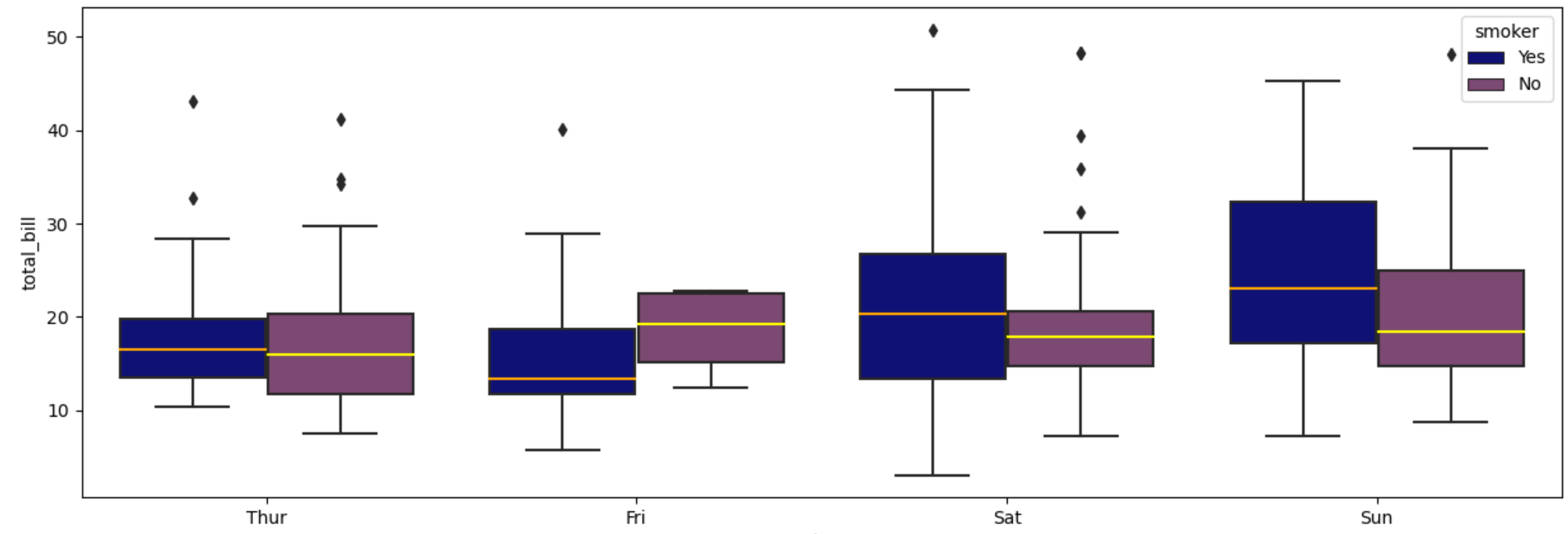
You can use medianprops to change the color of the median line. However, there only will be one color for all boxplots. If you need to assign individual colors, you can loop through the generated lines. This makes the code more robust towards different options and possible future changes.

ax1.get_lines() gives a list of all Line2D objects created by the boxplot. There will be a Line2D object for each of the elements that make up a box: 4 for the whiskers (2 vertical and 2 horizontal lines), 1 for the median and also 1 for the outliers (it is a Line2D that shows markers without connecting lines). In case showmeans=True there will also be a Line2D with a marker for the mean. So in that case there would be 7 Line2Ds per box, in this case 6.

Note that a boxplot also accepts a parameter notch=True which shows a confidence interval around the median. In the case of the current plot, most of the confidence intervals are larger than the quartiles, which create some flipped notches. Depending on your real application, such notches can help to accentuate the median.

import matplotlib.pyplot as plt
import seaborn as sns

fig, ax1 = plt.subplots(figsize=(15,5))

colours = ["#000184", "#834177"]
sns.set_palette(sns.color_palette(colours))
tips = sns.load_dataset("tips")

sns.boxplot(x="day", y="total_bill", hue="smoker", data=tips, ax=ax1,
            medianprops={'color': 'red', 'label': '_median_'})

median_colors = ['orange', 'yellow']
median_lines = [line for line in ax1.get_lines() if line.get_label() == '_median_']
for i, line in enumerate(median_lines):
    line.set_color(median_colors[i % len(median_colors)])
plt.show()

boxplot with changed median colors

Adena answered 12/5, 2020 at 15:59 Comment(2)
thanks - how do you know which lines to index? Or is the pattern than you've used there typical?Handlebar
I updated the code to filter out the medians via a label.Adena
C
13

It is possible to customize all artists in the boxplots, as demonstrated here. Since sns.boxplot() forwards all **kwargs to plt.boxplot(), the following works:

tips = sns.load_dataset("tips")
colours = ["#000184", "#834177"]
sns.boxplot(x="day", y="total_bill", hue="smoker",
            data=tips, palette=colours,
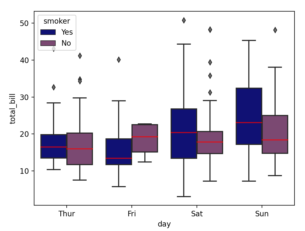
            medianprops=dict(color="red", alpha=0.7),
            flierprops=dict(markerfacecolor="#707070", marker="d"))

Resulting figure

This way, one can modify the aesthetics of the box, the "fliers" (the points representing outliers), the median or mean line, and the whiskers/caps. See the docs of plt.boxplot() for a complete list of modifiable properties.

Unfortunately, the above doesn't work to adjust the properties per category, as desired by the OP. But working with transparent colors (e.g. alpha=0.4) can still lead to very satisfactory results.

Note: It would be great if seaborn exposed information about artists in a structured manner for such kind of modifications. While this is not possible with the current version (seaborn v0.11), the author of seaborn is considering to add this maybe in future, see here for instance.

Coligny answered 27/4, 2021 at 20:20 Comment(0)
A
4

Update: the old version of this answer used the index in the generated lines to guess which line of the plot corresponds to a median line. The new version attaches a special label to each of the means, that can be retrieved later to filter out only those lines.

You can use medianprops to change the color of the median line. However, there only will be one color for all boxplots. If you need to assign individual colors, you can loop through the generated lines. This makes the code more robust towards different options and possible future changes.

ax1.get_lines() gives a list of all Line2D objects created by the boxplot. There will be a Line2D object for each of the elements that make up a box: 4 for the whiskers (2 vertical and 2 horizontal lines), 1 for the median and also 1 for the outliers (it is a Line2D that shows markers without connecting lines). In case showmeans=True there will also be a Line2D with a marker for the mean. So in that case there would be 7 Line2Ds per box, in this case 6.

Note that a boxplot also accepts a parameter notch=True which shows a confidence interval around the median. In the case of the current plot, most of the confidence intervals are larger than the quartiles, which create some flipped notches. Depending on your real application, such notches can help to accentuate the median.

import matplotlib.pyplot as plt
import seaborn as sns

fig, ax1 = plt.subplots(figsize=(15,5))

colours = ["#000184", "#834177"]
sns.set_palette(sns.color_palette(colours))
tips = sns.load_dataset("tips")

sns.boxplot(x="day", y="total_bill", hue="smoker", data=tips, ax=ax1,
            medianprops={'color': 'red', 'label': '_median_'})

median_colors = ['orange', 'yellow']
median_lines = [line for line in ax1.get_lines() if line.get_label() == '_median_']
for i, line in enumerate(median_lines):
    line.set_color(median_colors[i % len(median_colors)])
plt.show()

boxplot with changed median colors

Adena answered 12/5, 2020 at 15:59 Comment(2)
thanks - how do you know which lines to index? Or is the pattern than you've used there typical?Handlebar
I updated the code to filter out the medians via a label.Adena

© 2022 - 2024 — McMap. All rights reserved.