Using this data...
hogs.sample<-structure(list(Zone = c("B", "B", "B", "B", "B", "B", "B", "B",
"B", "B", "B", "B", "B", "B", "B", "B", "B", "B", "B", "B", "D",
"D", "D", "D", "D", "D", "D", "D", "D", "D", "D", "D", "D", "D",
"D", "D", "D", "D", "D", "D"), Levelname = c("Medium", "High",
"Low", "Med.High", "Med.High", "Med.High", "Med.High", "Med.High",
"Med.High", "Medium", "Med.High", "Medium", "Med.High", "High",
"Medium", "High", "Low", "Med.High", "Low", "High", "Medium",
"Medium", "Med.High", "Low", "Low", "Med.High", "Low", "Low",
"High", "High", "Med.High", "High", "Med.High", "Med.High", "Medium",
"High", "Low", "Low", "Med.High", "Low"), hogs.fit = c(-0.122,
-0.871, -0.279, -0.446, 0.413, 0.011, 0.157, 0.131, 0.367, -0.23,
0.007, 0.05, 0.04, -0.184, -0.265, -1.071, -0.223, 0.255, -0.635,
-1.103, 0.008, -0.04, 0.831, 0.042, -0.005, -0.022, 0.692, 0.402,
0.615, 0.785, 0.758, 0.738, 0.512, 0.222, -0.424, 0.556, -0.128,
-0.495, 0.591, 0.923)), row.names = c(NA, -40L), groups = structure(list(
    Zone = c("B", "D"), .rows = structure(list(1:20, 21:40), ptype = integer(0), class = c("vctrs_list_of",
    "vctrs_vctr", "list"))), row.names = c(NA, -2L), class = c("tbl_df",
"tbl", "data.frame"), .drop = TRUE), class = c("grouped_df",
"tbl_df", "tbl", "data.frame"))
I'm trying to add letters of significance based on a Tukeys HSD to the plot below...
library(agricolae)
library(tidyverse)
hogs.plot <- ggplot(hogs.sample, aes(x = Zone, y = exp(hogs.fit),
                                     fill = factor(Levelname, levels = c("High", "Med.High", "Medium", "Low")))) +
  stat_summary(fun = mean, geom = "bar", position = position_dodge(0.9), color = "black") +
  stat_summary(fun.data = mean_se, geom = "errorbar", position = position_dodge(0.9), width = 0.2) +
  labs(x = "", y = "CPUE (+/-1SE)", legend = NULL) +
  scale_y_continuous(expand = c(0,0), labels = scales::number_format(accuracy = 0.1)) +
  scale_fill_manual(values = c("midnightblue", "dodgerblue4", "steelblue3", 'lightskyblue')) +
  scale_x_discrete(breaks=c("B", "D"), labels=c("Econfina", "Steinhatchee"))+
  scale_color_hue(l=40, c = 100)+
 # coord_cartesian(ylim = c(0, 3.5)) +
  labs(title = "Hogs", x = "", legend = NULL) +
  theme(panel.border = element_blank(), panel.grid.major = element_blank(), panel.background = element_blank(),
        panel.grid.minor = element_blank(), axis.line = element_line(),
        axis.text.x = element_text(), axis.title.x = element_text(vjust = 0),
        axis.title.y = element_text(size = 8))+
  theme(legend.title = element_blank(),
        legend.position = "none")
hogs.plot
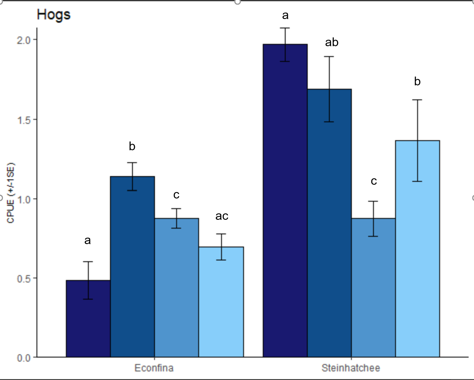
My ideal output would be something like this...
I'm not sure if these letters are 100% accurate on my sample plot, but they signify which groups are significantly different from each other. Zones are independent, so I don't want any comparisons between the two zones so I was running them seperate with the following code.
hogs.aov.b <- aov(hogs.fit ~Levelname, data = filter(hogs.sample, Zone == "B"))
hogs.aov.summary.b <- summary(hogs.aov.b)
hogs.tukey.b <- TukeyHSD(hogs.aov.b)
hogs.tukey.b

hogs.aov.d <- aov(hogs.fit ~ Levelname, data = filter(hogs.sample, Zone == "D"))
hogs.aov.summary.d <- summary(hogs.aov.d)
hogs.tukey.d <- TukeyHSD(hogs.aov.d)
hogs.tukey.d
I tried this route but I have many species other than hogs to apply this to. Show statistically significant difference in a graph
I can get the letters for one zone at a time, but I'm not sure how to add both zones to the plot. They are also out of order. I modified this code from a webpage and the letters do not place atop the bars nicely.
library(agricolae)
library(tidyverse)
# get highest point overall
abs_max <- max(bass.dat.d$bass.fit)
# get the highest point for each class
maxs <- bass.dat.d %>%
  group_by(Levelname) %>%
  # I like to add a little bit to each value so it rests above
  # the highest point. Using a percentage of the highest point
  # overall makes this code a bit more general
  summarise(bass.fit=max(mean(exp(bass.fit))))
# get Tukey HSD results
Tukey_test <- aov(bass.fit ~ Levelname, data=bass.dat.d) %>%
  HSD.test("Levelname", group=TRUE) %>%
  .$groups %>%
  as_tibble(rownames="Levelname") %>%
  rename("Letters_Tukey"="groups") %>%
  select(-bass.fit) %>%
  # and join it to the max values we calculated -- these are
  # your new y-coordinates
  left_join(maxs, by="Levelname")
There are lots of examples like this too https://www.staringatr.com/3-the-grammar-of-graphics/bar-plots/3_tukeys/ but they all just add text manually. It would be nice to have code that can take the Tukey output and add the significance letter to the plot automatically.
Thanks


n(): ! Must be used inside dplyr verbs. Runrlang::last_error()to see where the error occurred. – Transude