Show percent % instead of counts in charts of categorical variables
Asked Answered
M

9

208

I'm plotting a categorical variable and instead of showing the counts for each category value.

I'm looking for a way to get ggplot to display the percentage of values in that category. Of course, it is possible to create another variable with the calculated percentage and plot that one, but I have to do it several dozens of times and I hope to achieve that in one command.

I was experimenting with something like

qplot(mydataf) +
  stat_bin(aes(n = nrow(mydataf), y = ..count../n)) +
  scale_y_continuous(formatter = "percent")

but I must be using it incorrectly, as I got errors.

To easily reproduce the setup, here's a simplified example:

mydata <- c ("aa", "bb", NULL, "bb", "cc", "aa", "aa", "aa", "ee", NULL, "cc");
mydataf <- factor(mydata);
qplot (mydataf); #this shows the count, I'm looking to see % displayed.

In the real case, I'll probably use ggplot instead of qplot, but the right way to use stat_bin still eludes me.

I've also tried these four approaches:

ggplot(mydataf, aes(y = (..count..)/sum(..count..))) + 
  scale_y_continuous(formatter = 'percent');

ggplot(mydataf, aes(y = (..count..)/sum(..count..))) + 
  scale_y_continuous(formatter = 'percent') + geom_bar();

ggplot(mydataf, aes(x = levels(mydataf), y = (..count..)/sum(..count..))) + 
  scale_y_continuous(formatter = 'percent');

ggplot(mydataf, aes(x = levels(mydataf), y = (..count..)/sum(..count..))) + 
  scale_y_continuous(formatter = 'percent') + geom_bar();

but all 4 give:

Error: ggplot2 doesn't know how to deal with data of class factor

The same error appears for the simple case of

ggplot (data=mydataf, aes(levels(mydataf))) +
  geom_bar()

so it's clearly something about how ggplot interacts with a single vector. I'm scratching my head, googling for that error gives a single result.

Michaeline answered 12/9, 2010 at 15:58 Comment(2)
Data should be a data frame, not a bare factor.Pyrethrum
adding to hadley's comment, converting your data into a data frame using mydataf = data.frame(mydataf), and renaming it as names(mydataf) = foo will do the trickAntifederalist
B
255

Since this was answered there have been some meaningful changes to the ggplot syntax. Summing up the discussion in the comments above:

 require(ggplot2)
 require(scales)

 p <- ggplot(mydataf, aes(x = foo)) +  
        geom_bar(aes(y = (..count..)/sum(..count..))) + 
        ## version 3.0.0
        scale_y_continuous(labels=percent)

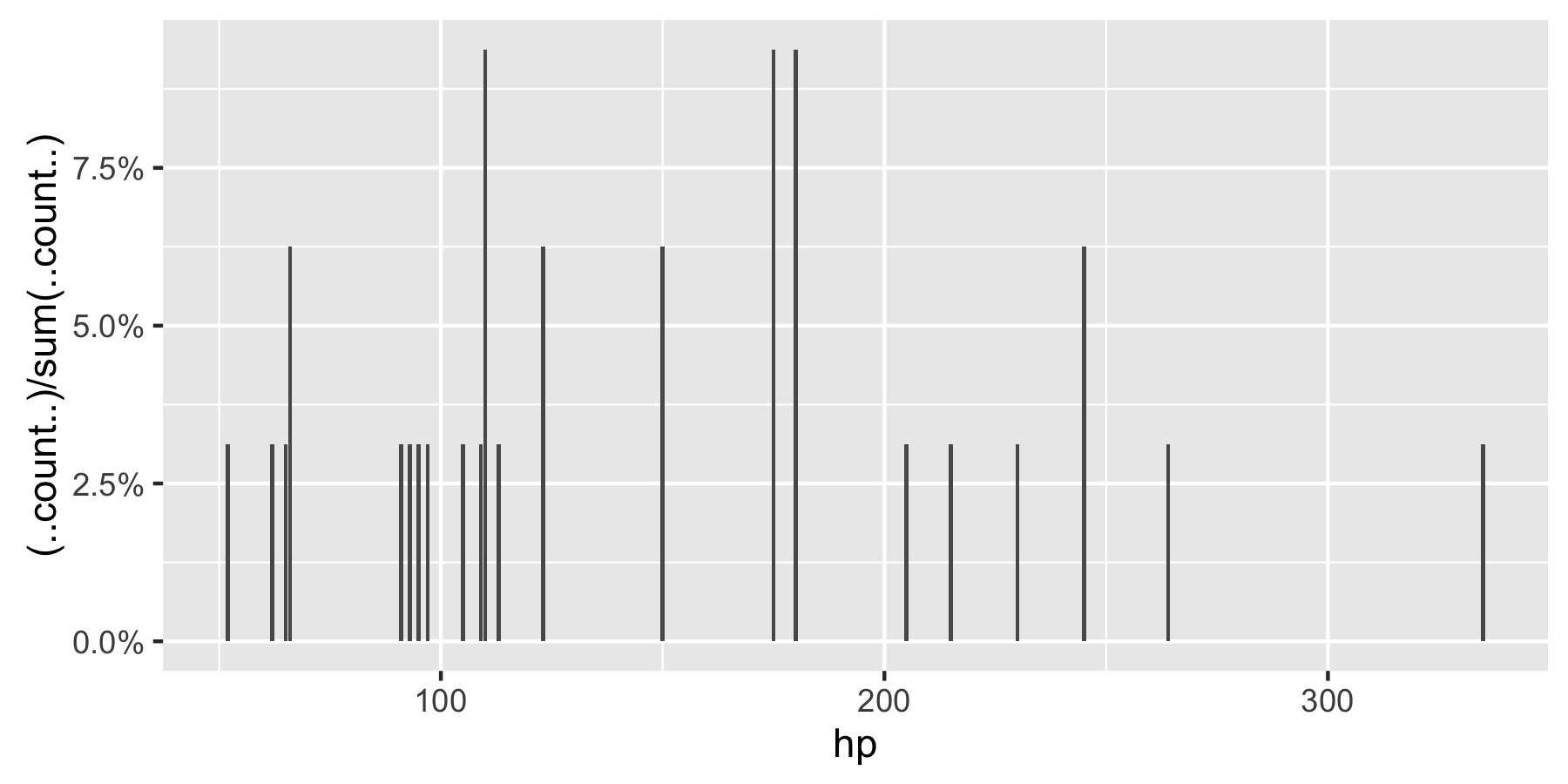
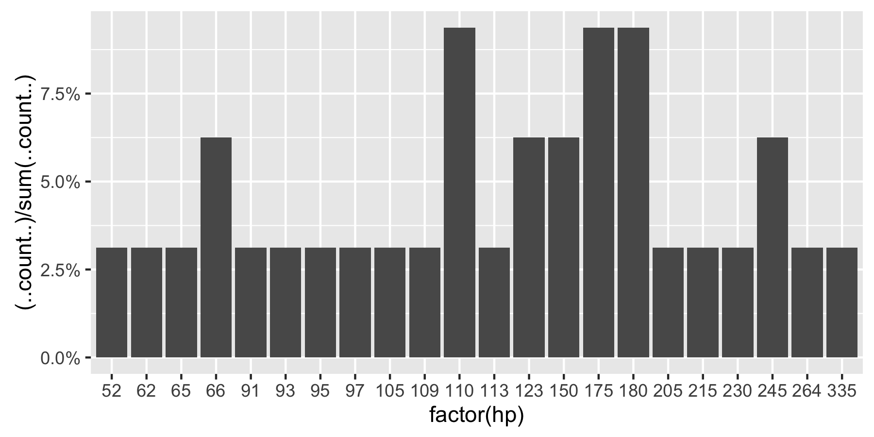
Here's a reproducible example using mtcars:

 ggplot(mtcars, aes(x = factor(hp))) +  
        geom_bar(aes(y = (..count..)/sum(..count..))) + 
        scale_y_continuous(labels = percent) ## version 3.0.0

enter image description here

This question is currently the #1 hit on google for 'ggplot count vs percentage histogram' so hopefully this helps distill all the information currently housed in comments on the accepted answer.

Remark: If hp is not set as a factor, ggplot returns:

enter image description here

Basilica answered 24/1, 2013 at 22:27 Comment(10)
Thanks for this answer. Any idea on how to do it class-wise ?Apathy
As .@Apathy suggests, this answer does not work with faceted data. See @Erwan's comment in #22181632A1
You might need to prefix percent with the package it's from to get the above to work (I did). ggplot(mtcars, aes(x = factor(hp))) + geom_bar(aes(y = (..count..)/sum(..count..))) + scale_y_continuous(labels = scales::percent)Joell
To get around use of facets use geom_bar(aes(y = (..count..)/tapply(..count..,..PANEL..,sum)[..PANEL..])) instead. Each facet should sum to 100%.Bashful
Wasn't variables with ".." around them replaced with the stat()-command? ggplot2.tidyverse.org/reference/stat.htmlTroche
Can you use stat() to to something similar?Troche
@Magnus, see my new answer, using the newer after_stat() function.Pomcroy
@Joell Is there any simple solution for faceted data then? The link was not usefulCandor
@Pomcroy Link of your answer?Candor
@Julien: https://mcmap.net/q/126438/-show-percent-instead-of-counts-in-charts-of-categorical-variablesPomcroy
A
58

this modified code should work

p = ggplot(mydataf, aes(x = foo)) + 
    geom_bar(aes(y = (..count..)/sum(..count..))) + 
    scale_y_continuous(formatter = 'percent')

if your data has NAs and you dont want them to be included in the plot, pass na.omit(mydataf) as the argument to ggplot.

hope this helps.

Antifederalist answered 12/9, 2010 at 16:23 Comment(13)
thanks for the suggestion. I just tried it and get "Error: ggplot2 doesn't know how to deal with data of class factor". By the way, if there's only one vector of values, what would be instead of 'foo'? I don't have column labels.Michaeline
see my comment after hadley's comment.Antifederalist
minor correction: the second command suggested, should have had quotes around "foo": names(mydataf) = "foo". With this and with data.frame() call, it worked. Thanks!Michaeline
Note that in ggplot2 version 0.9.0 the formatter argument will no longer work. Instead, you'll want something like labels = percent_format()).Agribusiness
And with 0.9.0 you'll need to load the scales library before using percent_format(), otherwise it won't work. 0.9.0 doesn't automatically load supporting packages anymore.Basilica
Note that na.omit will omit all rows with an NA in any column, even columns unrelated to your plot.Indefinite
Can someone point me to an explanation/documentation how the "..count.." stuff works, please? I haven't found it the docs.Pathan
See ? stat_bin. It shows what additional columns are added to the data frame by ggplot2. All extra columns are of the form ..variable...Antifederalist
Does it make sense to replace aes(y = (..count..)/sum(..count..)) with simply aes(y = ..density..)? Visually it give very similar (but still different) pictureIrons
In ggplot 0.9.3.1.0, you'll want to first load the scales library, then use scale_y_continuous(labels=percent) as mentioned in the docsJanis
Note that if you actually want percents, not fractions, you will need to use something like geom_bar(aes(y = ((..count..)/sum(..count..))*100))Deanadeanda
@Ramnath, I was trying to use the above code with fill = "another categorical variable", I get the plot but the % on y axis and bar height is not as per the actual percentage for the bar, instead it seems it is taking combination of the fill variable and then showing the height. How can I correct this? Can help by suggesting a solution. I have posted the problem at #41078980Ovate
For those coming to this after 2018, replace "labels = percent_format()" with "labels = scales::percent"Sternwheeler
V
53

With ggplot2 version 2.1.0 it is

+ scale_y_continuous(labels = scales::percent)
Verbenaceous answered 26/5, 2016 at 12:46 Comment(1)
Does not display the right percentages with facetsCandor
A
47

As of March 2017, with ggplot2 2.2.1 I think the best solution is explained in Hadley Wickham's R for data science book:

ggplot(mydataf) + stat_count(mapping = aes(x=foo, y=..prop.., group=1))

stat_count computes two variables: count is used by default, but you can choose to use prop which shows proportions.

Alon answered 21/3, 2017 at 8:22 Comment(4)
This is the best answer as of June 2017, works with filling by group and with faceting.Opalescent
For some reason this doesn't allow me to use the fill mapping (no error is thrown, but no fill color is added).Infidelity
@MaxCandocia I had to remove group = 1 in order to get fill mapping. maybe it helpsKursk
If I remove the group parameter, though, it does not show the proper percentages, since everything belongs to its own group for each unique x value.Infidelity
A
27

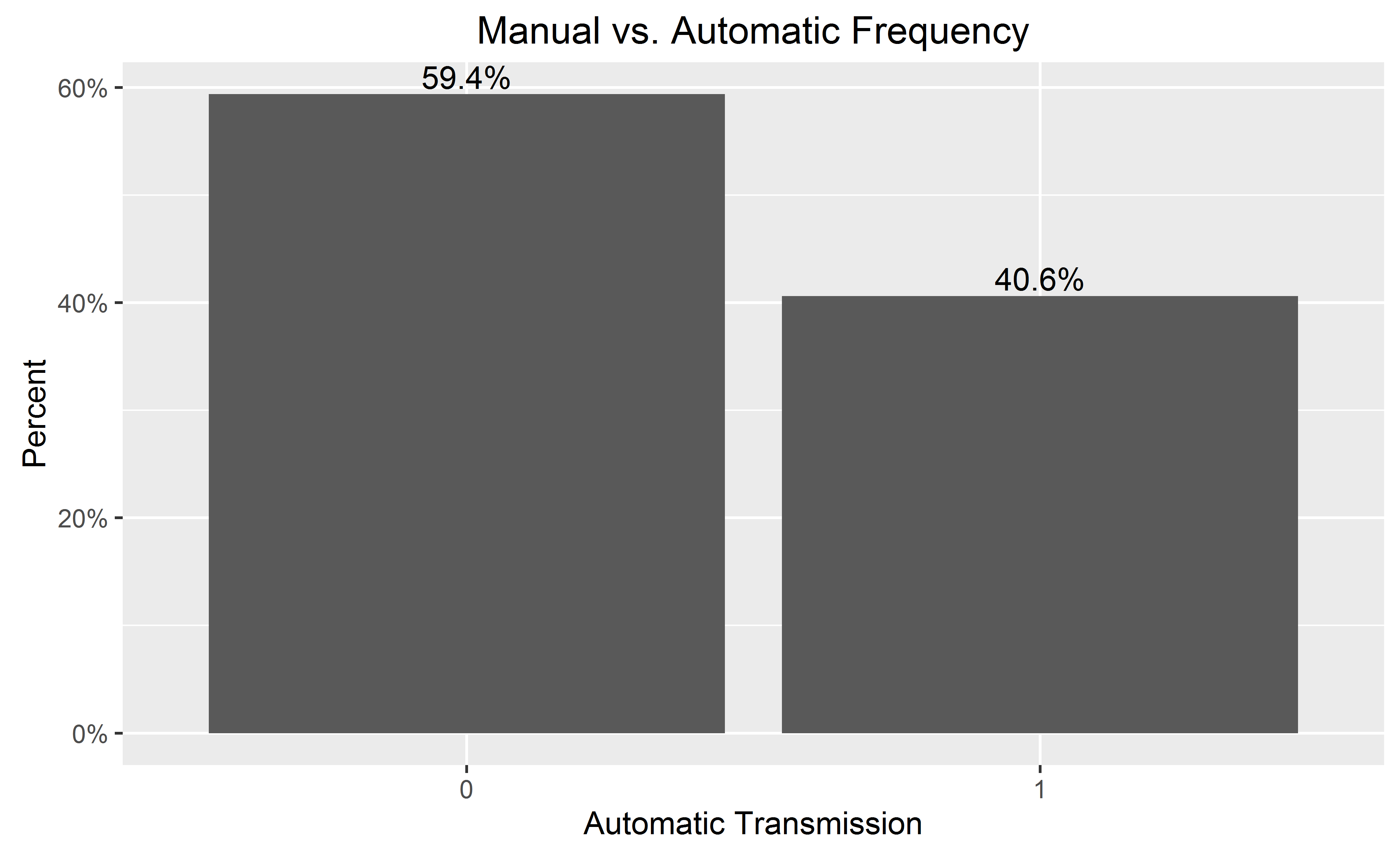
If you want percentages on the y-axis and labeled on the bars:

library(ggplot2)
library(scales)
ggplot(mtcars, aes(x = as.factor(am))) +
  geom_bar(aes(y = (..count..)/sum(..count..))) +
  geom_text(aes(y = ((..count..)/sum(..count..)), label = scales::percent((..count..)/sum(..count..))), stat = "count", vjust = -0.25) +
  scale_y_continuous(labels = percent) +
  labs(title = "Manual vs. Automatic Frequency", y = "Percent", x = "Automatic Transmission")

enter image description here

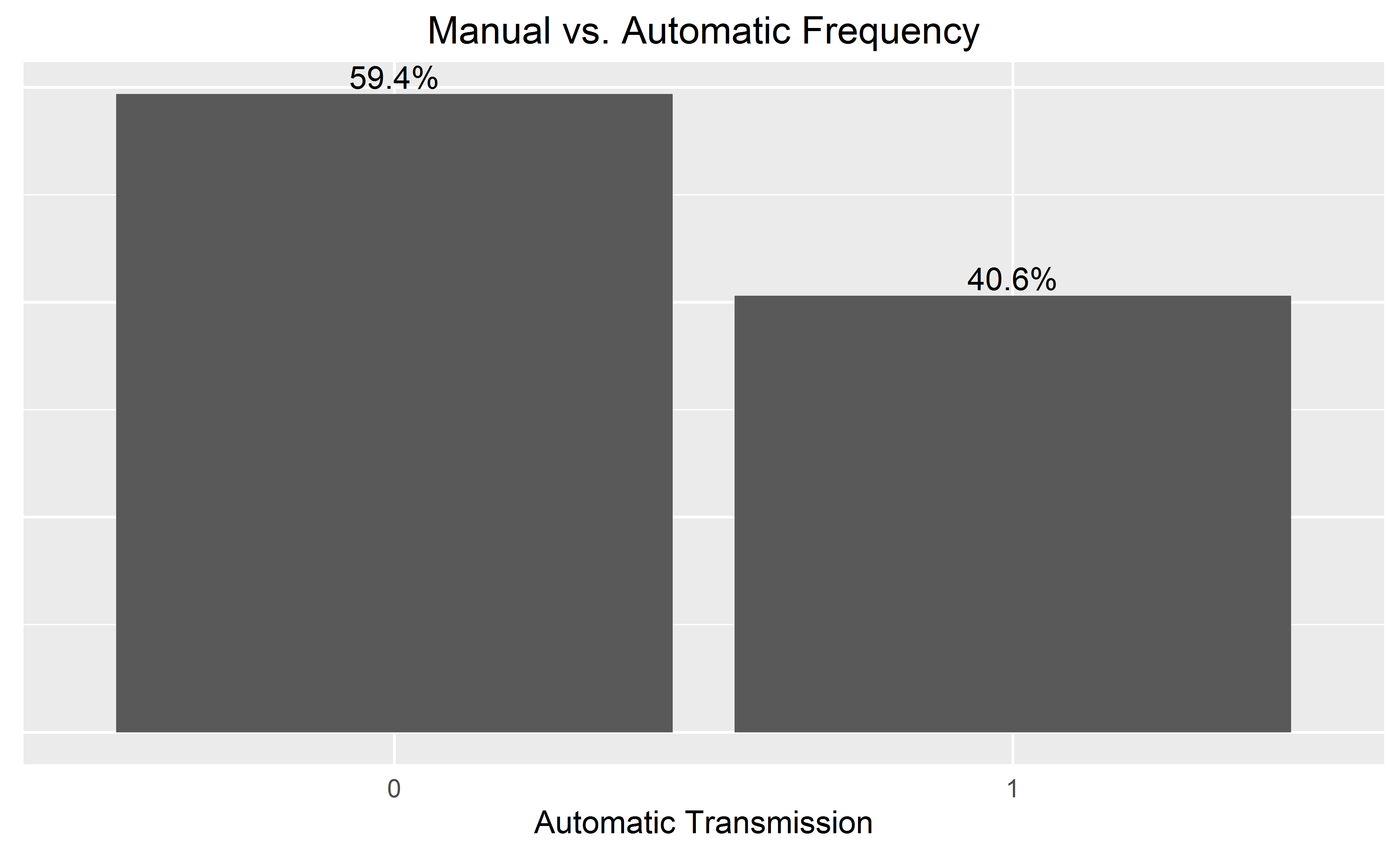
When adding the bar labels, you may wish to omit the y-axis for a cleaner chart, by adding to the end:

  theme(
        axis.text.y=element_blank(), axis.ticks=element_blank(),
        axis.title.y=element_blank()
  )

enter image description here

Anaesthesia answered 28/1, 2016 at 16:39 Comment(0)
T
9

Note that if your variable is continuous, you will have to use geom_histogram(), as the function will group the variable by "bins".

df <- data.frame(V1 = rnorm(100))

ggplot(df, aes(x = V1)) +  
  geom_histogram(aes(y = 100*(..count..)/sum(..count..))) 

# if you use geom_bar(), with factor(V1), each value of V1 will be treated as a
# different category. In this case this does not make sense, as the variable is 
# really continuous. With the hp variable of the mtcars (see previous answer), it 
# worked well since hp was not really continuous (check unique(mtcars$hp)), and one 
# can want to see each value of this variable, and not to group it in bins.
ggplot(df, aes(x = factor(V1))) +  
  geom_bar(aes(y = (..count..)/sum(..count..))) 
Tiffanytiffi answered 18/11, 2018 at 13:35 Comment(2)
Great solution. But you forgot to multiply by 100 to get %, i.e. geom_histogram(aes(y = 100*(..count..)/sum(..count..))).Commissionaire
+scale_y_continuous(labels = scales::percent_format()) to display in nice percent formatJethro
P
9

Since version 3.3 of ggplot2, we have access to the convenient after_stat() function.

We can do something similar to @Andrew's answer, but without using the .. syntax:

# original example data
mydata <- c("aa", "bb", NULL, "bb", "cc", "aa", "aa", "aa", "ee", NULL, "cc")

# display percentages
library(ggplot2)
ggplot(mapping = aes(x = mydata,
                     y = after_stat(count/sum(count)))) +
  geom_bar() +
  scale_y_continuous(labels = scales::percent)

You can find all the "computed variables" available to use in the documentation of the geom_ and stat_ functions. For example, for geom_bar(), you can access the count and prop variables. (See the documentation for computed variables.)

One comment about your NULL values: they are ignored when you create the vector (i.e. you end up with a vector of length 9, not 11). If you really want to keep track of missing data, you will have to use NA instead (ggplot2 will put NAs at the right end of the plot):

# use NA instead of NULL
mydata <- c("aa", "bb", NA, "bb", "cc", "aa", "aa", "aa", "ee", NA, "cc")
length(mydata)
#> [1] 11

# display percentages
library(ggplot2)
ggplot(mapping = aes(x = mydata,
                     y = after_stat(count/sum(count)))) +
  geom_bar() +
  scale_y_continuous(labels = scales::percent)

Created on 2021-02-09 by the reprex package (v1.0.0)

(Note that using chr or fct data will not make a difference for your example.)

Pomcroy answered 8/2, 2021 at 4:22 Comment(0)
G
8

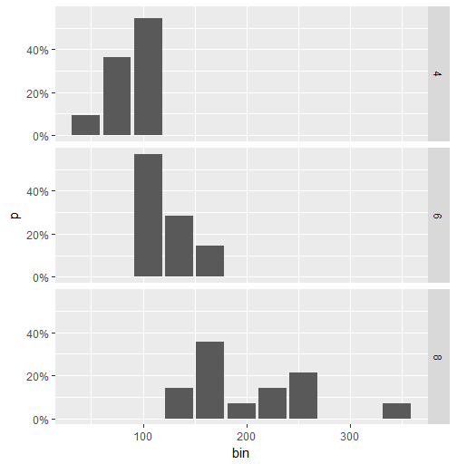
Here is a workaround for faceted data. (The accepted answer by @Andrew does not work in this case.) The idea is to calculate the percentage value using dplyr and then to use geom_col to create the plot.

library(ggplot2)
library(scales)
library(magrittr)
library(dplyr)

binwidth <- 30

mtcars.stats <- mtcars %>%
  group_by(cyl) %>%
  mutate(bin = cut(hp, breaks=seq(0,400, binwidth), 
               labels= seq(0+binwidth,400, binwidth)-(binwidth/2)),
         n = n()) %>%
  group_by(cyl, bin) %>%
  summarise(p = n()/n[1]) %>%
  ungroup() %>%
  mutate(bin = as.numeric(as.character(bin)))

ggplot(mtcars.stats, aes(x = bin, y= p)) +  
  geom_col() + 
  scale_y_continuous(labels = percent) +
  facet_grid(cyl~.)

This is the plot:

enter image description here

Graig answered 1/8, 2017 at 13:51 Comment(0)
N
6

If you want percentage labels but actual Ns on the y axis, try this:

    library(scales)
perbar=function(xx){
      q=ggplot(data=data.frame(xx),aes(x=xx))+
      geom_bar(aes(y = (..count..)),fill="orange")
       q=q+    geom_text(aes(y = (..count..),label = scales::percent((..count..)/sum(..count..))), stat="bin",colour="darkgreen") 
      q
    }
    perbar(mtcars$disp)
Nejd answered 11/6, 2014 at 21:21 Comment(0)

© 2022 - 2024 — McMap. All rights reserved.