identify graph uptrend or downtrend
Asked Answered
A

2

8

I am attempting to read in data and plot them on to a graph using python (standard line graph). Can someone please advise on how I can classify whether certain points in a graph are uptrends or downtrends programmatically? Which would be the most optimal way to achieve this? Surely this is a solved problem and a mathematical equation exists to identify this?

here is some sample data with some up trends and downtrends

x = [1,2,3,4,5,6,7,8,9,10,11,12,13,14,15,16,17,18,19,20,21,22,23,24,25,26,27,28,29,30]
y = [2,5,7,9,10,13,16,18,21,22,21,20,19,18,17,14,10,9,7,5,7,9,10,12,13,15,16,17,22,27]

thanks in advance

Adhern answered 10/6, 2014 at 7:7 Comment(5)
It sounds like you just want to fit a 1st order polynomial then look at if the coefficients are negative or positive. That will work for the entire data set it's unclear from the question what more you need.Ethanethane
apologies for my ignorance but by polynomial do you mean line of best fit?Adhern
Yes a 1st order polynomial is just a straight line best fit. Note that in general a best fit can fit any function. Can you post some sample data that you may be interested in?Ethanethane
sure, i have updated the question, please take a lookAdhern
Okay, fitting data like this is actually quite difficult but some methods do exist. The trouble is that your fitting the line y=mx+c to data but its not obvious how to segment up the data to achieve the best fit. Clearly it is obvious when you plot it which bit is which but from data alone it is not so clear. You then have several options, the easiest is to explicitly tell the computer which regions to fit (then it is fairly trivial). I do have an idea how to do it more generally using the Hough transform, I will try to get something back here but it may take a while.Ethanethane
O
20

A simple way would be to look at the 'rate in change of y with respect to x', known as the derivative. This usually works better with continuous (smooth) functions, and so you could implement it with your data by interpolating your data with an n-th order polynomial as already suggested. A simple implementation would look something like this:

import numpy as np
import matplotlib.pyplot as plt
from scipy.interpolate import interp1d
from scipy.misc import derivative

x = np.array([1,2,3,4,5,6,7,8,9,10,11,12,13,14,15,\
              16,17,18,19,20,21,22,23,24,25,26,27,28,29,30])
y = np.array([2,5,7,9,10,13,16,18,21,22,21,20,19,18,\
              17,14,10,9,7,5,7,9,10,12,13,15,16,17,22,27])

# Simple interpolation of x and y    
f = interp1d(x, y)
x_fake = np.arange(1.1, 30, 0.1)

# derivative of y with respect to x
df_dx = derivative(f, x_fake, dx=1e-6)

# Plot
fig = plt.figure()
ax1 = fig.add_subplot(211)
ax2 = fig.add_subplot(212)

ax1.errorbar(x, y, fmt="o", color="blue", label='Input data')
ax1.errorbar(x_fake, f(x_fake), label="Interpolated data", lw=2)
ax1.set_xlabel("x")
ax1.set_ylabel("y")

ax2.errorbar(x_fake, df_dx, lw=2)
ax2.errorbar(x_fake, np.array([0 for i in x_fake]), ls="--", lw=2)
ax2.set_xlabel("x")
ax2.set_ylabel("dy/dx")

leg = ax1.legend(loc=2, numpoints=1,scatterpoints=1)
leg.draw_frame(False)

Differential plot of y

You see that when the plot transitions from an 'upwards trend' (positive gradient) to a 'downwards trend' (negative gradient) the derivative (dy/dx) goes from positive to negative. The transition of this happens at dy/dx = 0, which is shown by the green dashed line. For the scipy routines you can look at:

http://docs.scipy.org/doc/scipy/reference/generated/scipy.misc.derivative.html

http://docs.scipy.org/doc/scipy/reference/tutorial/interpolate.html

NumPy's diff/gradient should also work, and not require the interpolation, but I showed the above so you could get the idea. For a complete mathemetical description of differentiation/calculus, look at wikipedia.

Outlander answered 13/6, 2014 at 13:18 Comment(2)
you have no idea just how much knowledge i have picked up from this and appreciate how much you have helped me, if you live in london i owe you a drink. Thanks so much!Adhern
This is a great answer, I just have one question regarding a possible improvement. Is there a way to always get a 'uniform' range of numbers as the output? For example, no matter how many and how big numbers we give as an input, to always get values of the second chart between -1 and 1? That way it would be easy to determine the trend no matter the numbers. Of course it would be relative to the numbers given.Whitley
M
1

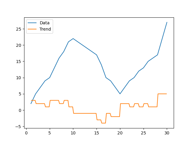
I found this topic very important and interesting. I would like to extend the above-mentioned answer:

import numpy as np
import matplotlib.pyplot as plt
from scipy.interpolate import interp1d
from scipy.misc import derivative

x = np.array([1,2,3,4,5,6,7,8,9,10,11,12,13,14,15,\
              16,17,18,19,20,21,22,23,24,25,26,27,28,29,30])
y = np.array([2,5,7,9,10,13,16,18,21,22,21,20,19,18,\
              17,14,10,9,7,5,7,9,10,12,13,15,16,17,22,27])


# Simple interpolation of x and y
f = interp1d(x, y, fill_value="extrapolate")
x_fake = np.arange(1.1, 30, 0.1)

# derivative of y with respect to x
df_dx = derivative(f, x_fake, dx=1e-6)

plt.plot(x,y, label = "Data")
plt.plot(x_fake,df_dx,label = "Trend")
plt.legend()
plt.show()

average = np.average(df_dx)
if average > 0 :
    print("Uptrend", average)
elif average < 0:
    print("Downtrend", average)
elif average == 0:
    print("No trend!", average)

print("Max trend measure is:")
print(np.max(df_dx))
print("min trend measure is:")
print(np.min(df_dx))
print("Overall trend measure:")
print(((np.max(df_dx))-np.min(df_dx)-average)/((np.max(df_dx))-np.min(df_dx)))


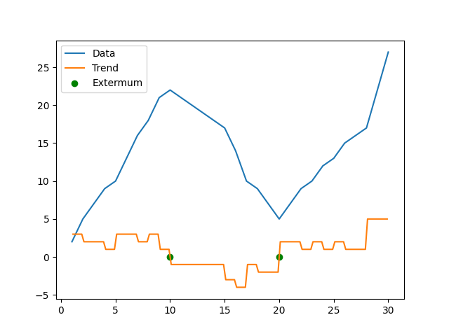
extermum_list_y = []
extermum_list_x = []

for i in range(0,df_dx.shape[0]):
    if df_dx[i] < 0.001 and df_dx[i] > -0.001:
        extermum_list_x.append(x_fake[i])
        extermum_list_y.append(df_dx[i])

plt.scatter(extermum_list_x, extermum_list_y, label="Extermum", marker = "o", color = "green")
plt.plot(x,y, label = "Data")
plt.plot(x_fake, df_dx, label="Trend")
plt.legend()
plt.show()

So, in overall the total trend is upward for this graph! This approach is also nice when you want to find the x where the slope is zero; for example, the extremum in the curves. The local minimum and maximum points are found with the best accuracy and computation time.

enter image description here

enter image description here

Morbidity answered 31/3, 2022 at 14:34 Comment(0)

© 2022 - 2024 — McMap. All rights reserved.