SnackBar Overlap FAB (Basic)
![enter image description here]()
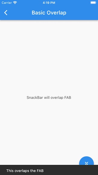
To have a SnackBar overlap a FAB, the FAB should be placed on a nested Scaffold.
class BasicOverlapFAB extends StatelessWidget {
  const BasicOverlapFAB();

  @override
  Widget build(BuildContext context) {
    return Scaffold(
      appBar: AppBar(
        title: Text('Basic Overlap'),
      ),
      body: Scaffold( // ← Nested
        body: Center(child: Text('SnackBar will overlap FAB'),),
        floatingActionButton: FloatingActionButton(
          child: Icon(Icons.keyboard_double_arrow_down),
          onPressed: () => ScaffoldMessenger.of(context).showSnackBar(
            SnackBar(content: Text('This overlaps the FAB'),)
          ),
        ),
      )
    );
  }
}
This works because a SnackBar is shown on the highest Scaffold nearest to a ScaffoldMessenger. The nearest ScaffoldMessenger is included in MaterialApp by default.
In the above code, the Scaffold showing the SnackBar is parent/above the Scaffold with a FAB, thus Snack overlaps FAB.
MaterialApp
  ScaffoldMessenger
    Scaffold ← Snacks here
      Scaffold
        FAB
Nested Scaffolds & ScaffoldMessengers
![SnackBar overlap FAB]()
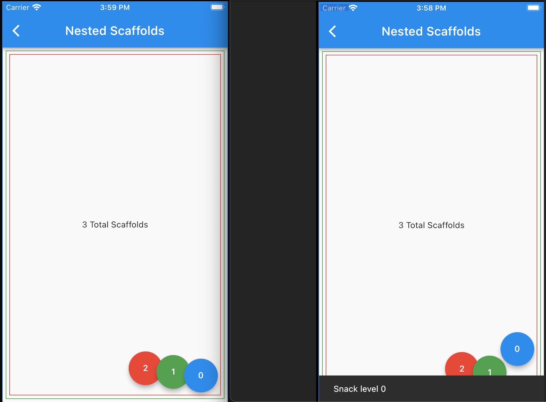
This example has several nested Scaffolds.
Scaffolds are like panes (layers) of glass. We can stack one on top of another. And we can show FABs, SnackBars and other widgets on each layer.
To make the layers of Scaffolds easier to see, each Scaffold is smaller and is outlined with a different color: blue, green, red. Red is the furthest down. (Nested panes go underneath.)
Scaffolds don't provide a ScaffoldMessenger by default, but MaterialApp provides a default ScaffoldMessenger. Most of the time we're interacting with this default "root" ScaffoldMessenger, but we can add our own.
For each layer of Scaffold in this example (AnotherScaffold custom class) we manually added its own ScaffoldMessenger. Each also has a FAB that shows SnackBars on its own ScaffoldMessenger.
Copy/Paste & play around with this in an emulator to get a feel for how the Scaffolds/ScaffoldMessengers form layers & how they overlap & interact.
class NestedScaffoldsPage extends StatelessWidget {
  const NestedScaffoldsPage();

  @override
  Widget build(BuildContext context) {
    return Container( // unnecessary container just for border color / educational visibility
      decoration: BoxDecoration(
          border: Border.all(color: Colors.blue)
      ),
      child: Scaffold(// Root Scaffold for FAB #0
        appBar: AppBar(
          title: Text('Nested Scaffolds'),
        ),
        body: AnotherScaffold(// Nested Scaffold & FAB #1
          level: 1,
          color: Colors.green,
          body: AnotherScaffold(// Nested Scaffold & FAB #2
            level: 2,
            color: Colors.red,
            body: Center(child: Text('3 Total Scaffolds')),
          ),
        ),
        floatingActionButton: FloatingActionButton( // FAB #0
          child: Text('0'),
          onPressed: () => ScaffoldMessenger.of(context).showSnackBar(
              SnackBar(content: Text('Snack level 0'),
                duration: const Duration(seconds: 2),
                //behavior: SnackBarBehavior.floating, // SnackBar will show above FAB
                //behavior: SnackBarBehavior.fixed, // default, pushes FAB up
              )
          ),
        ),
      ),
    );
  }
}

class AnotherScaffold extends StatelessWidget {
  final int level;
  final Widget body;
  final Color color;
  final GlobalKey<ScaffoldMessengerState> smState;

  AnotherScaffold({
    required this.level,
    required this.color,
    required this.body,
  }) : smState = GlobalKey<ScaffoldMessengerState>();
  /// This GlobalKey, given to a ScaffoldMessenger, will uniquely identify that
  /// ScaffoldMessenger.  We can then use it to show SnackBars.

  @override
  Widget build(BuildContext context) {
    return ScaffoldMessenger(
      key: smState, // use this key to show SnackBars on this ScaffoldMessenger
      child: Container( // unnecessary container just for border color / educational visibility
        margin: EdgeInsets.all(5),
        decoration: BoxDecoration(
          border: Border.all(color: color),
        ),
        child: Scaffold(
          body: body,
          floatingActionButton: Padding(
            padding: EdgeInsets.only(right: (level) * 40),
            child: FloatingActionButton(
              heroTag: GlobalKey(), // unique tag req'd for multiple FABs
              backgroundColor: color,
              child: Text('$level'),
              onPressed: () => // using smState key to show a SnackBar on that ScaffoldMessenger
                  smState.currentState!.showSnackBar(SnackBar(
                    duration: Duration(milliseconds: 2500),
                    content: Text('Snack level $level'),
                  )),
            ),
          ),
        ),
      ),
    );
  }
}


