I am using AlphaVantage API to download data points, which I then convert to a pandas DataFrame.
I want to plot the new DataFrame with a Scatter/Line graph using Plotly. The graphs seems to come out perfect when plotting them in Google Colab, however, I seem to be unable to replicate my results in PyCharm and Jupiter Notebook.
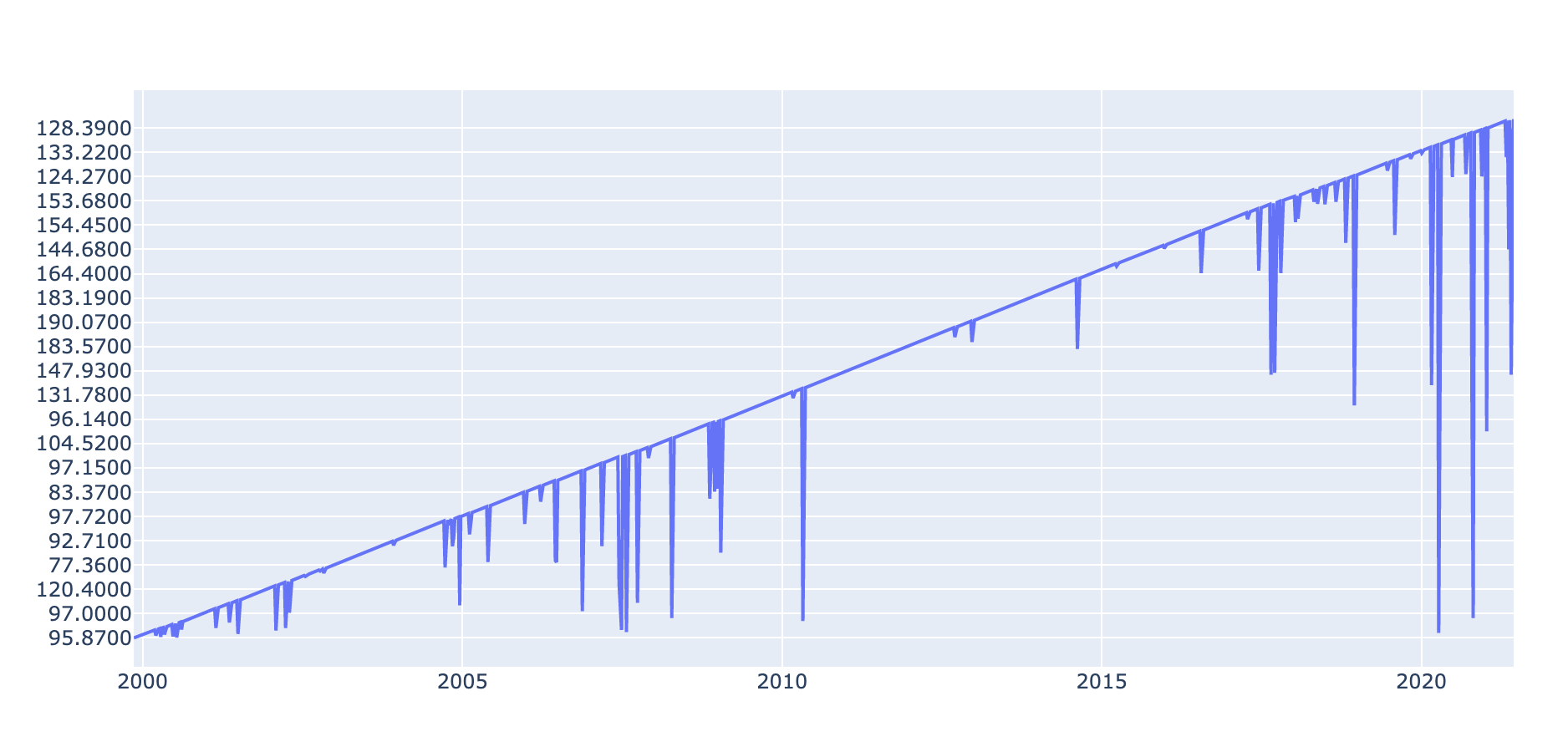
When plotting in either PyCharm and JN, the Y-Axis values are plotted out of order, like the graph is trying to create as straight of a line as possible (see 2nd image and look closely at y-axis).
Here is a simplified example of the code and graphs:
Exact Same code used in both instances
Desired Outcome (Sample from Colab):

Outcome on PyCharm and JN (Current Issue Graph):

See Code:
import requests
import pandas as pd
import plotly.graph_objects as go


# DATA FROM API
response = requests.get(url='https://www.alphavantage.co/query?function=TIME_SERIES_WEEKLY&symbol=IBM&apikey=demo')
response.raise_for_status()
stock_weekly = response.json()['Weekly Time Series']


# CHANGE DATA FORMAT, RENAME COLUMNS AND CONVERT TO DATETIME, FINALLY FLIP TO HAVE DATE IN ASCENDING ORDER
raw_weekly_data = pd.DataFrame(stock_weekly)
weekly_data = raw_weekly_data.T
weekly_data.reset_index(level=0, inplace=True)
weekly_data.rename(columns={
    'index': 'DATE',
    '1. open': 'OPEN',
    '2. high': 'HIGH',
    '3. low': 'LOW',
    '4. close': 'CLOSE',
    '5. volume': 'VOLUME'
    },
    inplace=True)
weekly_data['DATE'] = pd.to_datetime(weekly_data['DATE'])
weekly_data = weekly_data[::-1]
weekly_data = weekly_data.reset_index(drop=True)


# PLOT
fig = go.Figure()

fig.add_trace(go.Scatter(
    x=weekly_data['DATE'],
    y=weekly_data['CLOSE']))

fig.show()
