How to auto-resize imageview for different screen sizes android studio?
Asked Answered
N

3

8

I am starting to develop apps for android devices using Android Studio. While I was testing my app for screen size compatibilty I noticed that the imageviews do not auto-resize.

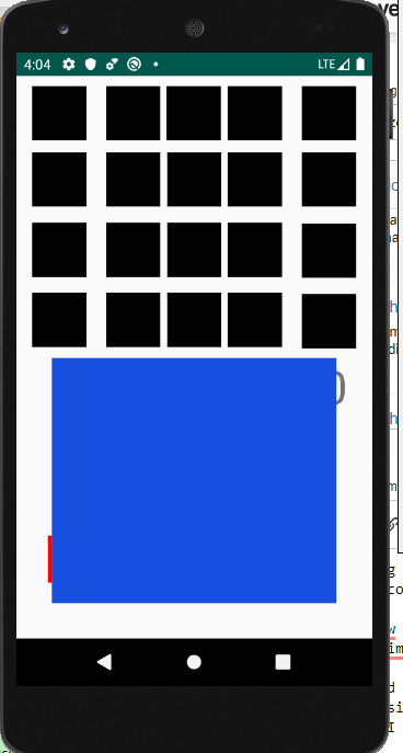
The imageview placement looks completely different in different screen sizes. If the screen is small enough, the imageview will sometimes be placed outside of the viewscope.

I have looked all over the internet but I am a little confused on how to make the app compatible with most screen sizes (not including tablets). I went to the android website and they said to use wrap_content. but if I use this, I wont be able to adjust the height and width of the imageview to how I want it.

Does anyone know how to make imageview auto-resize accordingly to the screen size?

Here are images of what is happening:

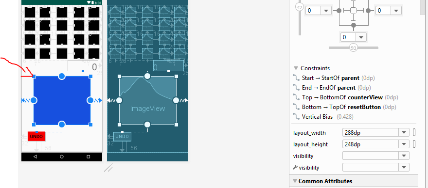
This is the layout of the app:

This is the layout

This is how I want it to look like (Pixel 3):

enter image description here

But this is how it looks like in a smaller screen(Nexus 5):

enter image description here

In Xcode there is a feature called auto-resize that automatically resizes the content for you. Does android studio have something similar to that?

This is the xml:

<?xml version="1.0" encoding="utf-8"?>
<androidx.constraintlayout.widget.ConstraintLayout xmlns:android="http://schemas.android.com/apk/res/android"
    xmlns:app="http://schemas.android.com/apk/res-auto"
    xmlns:tools="http://schemas.android.com/tools"
    android:layout_width="match_parent"
    android:layout_height="match_parent"
    tools:context=".MainActivity">
    
    <Button
        android:id="@+id/resetButton"
        style="@style/Widget.AppCompat.Button.Borderless.Colored"
        android:layout_width="wrap_content"
        android:layout_height="0dp"
        android:layout_marginStart="32dp"
        android:layout_marginLeft="32dp"
        android:layout_marginBottom="56dp"
        android:background="#F70000"
        android:text="Undo"
        android:textColor="#000000"
        android:textSize="24sp"
        app:layout_constraintBottom_toBottomOf="parent"
        app:layout_constraintStart_toStartOf="parent" />

    <ImageView
        android:id="@+id/imageView3"
        android:layout_width="288dp"
        android:layout_height="248dp"

        android:background="#1750DF"
        android:scaleType="fitXY"
        app:layout_constraintBottom_toBottomOf="parent"
        app:layout_constraintEnd_toEndOf="parent"
        app:layout_constraintHorizontal_bias="0.495"
        app:layout_constraintStart_toStartOf="parent"
        app:layout_constraintTop_toTopOf="parent"
        app:layout_constraintVertical_bias="0.685" />


</androidx.constraintlayout.widget.ConstraintLayout>

Thank you in advance!

Nonetheless answered 11/10, 2019 at 21:8 Comment(0)
P
17

the imageviews do not auto-resize

Because you are using a fixed size value on your imageView you are having this problem:

Different phones got different screen size, in your layout you are using fixed size on your view (fixed size is 240dp for example) and the result is that what may look good on one screen (your android studio preview screen) will not look good on another screen (your actual phone).


How to fix

You can use those attributes to make your image responsive in size:

app:layout_constraintHeight_percent="0.25"
app:layout_constraintWidth_percent="0.25"

You will need to give your image 0dp size both in android:layout_width and android:layout_height

What I did was to tell the view to be equal to 25% both in width and height according to the screen size, this will make you view responsive to all screen size and thus it will "auto-resize"

Peruzzi answered 12/10, 2019 at 8:44 Comment(2)
This worked for me. One note, shouldn't this size percentage be based on the parent view and not the screen size view?Perfidy
@Perfidy Hey, so a bit of a late answer but from the docs: layout_constraintWidth_percent and layout_constraintHeight_percent : will set the size of this dimension as a percentage of the parentPeruzzi
L
5

Update

Following the answer by @tamir-abutbul , it is a nice workaround to use layout_constraintHeight_percent and layout_constraintWidth_percent to make view fit according to screen size. I have placed the top items in a Grid Layout, you can apply this to any of your top layout which you are using, the main thing to consider is the layout_constraintHeight/Width_percent here. Also, for the image , I have set the background transparent and changed scaleType to "fitCenter" so that the image keeps its aspect ratio on any screen. hope this helps. You can change android to androidx.

<?xml version="1.0" encoding="utf-8"?>
<android.support.constraint.ConstraintLayout
xmlns:android="http://schemas.android.com/apk/res/android"
xmlns:app="http://schemas.android.com/apk/res-auto"
xmlns:tools="http://schemas.android.com/tools"
android:layout_width="match_parent"
android:layout_height="match_parent"
tools:context=".MainActivity"
>

<GridLayout
    android:id="@+id/gridLayout"
    android:layout_width="match_parent"
    android:layout_height="0dp"
    android:layout_marginTop="0dp"
    android:background="#faf"
    android:columnCount="5"
    android:rowCount="4"
    app:layout_constraintHeight_percent="0.4"
    app:layout_constraintTop_toTopOf="parent">


</GridLayout>

<ImageView

    android:id="@+id/imageView3"
    android:layout_width="0dp"
    android:layout_height="0dp"
    android:layout_marginTop="8dp"
    android:background="#00000000"
    android:scaleType="fitCenter"
    android:src="@drawable/lamborghini"
    app:layout_constraintBottom_toBottomOf="parent"
    app:layout_constraintEnd_toEndOf="parent"
    app:layout_constraintHeight_percent="0.30"
    app:layout_constraintHorizontal_bias="0.495"
    app:layout_constraintStart_toStartOf="parent"
    app:layout_constraintTop_toBottomOf="@+id/gridLayout"
    app:layout_constraintVertical_bias="0.265"
    app:layout_constraintWidth_percent="0.7" />

<Button
    android:id="@+id/resetButton"
    style="@style/Widget.AppCompat.Button.Borderless.Colored"
    android:layout_width="wrap_content"
    android:layout_height="wrap_content"
    android:layout_marginStart="16dp"
    android:layout_marginTop="8dp"
    android:layout_marginBottom="16dp"
    android:background="#F70000"
    android:text="Undo"
    android:textColor="#000000"
    android:textSize="20sp"
    app:layout_constraintBottom_toBottomOf="parent"
    app:layout_constraintStart_toStartOf="parent"
    app:layout_constraintTop_toBottomOf="@+id/imageView3"
    app:layout_constraintVertical_bias="0.395" />


 </android.support.constraint.ConstraintLayout> 
Lardy answered 11/10, 2019 at 21:35 Comment(3)
I believe I have tried this but I still get it in wrong position. Will this change the size of the image view when screen sizes change ? Or will the imageview stay the same size ?Nonetheless
Can you share your layout xml, because there are techniques to create layouts. Lets see what you are using.Lardy
Hello!, I added the XML code to the question. Can you please tell me what I am doing wrong @AdnanNonetheless
A
3

your imageview like that because your define width and height large in other view, so maybe you can try this library for same size in other screen

https://github.com/intuit/sdp

Amarelle answered 12/10, 2019 at 0:45 Comment(1)
Thank you! This is a great alternative to use as well.Nonetheless

© 2022 - 2024 — McMap. All rights reserved.