Using flex-wrap: wrap; on the container is a great option, although sometimes I think it looks strange to have different sized buttons:
![stretched rows of buttons]()
It's a little better if you also set flex: 0 !important; on each button, but the jagged block still isn't visually appealing to me:
![jagged rows of buttons]()
Sometimes, I prefer a vertical column of buttons for screens below a certain width. For example:
@media screen and (max-width: 600px) {
  .btn-group {
    flex-direction: column;
  }
}
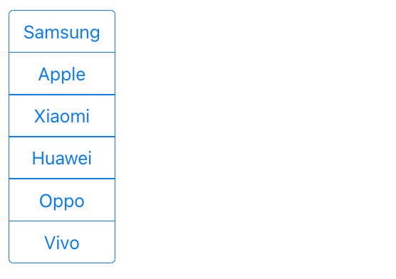
With a few more styles, you can also get nicely rounded corners:
![vertical stack of buttons]()
Here is the full code:
/* Responsive: Use a vertical column if under 450px wide */
@media screen and (max-width: 450px) {
  .btn-group {
    flex-direction: column;
  }
  .btn-group .btn {
    border-radius: 0 !important;
    margin-left: 0px !important;
    margin-top: -1px !important;
  }
  .btn-group .btn:first-child {
    border-top-left-radius: 4px !important;
    border-top-right-radius: 4px !important;
  }
  .btn-group .btn:last-child {
    border-bottom-left-radius: 4px !important;
    border-bottom-right-radius: 4px !important;
  }
}
<link href="https://cdn.jsdelivr.net/npm/[email protected]/dist/css/bootstrap.min.css" rel="stylesheet" />

<div class="container">
  <h2>Responsive Button Group</h2>
  <div class="btn-group">
    <button type="button" class="btn btn-outline-primary">Samsung</button>
    <button type="button" class="btn btn-outline-primary">Apple</button>
    <button type="button" class="btn btn-outline-primary">Xiaomi</button>
    <button type="button" class="btn btn-outline-primary">Huawei</button>
    <button type="button" class="btn btn-outline-primary">Oppo</button>
    <button type="button" class="btn btn-outline-primary">Vivo</button>
  </div>
</div>
P.S. In case it wasn't clear, both flex-direction: column; and flex-wrap: wrap; work for both btn-group and btn-group-toggle.


