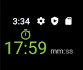
I'm having trouble aligning widgets. I have seen questions on here asking about similar things, however, none of them seem to work for my specific task. I'm trying to create a widget containing an icon and two text widgets. The icon is supposed to be centered over the first text widget, and the other text widget is supposed to be aligned with the baseline of the first.
The way I have gone about doing this is to place the icon and the first text widget in a column, and then place that column in a row together with the second text widget. I'm using crossAxisAlignment: CrossAxisAlignment.baseline and textBaseline: TextBaseline.ideographic in the row widget but for some reason the second text aligns with the icon. It looks like this:
If I instead use crossAxisAlignment: CrossAxisAlignment.end the text widgets do not align properly:
I have tried to put the text widgets in a row and place them in a column together with the icon, but then the icon is no longer centered over the first text widget:
Here's the code used for the first image, the other images are just rearrangements of the same code.
return Row(
  crossAxisAlignment: CrossAxisAlignment.baseline,
  textBaseline: TextBaseline.ideographic,
  children: [
    Column(
      crossAxisAlignment: CrossAxisAlignment.center,
      children: [
        Icon(
          widget.icon,
          color: color_text_highlight,
          size: 20,
        ),
        Text(
          widget.data,
          style: TextStyle(
            fontSize: 28,
            fontFamily: 'Quicksand',
            color: color_text_highlight,
          ),
        ),
      ],
    ),

    SizedBox(width: 5),

    Text(
        widget.label,
        style: TextStyle(
          fontSize: 12,
          fontFamily: 'Roboto',
          color: color_text_dark,
        )
    ),
  ],
);
Any help is appreciated!


