Visualize an RDFLIB Graph in Python
Asked Answered
A

2

8

I am new to RDFLIB in python. I found this example of creating a graph on here. What is the simplest way to visualize graph created by this code?

import rdflib
# Now we create a graph, a representaiton of the ontology
g = rdflib.Graph()

# Now define the key words that we will use (the edge weights of the graph)
has_border_with = rdflib.URIRef('http://www.example.org/has_border_with')
located_in = rdflib.URIRef('http://www.example.org/located_in')

# define the things - base level objects that will be the nodes
# In this case first we have countries
germany = rdflib.URIRef('http://www.example.org/country1')
france = rdflib.URIRef('http://www.example.org/country2')
china = rdflib.URIRef('http://www.example.org/country3')
mongolia = rdflib.URIRef('http://www.example.org/country4')

# then we have continents
europa = rdflib.URIRef('http://www.example.org/part1')
asia = rdflib.URIRef('http://www.example.org/part2')

# Having defined the things and the edge weights, now assemble the graph
g.add((germany,has_border_with,france))
g.add((china,has_border_with,mongolia))
g.add((germany,located_in,europa))
g.add((france,located_in,europa))
g.add((china,located_in,asia))
g.add((mongolia,located_in,asia))

I see that the rdflib package has a tools component that has a function called rdfs2dot. How can I use this function to display a plot with the RDF graph in it?

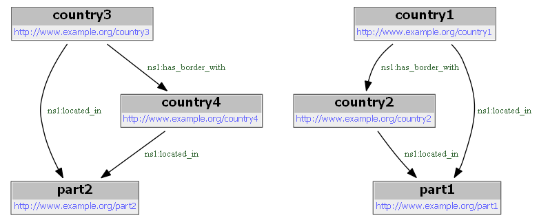
Arcograph answered 1/9, 2016 at 14:25 Comment(2)
I gave it a look but could not find a complete solution. What I found is that rdfs2dot is a commandline tool: you must first export your graph g.serialize("world.rdf"), then convert it the dot syntax: rdfs2dot world.rdf > world.dot, then use whatever tools that allows to plot dot graphs. For instance xdot xdot world.dot. For some reason, rdfs2dot produces an empty graph. According to the doc of Graph.serialize, rdf is supposed to be the default format, thus either there is a bug here or in rdfs2dot. Maybe look open tickets on github, or post a new issue.Arsine
Thanks! This makes sense. So you need to first export the graph and then run a command in cmd to create the graph dot file.Arcograph
M
15

Using the hint in this question: https://www.researchgate.net/post/Is_there_any_open_source_RDF_graph_converter

I was able to plot the RDF Graph by converting to Networkx Graph and using the Networkx/Matplotlib plotting tools.

import rdflib
from rdflib.extras.external_graph_libs import rdflib_to_networkx_multidigraph
import networkx as nx
import matplotlib.pyplot as plt

url = 'https://www.w3.org/TeamSubmission/turtle/tests/test-30.ttl'

g = rdflib.Graph()
result = g.parse(url, format='turtle')

G = rdflib_to_networkx_multidigraph(result)

# Plot Networkx instance of RDF Graph
pos = nx.spring_layout(G, scale=2)
edge_labels = nx.get_edge_attributes(G, 'r')
nx.draw_networkx_edge_labels(G, pos, edge_labels=edge_labels)
nx.draw(G, with_labels=True)

#if not in interactive mode for 
plt.show()

To visualise large RDF Graphs the styling might need some finetuning ;-)

Mezzotint answered 8/1, 2019 at 15:49 Comment(6)
Interesting, your answer is a couple years newer than the question. I wonder what has changed or improved in the mean time.Arcograph
From the history in the RDFLib GitHub it seems as if this rdflib.extras.external_graph_libs.rdflib_to_networkx_multidigraph was already available at the time you asked the question. Do you mean that you think there should be a better solution in this day and age?Mezzotint
The line result = g.parse(url, 'ttl') did not work for me. The format argument wasn't recognized and rdflib tried to parse it as rdf/xml. I had to write the "format" keyword, and also, use "turtle" rather than "ttl" to make it work. result = g.parse(url, format='turtle')Spilt
I put the edge labels from another dictionary and I needed nx.draw(G, pos, with_labels=True) to draw them in positionsCommutator
@TomHemmes would you know about any interactive graph solutions, in case the graph size is large?Mehalick
@Karl17302 For interactive plots my go to would be bokeh, I see they have some documentation and examples for plotting network graphs. docs.bokeh.org/en/latest/docs/user_guide/topics/graph.htmlMezzotint
M
15

I could make a picture of your RDF Graph with rdf2dot, as you suggested. Nevertheless I am not completely happy with that library since it makes no nodes for literals. This is my code:

!pip install pydotplus
!pip install graphviz

import io
import pydotplus
from IPython.display import display, Image
from rdflib.tools.rdf2dot import rdf2dot

def visualize(g):
    stream = io.StringIO()
    rdf2dot(g, stream, opts = {display})
    dg = pydotplus.graph_from_dot_data(stream.getvalue())
    png = dg.create_png()
    display(Image(png))

visualize(g)

Giving the following result: enter image description here

Melnick answered 28/4, 2020 at 15:28 Comment(4)
that seems great! Would you mind sharing how to replicate this result using a standalone ttl or (if possible) a sparql endpoint?Carrefour
I am not sure what yoe mean. You can load the graph in any way you want. A small example with an RDF-fragment from a standard intorduction to RDF. If you first load the ttl-data into a string, eg the variabe ttlstring, then you can get the graph in the following way: from rdflib import Graph, URIRef, Literal g = Graph() g.parse(data=ttlstring, format='turtle') and then proceed as above. Sorry, I can't get any code formatting or new lines here.Melnick
@ChristianWartena - this is a fabulous answer! - I've not come across such an elegant solution as this before today - works a treat!Reindeer
@ChristianWartena would you know about any interactive graph solutions, in case the graph size is large?Mehalick

© 2022 - 2024 — McMap. All rights reserved.