How to plot a linear regression with datetimes on the x-axis
Asked Answered
C

3

8

My DataFrame object looks like

            amount
date    
2014-01-06  1
2014-01-07  1
2014-01-08  4
2014-01-09  1
2014-01-14  1

I would like a sort of scatter plot with time along the x-axis, and amount on the y, with a line through the data to guide the viewer's eye. If I use the pandas plot df.plot(style="o") it's not quite right, because the line is not there. I would like something like the examples here.

Chloris answered 27/3, 2015 at 19:28 Comment(0)
G
26

note: this has a lot in common with Ian Thompson's answer but the approach is different enough to have it be a separate answer. I use the DataFrame format provided in the question and avoid changing the index.

Seaborn and other libraries don't deal as well with datetime axes as you might like them to. Here's how I'd work around it:

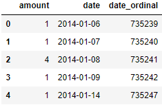
Start by adding a column of date ordinals

Seaborn will deal better with these than with dates. This is a handy trick for doing all kind of mathy things with dates and libraries that don't love dates.

from datetime import date

df['date_ordinal'] = pd.to_datetime(df['date']).apply(lambda date: date.toordinal())

dataframe with ordinals

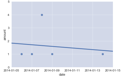
Make a plot with the ordinals on the date axis

ax = seaborn.regplot(
    data=df,
    x='date_ordinal',
    y='amount',
)
# Tighten up the axes for prettiness
ax.set_xlim(df['date_ordinal'].min() - 1, df['date_ordinal'].max() + 1)
ax.set_ylim(0, df['amount'].max() + 1)

Replace the ordinal X-axis labels with nice, readable dates

ax.set_xlabel('date')
new_labels = [date.fromordinal(int(item)) for item in ax.get_xticks()]
ax.set_xticklabels(new_labels)

plot with regression line

ta-daa!

Geist answered 18/12, 2017 at 22:1 Comment(2)
This is great! I'd just add that I had to use new_labels = [dt.date.fromordinal(int(item)) for item in ax.get_xticks()] as I had import datetime as dt at the top of my script. I guess this answer assumes the user has done from datetime import date already.Blamed
yeah, you need that date import; it's in the first code block. Skip steps at your own risk ;)Geist
P
3

Since Seaborn has trouble with dates, I'm going to create a work-around. First, I'll make the Date column my index:

# Make dataframe
df = pd.DataFrame({'amount' : [1,
                               1,
                               4,
                               1,
                               1]},
                  index = ['2014-01-06',
                           '2014-01-07',
                           '2014-01-08',
                           '2014-01-09',
                           '2014-01-14'])

Second, convert the index to pd.DatetimeIndex:

# Make index pd.DatetimeIndex
df.index = pd.DatetimeIndex(df.index)

And replace the original with it:

# Make new index
idx = pd.date_range(df.index.min(), df.index.max())

Third, reindex with the new index (idx):

# Replace original index with idx
df = df.reindex(index = idx)

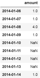
This will produce a new dataframe with NaN values for the dates you don't have data:

df edit

Fourth, since Seaborn doesn't play nice with dates and regression lines I'll create a row count column that we can use as our x-axis:

# Insert row count
df.insert(df.shape[1],
          'row_count',
          df.index.value_counts().sort_index().cumsum())

Fifth, we should now be able to plot a regression line using 'row_count' as our x variable and 'amount' as our y variable:

# Plot regression using Seaborn
fig = sns.regplot(data = df, x = 'row_count', y = 'amount')

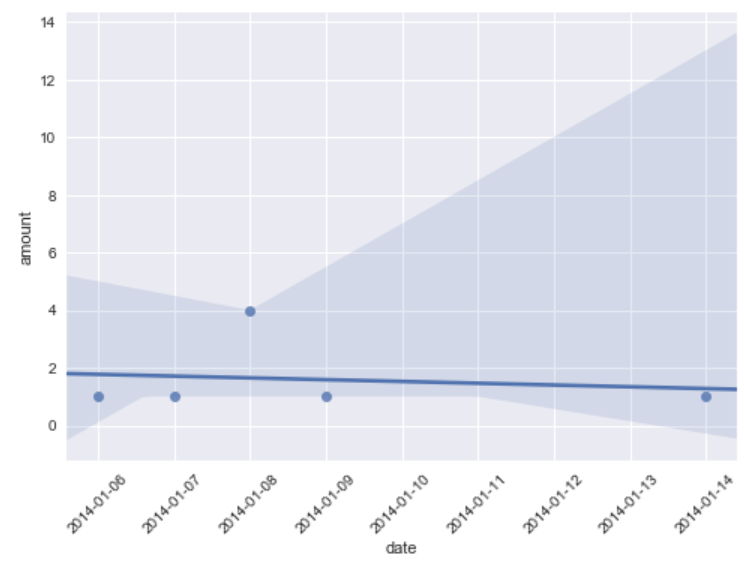
Sixth, if you would like the dates to be along the x-axis instead of the row_count you can set the x-tick labels to the index:

# Change x-ticks to dates
labels = [item.get_text() for item in fig.get_xticklabels()]

# Set labels for 1:10 because labels has 11 elements (0 is the left edge, 11 is the right
# edge) but our data only has 9 elements
labels[1:10] = df.index.date

# Set x-tick labels
fig.set_xticklabels(labels)

# Rotate the labels so you can read them
plt.xticks(rotation = 45)

# Change x-axis title
plt.xlabel('date')

plt.show();

plot edit 2

Hope this helps!

Papyrology answered 21/9, 2017 at 20:23 Comment(0)
K
2
  • The datetime dtype values must be converted to something like ordinal
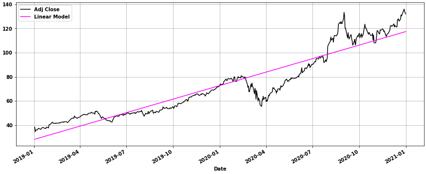
  • This can be done by calculating the model with sklearn.linear_model.LinearRegression and then adding the regression line with matplotlib.pyplot.plot
    • sns.lineplot(x=[x1_date, x2_date], y=[y1, y2], label='Linear Model', color='magenta') also works.
  • Tested in python 3.8.11, pandas 1.3.2, matplotlib 3.4.3, sklearn 0.24.2
import yfinance as yf  # for data
from sklearn.linear_model import LinearRegression
import matplotlib.pyplot as plt

# download the data
data = yf.download('aapl', '2019-01-02', '2021-01-01')

# add an ordinal column because sklearn doesn't work with datetimes
data['ordinal'] = data.index.map(pd.Timestamp.toordinal)

# create the model
model = LinearRegression()

# extract x and y from dataframe data
x = data[['ordinal']]
y = data[['Adj Close']]

# fit the mode
model.fit(x, y)

# print the slope and intercept if desired
print('intercept:', model.intercept_[0])
print('slope:', model.coef_[0][0])

# select x1 and x2 and get the corresponding date from the index
x1 = data.ordinal.min()
x1_date = data[data.ordinal.eq(x1)].index[0]
x2 = data.ordinal.max()
x2_date = data[data.ordinal.eq(x2)].index[0]

# calculate y1, given x1
y1 = model.predict(np.array([[x1]]))[0][0]

print('y1:', y1)

# calculate y2, given x2
y2 = model.predict(np.array([[x2]]))[0][0]

print('y2:', y2)

[out]:
intercept: -90078.45713565295
slope: 0.12225139598567565
y1: 28.279040945126326
y2: 117.40030861868581

Plot

ax1 = data.plot(y='Adj Close', c='k', figsize=(15, 6), grid=True, legend=False)
ax1.plot([x1_date, x2_date], [y1, y2], label='Linear Model', c='magenta')
ax1.legend()

enter image description here

Katelyn answered 14/9, 2021 at 11:56 Comment(0)

© 2022 - 2024 — McMap. All rights reserved.