Using pandas crosstab to create a bar plot
Asked Answered
H

3

8

I am trying to create a stacked barplot in seaborn with my dataframe.

I have first generated a crosstab table in pandas like so:

pd.crosstab(df['Period'], df['Mark'])

which returns:

  Mark            False  True  
Period BASELINE    583    132
       WEEK 12     721      0 
       WEEK 24     589    132 
       WEEK 4      721      0

I would like to use seaborn to create a stacked barplot for congruence, ans this is what I have used for the rest of my graphs. I have struggled to do this however as I am unable to index the crosstab.

I have been able to make the plot I want in pandas using .plot.barh(stacked=True) but no luck with seaborn. Any ideas how i can do this?

Hexapod answered 21/4, 2017 at 14:0 Comment(1)
As an FYI, stacked bars are not the best option because they can make it difficult to compare bar values and can easily be misinterpreted. The purpose of a visualization is to present data in an easily understood format; make sure the message is clear. Side-by-side bars are often a better option. Stacked bars may be appropriate for comparing total amount across groups, or for comparing relative differences between quantities in each group. Stacked Bar Graph.Cacomistle
O
34
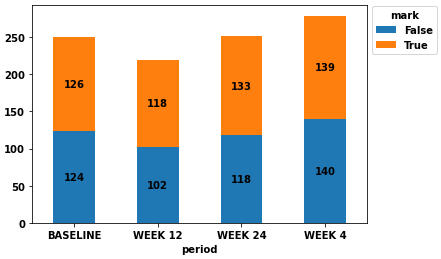
  • As you said you can use pandas to create the stacked bar plot. The argument that you want to have a "seaborn plot" is irrelevant, since every seaborn plot and every pandas plot are in the end simply matplotlib objects, as the plotting tools of both libraries are merely matplotlib wrappers.
  • Here's a complete solution (using the data creation from @andrew_reece's answer).
  • Tested in python 3.8.11, pandas 1.3.2, matplotlib 3.4.3, seaborn 0.11.2
import numpy as np 
import pandas as pd
import seaborn as sns
import matplotlib.pyplot as plt

n = 500
np.random.seed(365)
mark = np.random.choice([True, False], n)
periods = np.random.choice(['BASELINE', 'WEEK 12', 'WEEK 24', 'WEEK 4'], n)

df = pd.DataFrame({'mark': mark, 'period': periods})
ct = pd.crosstab(df.period, df.mark)
    
ax = ct.plot(kind='bar', stacked=True, rot=0)
ax.legend(title='mark', bbox_to_anchor=(1, 1.02), loc='upper left')

# add annotations if desired
for c in ax.containers:
    
    # set the bar label
    ax.bar_label(c, label_type='center')

enter image description here

Oedipus answered 21/4, 2017 at 23:42 Comment(0)
B
10
  • The guy who created Seaborn doesn't like stacked bar charts (but that link has a hack which uses Seaborn + Matplotlib to make them anyway).
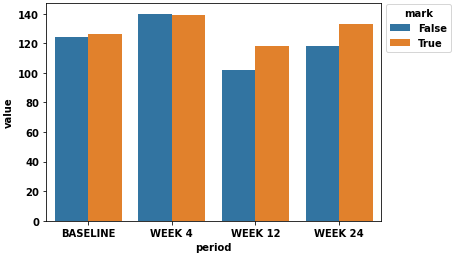
  • If you're willing to accept a grouped bar chart instead of a stacked one, following are two approaches
  • Tested in python 3.8.11, pandas 1.3.2, matplotlib 3.4.3, seaborn 0.11.2
# first some sample data
import numpy as np 
import pandas as pd
import seaborn as sns

N = 1000
np.random.seed(365)
mark = np.random.choice([True, False], N)
periods = np.random.choice(['BASELINE', 'WEEK 12', 'WEEK 24', 'WEEK 4'], N)

df = pd.DataFrame({'mark':mark,'period':periods})
ct = pd.crosstab(df.period, df.mark)

mark      False  True
period               
BASELINE    124   126
WEEK 12     102   118
WEEK 24     118   133
WEEK 4      140   139

# now stack and reset
stacked = ct.stack().reset_index().rename(columns={0:'value'})

# plot grouped bar chart
p = sns.barplot(x=stacked.period, y=stacked.value, hue=stacked.mark, order=['BASELINE', 'WEEK 4', 'WEEK 12', 'WEEK 24'])
sns.move_legend(p, bbox_to_anchor=(1, 1.02), loc='upper left')

enter image description here

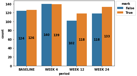
  • The point of using pandas.crosstab is to get the counts per group, however this can be bypassed by passing the original dataframe, df, to seaborn.countplot
ax = sns.countplot(data=df, x='period', hue='mark', order=['BASELINE', 'WEEK 4', 'WEEK 12', 'WEEK 24'])
sns.move_legend(ax, bbox_to_anchor=(1, 1.02), loc='upper left')

for c in ax.containers:
    
    # set the bar label
    ax.bar_label(c, label_type='center')

enter image description here

Bebe answered 21/4, 2017 at 22:54 Comment(0)
G
0

I recommend using seaborn histplot, especially if you have more than 2 values for the categorical data.

import numpy as np 
import pandas as pd
import seaborn as sns

N = 1000
np.random.seed(365)
mark = np.random.choice([True, False], N)
periods = np.random.choice(['BASELINE', 'WEEK 12', 'WEEK 24', 'WEEK 4'], N)


df = pd.DataFrame({'mark':mark,'period':periods})
group_df = df.groupby(['period', 'mark']).size().reset_index(name='count')

plt.figure(figsize=(10,6))
ax = sns.histplot(group_df, y='period', hue='mark', weights='count',
             multiple='stack', palette='colorblind')

horizontal histplot

Gisellegish answered 8/8 at 16:38 Comment(0)

© 2022 - 2024 — McMap. All rights reserved.