I'm making some TabView buttons in SwiftUI (Xcode 11.1, Swift 5.1, and iOS 13.1.3).
For my TabView, I don't want any images -- just text. This code accomplishes that nicely:
import SwiftUI

struct ContentView: View {
    var body: some View {

        TabView {
            Text("The First Tab")
                .tabItem {
                    Text("My Projects")
            }
            Text("Another Tab")
                .tabItem {
                    Text("Augmented Reality")
            }

            Text("The Last Tab")
                .tabItem {
                    Text("Products")
            }
        }
    }
}
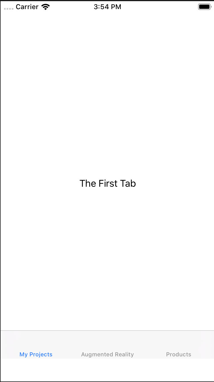
However, in this case, the text ends up aligned to the very bottom of the tab bar items, like this:

What I want, though is for the tab bar not to reserve space for the icons, and to vertically center the text -- something like this mock-up:
I've tried sticking it in a VStack and trying to adjust the alignment, but nothing changes.
Is there some smart way to do this, or do I need to do some sort of offset by a specific number of points?
Also FYI, Apple's developer doc says, "Tab views only support tab items of type Text, Image, or an image followed by text. Passing any other type of view results in a visible but empty tab item."
I should add that I can use .offset to adjust the entire TabView, but that's obviously not what we want. .tabItem itself ignores any .offset given, as does the Text within .tabItem.
I was able to get closer, by doing this -- essentially I'm moving the content view for each tab down by 40.0 points, and then moving the entire TabView up by 40. This looks much closer, but the background behind the tabs is then messed up:
Here's the code:
struct ContentView: View {
    let vOffset: CGFloat = 40.0
    var body: some View {


        TabView {
            Text("The First Tab")
                .tabItem {
                    Text("My Projects")
            }.offset(CGSize(width: 0.0, height: vOffset))

            Text("Another Tab")
                .tabItem {
                    Text("Augmented Reality")
            }.offset(CGSize(width: 0.0, height: vOffset))

            Text("The Last Tab")
                .tabItem {
                    Text("Products")
            }.offset(CGSize(width: 0.0, height: vOffset))
        }
        .offset(CGSize(width: 0.0, height: -vOffset))
    }
}
Here's what it looks like:
I assume it will be possible in some way to fix that background, though haven't quite figured out how yet.
The other thought is that I wonder if it's even a good idea to do this sort of "hacky" thing. Or if this even is a hacky thing? I know the whole idea of the declarative nature of SwiftUI is to separate the implementation from the declaration. With that in mind, it would be conceivable to expect that some future implementation could look very different, and thus be made to look stupid via the hacky offsets I'm doing here.
That aside, I still want to do it, for now anyway. 😊
So for now I'm looking for a way to fix the background color of the tab bar area, and also, of course, a less hacky way to solve the original problem.
Thanks!


appearance.UITabBar.appearance().backgroundColor = UIColor.green. – Moriarty