Wrap horizontal based on height?
Asked Answered
P

2

9

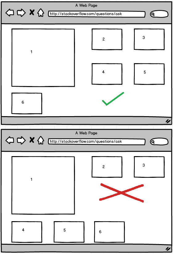
I'm using layout horizontal wrap to locate some items based on its size and the container. These items have different sizes so, sometimes, I'm losing a lot of space below them.

Better if I show you a sketch with the situation...

enter image description here

My relevant code looks like:

<style>
  .high {
      height: 200px;
    }

    .low {
      height: 50px;
    }

    .object {
      min-width: 200px;
    }
</style>
<div class="layout horizontal wrap" style="height:auto" id="container">
  <div class="object high">
    <p>1</p>
  </div>
  <div class="object low">
    <p>2</p>
  </div>
  <div class="object low">
    <p>3</p>
  </div>
  <div class="object low">
    <p>4</p>
  </div>
</div>
<script type="text/javascript">
  $(function() {

      $("#container").sortable({
        cursor: "move"
      });
    });
</script>

Those elements are sortable, so the user can move them. A solution with fixed positions is not possible.

Is it possible to resolve it using polymer-shadow? Any idea?

I did a plnkr where you can reproduce it

Update

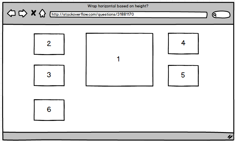
As I´m getting some suggestions to use float and I'm getting some difficulties to explain the problem I'm having with it, I'm adding a new sketch to show a possible goal. Notice how the user could move the small items at both sides of the big one. goal Sketch
Parolee answered 7/8, 2015 at 15:14 Comment(10)
Hey, would you mind posting your code directly in your question itself instead of only on plnkr? That way, if something ever happens to your plnkr, other people can still get help from this question.Swam
Really true, @oxguy3 It was weird, usually I have a notification about it when I post a question with a plnkr reference without code. I've extend my question.Parolee
Immediately after seeing your sketch, i thought why don't you use floats. It seems as the boxes have a predetermined size and it would be much easier than to fiddle with the flex layout...Heinie
Thanks @Heinie for your suggestion. I've try with float: left, but it doesn't allow me to have multiple small objects at the left side of a big one (1st column items 2,3,4. 2nd column item 1). I've modify the plunkr with this fork plnkr.co/edit/7fm9zO?p=preview .Parolee
I don't think you can achieve your last example using float or display: inline-block, check out my answer I explained why you can't do it using float here: #5235249Liberalism
Sorry, now i'm not really getting it. Is the big box fixed in the middle, or is it also draggable? Do you want something like boxes sticking to a grid? I think all you layouts are achieveable via pure CSS, but if users can sort and drag the boxes freely - that's a completely different story!Heinie
Exactly @Kjell, all the items are draggable. It's like Windows tilesParolee
Then u are better off with a grid library; Like: gridster.netHeinie
Try this plunk.. Maybe it helps... plnkr.co/edit/qH25iYvzSDxIdPx2UDhF?p=previewBagley
Can you try to use the CSS Grid layouts? egghead.io/lessons/css-specify-a-grid-gutter-size-with-grid-gapSailesh
R
0

This CSS make the design look like your wireframe:

  <div class="object high">
  <p>1</p>
</div>
<div class="object low">
  <p>2</p>
</div>
<div class="object low">
  <p>3</p>
</div>
<div class="object low">
  <p>4</p>
</div> 

 #container{
          display:table;
          float:left;
          width:100%;
        }

        .object.high {
          height: 200px;
          display:table-cell;
          float:right;
          width:49%;
          margin-left:1%;
        }

        .object.low {
          height: 50px;
          width:24%;
          margin-right:1%;
          display:table-cell;
          float:left;
        }

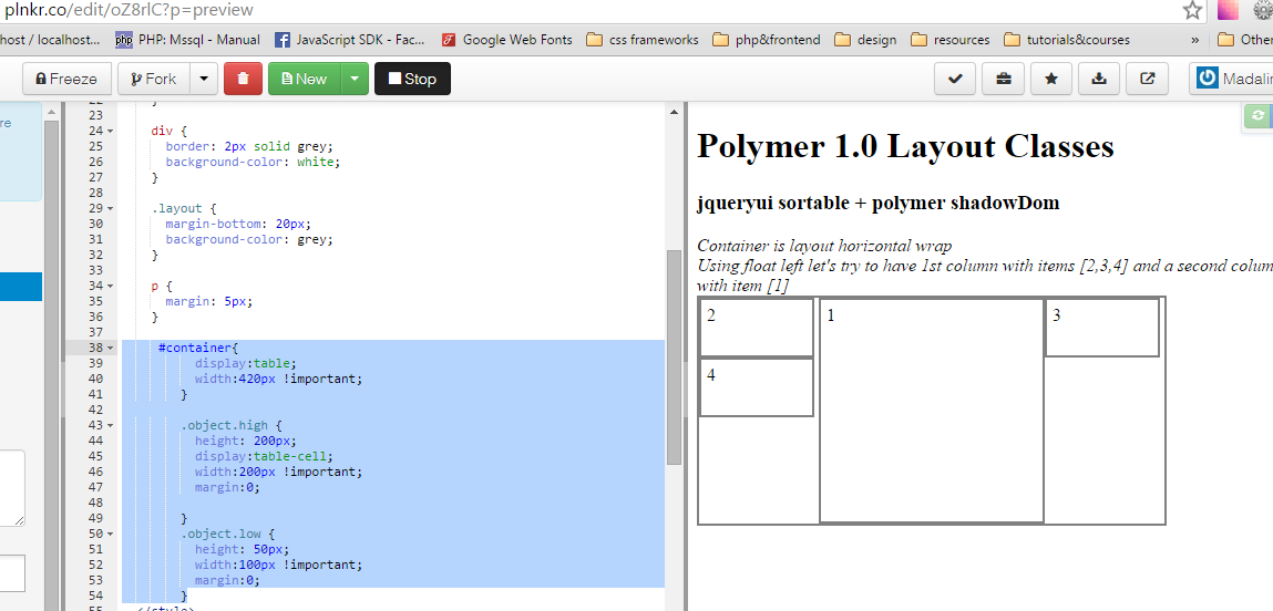
Update:

 #container{
      display:table;
      width:420px !important;
    }

    .object.high {
      height: 200px;
      display:table-cell;
      width:200px !important;
      margin:0;

    }
    .object.low {
      height: 50px;
      width:100px !important;
      margin:0;
    }

enter image description here

Maybe this will help.

Rokach answered 27/8, 2015 at 9:34 Comment(7)
Thanks, but it has the same problem that @Heinie suggestion. Floating left moves the lost space to the left side. I fork the plnkr with your css, you can check the problem there plnkr.co/edit/xzOMGX?p=previewParolee
I tried this there and it was ok. I will try again. Probably, I changed something here.Rokach
I just can't understand. Why you have changed the html? Fot the initial html, with the first column bigger, the CSS is ok.Rokach
Sorry about the confusion. Just to show, by default, the behaviour when problem appears. Items are sortable, so the user can move the items and get that lost space at the left side.Parolee
Exactly Madalina, in your plnkr you can see how it's not possible -as I commented in the italic lines in the plunkr- to make a first column with the small items at the left side of the big one. Remember that the items are sortable. I've add a new sketch to the question in order to clarify that situation.Parolee
If you put float right to the highest div, and float left to the lowest div, it will be ok.Rokach
Thanks, Madalina. Your update is ok to allow items at both sides of the big element, but the table-cellelement is getting the whole height, so it doesn't allow any other row under it. If you try to reproduce the position of the 6th element in my sketches you will see that is not possible with your solution.Parolee
S
0

If the heights of the elements are dynamic then floats will not always work as you have seen, but if you can say that the widths remain the same you can add a bit of JS to move elements up to make a nice fit

here is a js bin to show the result http://jsbin.com/xeyife

in this gist I did a while back the js is wrapped up in angular

https://gist.github.com/MrAntix/c4edb6a14c9d419bfc44#file-index-html-L90

basically you loop through the elements grouping them in columns by their left pixel value

var column='_'+left;

the height of the column is stored away, each time you add an element you increase the column height by the elements height

columns[column]+=height;

and the element is moved up by setting the margin, which closes the gap

cellElement.css({marginTop:(columns[column]-top)+'px'});

you can only do this with JS and CSS

btw. I am not sure css flex would help here as your elements need to be in the same container

Sheppard answered 6/9, 2015 at 23:59 Comment(0)

© 2022 - 2024 — McMap. All rights reserved.