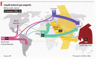
The fascinating chart below is in the Economist, Jan. 30, 2016 at 61. It depicts exports of liquified natural gas (LNG) from five regions to six regions. How can R draw something similar to it, perhaps with several Sankey diagrams (from the package riverplots) but with arrows reversed as the depicted arrow heads? Meaning, the flows into the exporting region would show as flowing out.
Extracting the data from the plot by eyeball resulted in the df data frame. The variables have strange names because the `riverplot requires unique node names.
> dput(df)
structure(list(ID = structure(c(1L, 6L, 9L, 13L, 2L, 7L, 14L,
3L, 10L, 15L, 4L, 11L, 5L, 8L, 12L, 16L), .Label = c("Africa-Asia",
"Africa-Europe", "Africa-Nam", "Africa-SE", "Africa-SthAm", "Europe-Asia",
"Europe-Europe", "Europe-SthAm", "MidEast-Asia", "MidEast-NthAm",
"MidEast-SE", "MidEast-SthAm", "SE Asia-Asia", "Sth Am.-Eur",
"Sth Am.-NthAm", "Sth Am.-SthAm"), class = "factor"), x = c(-30,
1, 20, 100, -30, 1, -100, -30, 20, -100, -30, 20, -30, 1, 20,
-100), y = c(120, 120, 120, 120, 1, 1, 1, -120, -120, -120, 100,
100, -100, -100, -100, -100), value = c(21, 22, 290, 100, 22,
3, 16, 1, 5, 6, 2, 62, 3, 3, 5, 3), col = structure(c(2L, 3L,
5L, 1L, 2L, 3L, 4L, 2L, 5L, 4L, 2L, 5L, 2L, 3L, 5L, 4L), .Label = c("brickred",
"green", "purple", "red", "yellow"), class = "factor"), region = structure(1:16, .Label = c("Asia-Africa",
"Asia-Eur", "Asia-ME", "Asia-SE", "Europe-Africa", "Europe-Eur",
"Europe-SthAm", "No. Am.-Africa", "No. Am.-ME", "No. Am.-Stham",
"SE Asia-Afr", "SE Asia-MI", "Sth. Am.-Africa", "Sth. Am.-Eur",
"Sth. Am.-ME", "Sth. Am.-SthAm"), class = "factor")), .Names = c("ID",
"x", "y", "value", "col", "region"), row.names = c(NA, -16L), class = "data.frame")
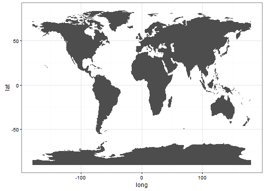
Creating the map is straightforward (although it would look better with Antarctica melted!). Tru, the goal is not a choropleth -- with colored regions according to some variable -- but Ari Lamstein's package choroplethr and its complement, choroplethrMaps, easily creates a world map.
library(choroplethr)
library(choroplethrMaps)   # to obtain a map of the world
library(ggplot2)
library(riverplot)

data(country.map)          # choose a world map
world <- ggplot(country.map, aes(long, lat, group=group)) +
  geom_polygon(fill = "grey10") +
  theme_bw()
But the riverplot foiled me, and even if I had gotten an overall plot working, is there code to make four of them (one for each LNG exporting region) and overlay them on the world map?
nodes.df <- df
nodes.df$ID <- capwords(as.character(nodes.df$ID))
nodes.df$ID <- as.factor(nodes.df$ID)

edges.df <- df
edges.df <- setNames(edges.df, c("ID", "N1", "N2", "Value", "Color", "Region"))

edges.df <- df[  , c("region", "x", "y", "value", "col", "region")]         #  use different ID names
edges.df <- setNames(edges.df, c("ID", "N1", "N2", "Value", "Color", "Region"))


river <- makeRiver(nodes = nodes.df, edges = edges.df, node_labels = NULL,
                   node_xpos = nodes.df$x, node_ypos = nodes.df$y)

Error in checkedges(edges, nodes$ID) :
  edges must not have the same IDs as nodes


