frequency axis in continuous wavelet transform plot (scaleogram) in python
Asked Answered
S

1

9

I have an EEG signal that I'm interested in analyzing it in both time and frequency domains. I have already used scipy.signal.spectrogram function, but I think using wavelets can yield better results for feature extraction. I tried running the continuous wavelet transform on artificial signal that I created as follows:

fs = 128.0
sampling_period = 1/fs
t = np.linspace(0, 2, 2*fs)
x = chirp(t,10,2,40,'quadratic')

coef, freqs = pywt.cwt(x, np.arange(1,50),'morl', 
sampling_period=sampling_period)

and then I plotted the coef matrix:

plt.matshow(coef)
plt.show()

the resuls for the code above

My question is how can I adjust the scale and time axes?

Succinct answered 24/4, 2017 at 11:51 Comment(0)
P
4

The function plt.matshow(coef) does not use the time and and frequency arrays for creating axes (but it creates sample-index based axes).

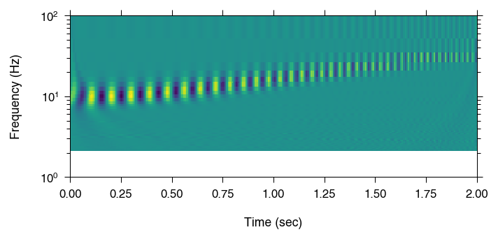
I suggest using plt.pcolormesh(t, freqs, coef), so the time and frequency are used for the axes. Then you can play with scale – say, put the frequency axis in log scale – and produce something like that:

enter image description here

Here is the code that produced the image, derived from your example:

import pywt
import numpy as np
import matplotlib.pyplot as plt

from scipy.signal import chirp

# Define signal
fs = 128.0
sampling_period = 1 / fs
t = np.linspace(0, 2, 2 * fs)
x = chirp(t, 10, 2, 40, 'quadratic')

# Calculate continuous wavelet transform
coef, freqs = pywt.cwt(x, np.arange(1, 50), 'morl',
                       sampling_period=sampling_period)

# Show w.r.t. time and frequency
plt.figure(figsize=(5, 2))
plt.pcolor(t, freqs, coef)

# Set yscale, ylim and labels
plt.yscale('log')
plt.ylim([1, 100])
plt.ylabel('Frequency (Hz)')
plt.xlabel('Time (sec)')
plt.savefig('egg.png', dpi=150)
Polyphyletic answered 25/5, 2018 at 3:25 Comment(0)

© 2022 - 2024 — McMap. All rights reserved.