CSS grid with auto-sized auto-filled rows
Asked Answered
C

2

9

I'd like to create a grid of items that places as many items on each row as can fit. It should:

  • Automatically size columns to fit their elements
  • Automatically add/remove columns to fit the container

Effectively, I'm looking for a table with auto-sized columns and an auto number of columns. Flexbox with flex-wrap doesn't work for me, since the columns wouldn't be aligned.

I've tried using grid with auto-fill, but I can't figure out how to ensure each column grows to fit its content. In this example, it only works if I specify a fixed minimum width, e.g.:

grid-template-columns: repeat(auto-fill, minmax(50px, 1fr));

I tried replacing the minmax function with auto, but that results in each column taking up 100% width. Is there another way to achieve what I'm trying to do (without JavaScript)?

div {
  width: 300px;
  border: 1px solid red;
  display: grid;
  grid-template-columns: repeat(auto-fill, minmax(50px, 1fr));
}
<div>
  <span>word</span>
  <span>word</span>
  <span>longword</span>
  <span>word</span>
  <span>longword</span>
  <span>word</span>
  <span>word</span>
  <span>word</span>
  <span>word</span>
  <span>word</span>
  <span>word</span>
  <span>word</span>
  <span>word</span>
  <span>word</span>
</div>

My desired layout would look just like the above, except that any columns containing a "longword" cell would be wide enough to fit that cell (and the number of columns would shrink, if necessary). The end result would be several auto-sized columns, each of which is only as wide as necessary to fit their cells' contents. Basically, an HTML table with an indeterminate number of columns.

Crept answered 5/4, 2022 at 21:3 Comment(1)
I've had this same problem for ages I don't think there's an elegant solutionDossal
H
3

This requirement leads to contradictory scenarios:

Let's say there are 6 cells with the following lengths in that particular order:
11111, 2, 3, 44444, 5, 6

  • 3 columns → width: 7

    |11111|2|3|
    |44444|5|6|
    
  • 2 columns → width: 10

    |11111|2    |
    |3    |44444|
    |5    |6    |
    

⚠️ Reducing the number of columns for smaller screens would result in a wider grid in that case and it wouldn't fit any more.

This is at least one reason why the layout of such a grid could be a complex task, is not supported by CSS and why it is probably not a good idea in general.

Suggestions (CSS-only):

  • Manually define the number of columns for each screen size using media queries
  • or just use flex-wrap and make all cells the same width if they should align.
Headforemost answered 7/4, 2022 at 23:37 Comment(5)
Thanks for the suggestions. I don't know the width of the content, so I can't manually define the widths. I'll look into a JS solution. (I don't mind if all the columns are the same width, but I just don't know what that width would be a priori.)Crept
You don't know the natural widths of the cell contents but you could still treat the cells as containers and set their width to a fixed value, for example width: 400px; max-width: 100vw. You need to restrain the width to a certain value anyways, otherwise a big paragraph of text would result in just a single, very long line, which you probably don't want to have.Headforemost
It's key for the cells to be as narrow as possible based on their contents. A fixed width of 400px enforces a minimum width of 400px, right?Crept
Regardless, thanks for the suggestions and for pointing out the contradictory requirements! You're probably right that there's no CSS-only solution to what I'm trying to achieve so I'm marking this as the answer.Crept
Css width sets the width. If it's a container and its contents are smaller, it will still have that width. If the contents are wider you can control the behavior with overflow.Headforemost
S
1

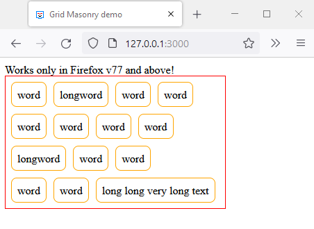
If you are looking for a masonry layout. The CSS specification for it is still in draft level ref.

However, you can try the specification in Firefox v77 and above. ref
In about:config set the preference layout.css.grid-template-masonry-value.enabled to true and try this demo:

div {
  padding: .5rem;
  width: 300px;
  display: grid;
  gap: 10px;
  grid-template-columns: masonry;
  grid-template-rows: repeat(4, auto);
  border: 1px solid red;
}

div span {
  display: inline-block;
  padding: .5rem;
  border: 1px solid orange;
  border-radius: .5rem;
}
Works only in Firefox v77 and above!
<div>
  <span>word</span>
  <span>word</span>
  <span>longword</span>
  <span>word</span>
  <span>longword</span>
  <span>word</span>
  <span>word</span>
  <span>word</span>
  <span>word</span>
  <span>long long very long text</span>
  <span>word</span>
  <span>word</span>
  <span>word</span>
  <span>word</span>
</div>

For those who do not have Firefox installed, this is how it looks: enter image description here

More demos are available here


For now you'll have to use JavaScript based solutions like:

Secularity answered 8/4, 2022 at 6:35 Comment(1)
Very cool, but my question specifies that columns should be aligned. Your example looks a lot like flex with flex-wrap. The draft spec says: "Items are placed into the column (or row) with the most remaining space based on the layout size of the items placed so far", which I think is not what I want.Crept

© 2022 - 2024 — McMap. All rights reserved.