What is it in the CSS/DOM that prevents an input box with display: block from expanding to the size of its container
Asked Answered
P

6

19

Sample HTML/CSS:

<div class="container">
    <input type="text" />
    <div class="filler"></div>
</div>

div.container {
    padding: 5px;
    border: 1px solid black;
    background-color: gray;
}

div.filler {
    background-color: red;
    height: 5px;
}

input {
    display: block;
}

http://jsfiddle.net/bPEkb/3/

Question

Why doesn't the input box expand to have the same outer width as, say div.filler? That is to say, why doesn't the input box expand to fit its container like other block elements with width: auto; do?

I tried checking the "User Agent CSS" in Firebug to see if I could come up with something there. No luck. I couldn't find any specific differences in CSS that I could specifically link to the input box behaving differently from the regular div.filler.

Besides curiousity, I'd like to know why this is to get to the bottom of it to figure out a way to set width once and forget it. My current practice of explicitly setting the width of both input and its containing block element seems redundant and less than modular. While I'm familiar with the technique of wrapping the input element in a div then assigning to the input element negative margins, this seems quite undesirable.

borkweb and Phrogz have both provided exceptional information that takes advantage of the border-box box model from the old days. Thanks for this! I'd like to reiterate the focus of my question that I intend to keep distinct from the proposed solution to my practical problem:

What about the specification causes input boxes to be formatted unlike ordinary block elements like divs? The border-box solution is wonderful, but it doesn't satisfy the desire to figure out why input boxes are this way in the first place and why they can't be made to behave exactly like ordinary divs, which do not use the border-box model these days.

Peep answered 31/12, 2010 at 4:1 Comment(7)
besides quirksmode.org/css/display.html#block I'ld question what does width:auto; imply in this situation? It doesn't imply "full parent width"Multifaceted
@drachenstern: I concede that my understanding of width: auto; is shotty at best. I've only ever used it when trying to force a non-floated block element to take up the rest of the container width next to a floated element. I'll remove it to avoid confusion in this case, although it seems not to make a difference.Peep
It doesn't, because width: auto; is generally the default setting. There's reasons to use it in a stylesheet, but in this case I'm almost certain that what you want is width: 100%;Multifaceted
@drachenstern: Please see my below comment on why width: 100% is insufficient because it sets the input width to the inner width of the container, and subsequent padding and borders will be in excess.Peep
possible duplicate of input with display:block is not a block, why not?Galatians
@Phrogz: Thanks for the link. That solution is definitely more satisfying than my DOM hack. To the question of closing this one, the main predicates of the questions are different: I am asking, above all, what about the specification causes this sort of behaviour in the input box; the linked post just asks for a way to solve it. I will reword my question to make this very distinct objective clear.Peep
@StevenXu Understood and agreed. I want to know, too. :) Some things I saw on my search lead me to believe that it may be related to the fact that the default is width:auto but what that means might vary. (Why or where this is codified, I don't know.)Galatians
P
25

Alright, due to the clarification of the original question...I did some digging and found these laments and this article.

There are a few elements (<input>, <select>, <button>, <img>, <object>, and <textarea>) that are considered replaced elements whose appearance and dimensions are defined by an external resource. (e.g. the operating system, a plugin, etc)

Replaced elements can have intrinsic dimensions—width and height values that are defined by the element itself, rather than by its surroundings in the document. For example, if an image element has a width set to auto, the width of the linked image file will be used. Intrinsic dimensions also define an intrinsic ratio that’s used to determine the computed dimensions of the element should only one dimension be specified. For example, if only the width is specified for an image element—at, say, 100px—and the actual image is 200 pixels wide and 100 pixels high, the height of the element will be scaled by the same amount, to 50px.

Replaced elements can also have visual formatting requirements imposed by the element, outside of the control of CSS; for example, the user interface controls rendered for form elements.

W3C's CSS 2.1 "Visual Formatting Model Details" section discusses the calculation of widths of both replaced and non-replaced elements.

Overall...pretty annoying for some form elements (<textarea>, <button>, and <input>). Can/will it change? Probably not any time soon...Until it does change at the core, we'll have to stick with the hacks :(

Parks answered 31/12, 2010 at 5:50 Comment(4)
Thanks for this, borkweb. I have familiarized myself with replaced elements, but I had no clue that input elements belonged in this category. In retrospect, this still doesn't make any sense. Links: definition of replaced element; width of inline replaced elements. I'd like to dig a bit further into options with the box-sizing declaration; perhaps there is a value that forces non-replaced element-like behaviour.Peep
Upon further inspection as well as your other sources, it doesn't seem feasible at this moment (although it does explain why I've never gotten line-height to work in input boxes). Among the non-JS/Flash options of replacing input text boxes with editable divs, wrapping them in containing divs, and using border-box, it seems like the last one is the best if only to maintain DOM structure.Peep
One of the articles I linked to in the above post (meyerweb.com/eric/thoughts/2007/05/15/formal-weirdness) discusses some of the reasons behind form elements acting as replaced elements. It is weird, however, at least there seems to be some very small amount of sanity behind it. :/Parks
I've reviewed the article, and it's really highly unconvincing. Total conversion plugins like jQueryMobile amply demonstrate that non-replaced input quasi-elements can fully take the place of the current replaced elements. I do understand, however, the need for legacy support and will come to accept it. It truly would be a shame though if these same replaced elements fully make their way into the HTML5 specification.Peep
P
6

You can accomplish this by making use of the box-sizing CSS property on the input box:

input {
    display: block;
    width: 100%;
    box-sizing: border-box; /* CSS3 */
    -moz-box-sizing: border-box; /* Firefox */
    -ms-box-sizing: border-box; /* IE8 */
    -webkit-box-sizing: border-box; /* Safari */
    -khtml-box-sizing: border-box; /* Konqueror */
}

Additionally, to get it to work with IE6 & IE7, you'll need to throw this in your HTML:

<!--[if lt IE 8]><style>input{behavior:url("boxsizing.htc");}</style><![endif]-->

See it in action, here.

Get the boxsizing.htc here.

SpliFF's post was my source a while back and I've used it a couple times since.

Parks answered 31/12, 2010 at 4:39 Comment(4)
As the comments clearly indicate, he's trying to NOT use the width: 100%; setting and he has a padding on the parent element, causing the width to be miscalculated. Additionally, I doubt CSS3 is on his plate.Multifaceted
Yeah...I saw that. Why an input's width fails to function like a block element - with regards to width - is beyond me, however, the above solution allows one to use width: 100% without the width actually being miscalculated. In other words, it forces the input element to function like a typical block level element.Parks
so apparently the word is that input elements have a different internal box model ...Multifaceted
Thanks for this answer. It's a wonderful solution to my practical problem, but I'm afraid the initial question I posed remains unresolved :(.Peep
I
1

As far as I know, the default length of the input text field is 20 characters.

I guess that's the value it gets when you set it to auto. Usually it is not useful to have a text field of the size of width of the screen, that's why I guess it defaults to 20 characters in auto.

Anyway, it should be better to check the w3c standard, or get a response from some browser developer.

Intolerable answered 31/12, 2010 at 4:40 Comment(3)
I looked at the w3c on this one, and there's nothing about the width defined (or I missed it)Multifaceted
Yeah, I just checked there, but I cannot find any reference. But I'm totally sure that the default value is 20. I guess that comes from the browser vendors, if not w3c. Anyone with a friend in Mozilla?Intolerable
@Christian, I think you're talking about the <input> element's size attribute, which does indeed default to 20 (characters): developer.mozilla.org/en-US/docs/Web/HTML/Element/InputWaligore
C
0

if you want that the input element has the same width as div.filter, and if div.filter has the same width of div.container you can set width: 100% on input box.

Composure answered 31/12, 2010 at 4:12 Comment(5)
width: 100% only adjusts the inner width of the input box. Doing so very clearly makes the input element's outer width exceed the inner width of the containing div. Thus the question.Peep
@StevenXu It's because of the padding on the previous container. Try this for playing with jsfiddle.net/bPEkb/4Multifaceted
Thanks very much for your contribution, but I'm afraid this doesn't accomplish much. So long as width: 100%, the input box can't take a border or padding lest it exceed the inner width of the containing div. Sure, you can add a negative left margin (your negative right margin doesn't do much here) and center the difference, but the matter remains that you still have an input with an outer width wider than the containing div.container. I have made the issue abundantly clear here: jsfiddle.net/bPEkb/4Peep
@StevenXu I saw the "abundantly clear" reason there, and the options are either a) find the target width using javascript and setting the width of the textbox that way, or b) the way I demonstrated with negative margins. My negative margin hack was just that, a hack. I just wanted to demonstrate the fact that it could be done from the CSS. If I needed it to be the width of the internal, I would set it with javascript. Sorry.Multifaceted
The superior "hack" might be to include a containing div with positive margins equal to the sum of the padding+border.Peep
W
0

I have some findings on newly HTML spec:

  1. <input type="text"> elements are non-replaced elements.

    MDN:replaced element

  2. <input type="text"> should adjust the width according to its size attribute by default, if it does not have size attribute (unlimited input length), adjust width with 20 characters:

    HTML 5.2:The input element as a text entry widget

    HTML Living Standard:The input element as a text entry widget

    If an input element whose type attribute is in one of the above states(Text, Search, Telephone, URL, or E-mail) has a size attribute, and parsing that attribute's value using the rules for parsing non-negative integers doesn't generate an error, then the user agent is expected to use the attribute as a presentational hint for the 'width' property on the element, with the value obtained from applying the converting a character width to pixels algorithm to the value of the attribute.

    If an input element whose type attribute is in one of the above states does not have a size attribute, then the user agent is expected to act as if it had a user-agent-level style sheet rule setting the 'width' property on the element to the value obtained from applying the converting a character width to pixels algorithm to the number 20.

Workingman answered 31/1, 2020 at 7:54 Comment(0)
W
0
  • In my HTML I have a <ul> menu...

    • where some <li> elements have <button> content.
    • some other <li> elements have <label> content (wrapping a checkbox and <span>).
    • and most remaining <li> elements have a child-menu as their content.
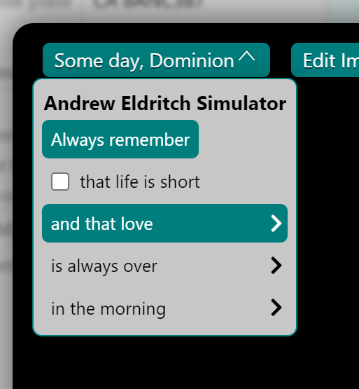
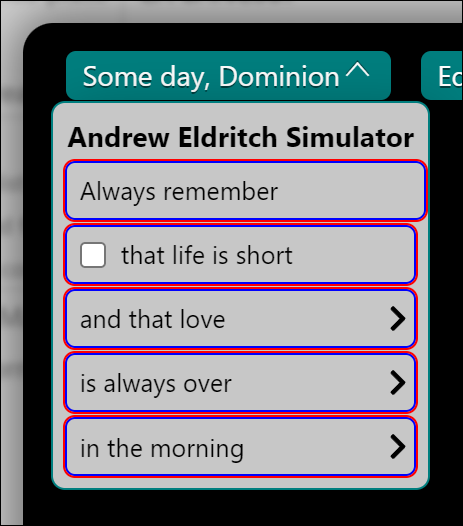
  • I'm having the same problem as an old duplicate of this question post: where it's a <button> element that has seemingly identical computed-styles as the li > label elements and yet the final rendered layout width of the <button> is awkwardly different.

    • My stylesheet already specifies these style properties on the <button> elements in-question and the li > label elements, so they should be rendered the same... except they aren't:
      • appearance: none;
        • (so it shouldn't have any native or replaced button style or layout... right?)
      • display: block;
      • box-sizing: border-box;
      • width: 100%;
      • margin: 0.2em;
      • padding: 0.3em 0.5em;
      • border: none;
      • border-radius: 5px;
  • This is how it looks in Firefox and Chrome. (I've used the "force :hover" tool to show the teal background-color of two of the <li> children to show the effective size of the elements:

    • In this case, see how the top <li>'s <button> is akwardly ever-so-slightly wider than the other list items:
      • enter image description here
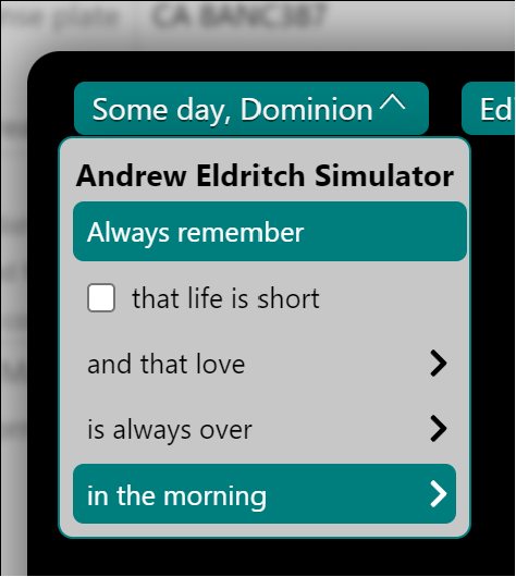
  • If I set width: auto; on the <button> then the <button> shrinks width in-place and looks like this:

    • enter image description here
    • ...however, setting width: auto; on li > label has no effect.
    • Therefore there is something inherent in <button> give it a different final layout compared to <label> even when all style properties are the same. Weird.
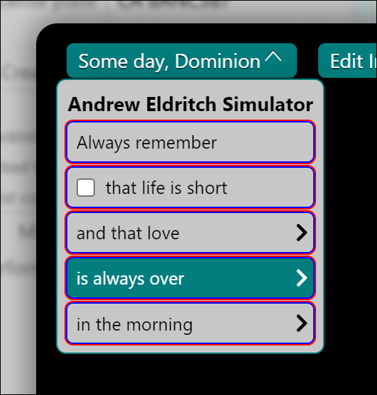
  • Here's a screenshot showing the same li > button, li > label, etc elements with outline: 1px solid red; border: 1px solid blue; set - the awkward size different is palpable:

    • enter image description here

  • After some experimentation I stumbled upon width: -webkit-fill-available; in Chrome's WebInspector's list of supported values for width: and to my surprise it works:.

    • enter image description here
  • However -webkit-fill-available has that dreaded vendor prefix, so what's a good, vendor-neutral, well-supported, solution?

    • ...according to caniuse.com there still isn't yet a finalized CSS specification version of width: -webkit-fill-available, hence all the synonyms and vendor-prefixes still.

    • So as of September 2022, try this:

      button {
          appearance: none;
          display: block;
          font-family: inherit;
      
          width: -webkit-fill-available; /* Chromium/Blink 46 to 108 and beyond */
          width: -moz-available; /* Firefox 66 to 106 and beyond */
          width: stretch; /* Safari/WebKit 11 and beyond */
      }
      
Walkup answered 11/9, 2022 at 8:6 Comment(0)

© 2022 - 2024 — McMap. All rights reserved.