How to add lines on combined ggplots, from points on one plot to points on the other?
Asked Answered
P

2

9

I need to reproduce plots generated in InDesign in ggplot for reproducibility.

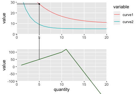
In this particular example, I have two plots that are combined into one composite plot (I have used the package {patchwork} for this).

I then need to overlay lines joining key points on one plot with the corresponding points on the bottom plot.

The two plots are generated from the same data, have the same x-axis values, but different y-axis values.

I have seen these examples on Stack Overflow, but these deal with drawing lines across facets, which doesn't work here as I'm attempting to draw lines across separate plots:

I've tried several approaches, and my closest so far has been to:

  1. Add the lines with grobs using {grid} package
  2. Convert the second plot to a gtable using {gtable} and set the clip of the panel to off so that I can extend the lines upwards beyond the panel of the plot.
  3. Combine the plots again into a single image with {patchwork}.

The problem comes in the last step as the x-axes now do not line up anymore as they did before adding the lines and setting the clip to off (see example in code).

I have also tried combining the plots with ggarrange, {cowplot} and {egg} and {patchwork} comes the closest.

Following is my attempt at the best minimal reprex I can create, but still capturing the nuances of what it is I want to achieve.

library(ggplot2)
library(dplyr)
library(tidyr)
library(patchwork)
library(gtable)
library(grid)

# DATA
x <- 1:20
data <- data.frame(
  quantity = x,
  curve1 = 10 + 50*exp(-0.2 * x),
  curve2 = 5 + 50*exp(-0.5 * x),
  profit = c(seq(10, 100, by = 10),
             seq(120, -240, by = -40))
)

data_long <- data %>%
  gather(key = "variable", value = "value", -quantity)

# POINTS AND LINES
POINTS <- data.frame(
  label = c("B", "C"),
  quantity = c(5, 10),
  value = c(28.39397, 16.76676),
  profit = c(50, 100)
)

GROB <- linesGrob()

# Set maximum y-value to extend lines to outside of plot area
GROB_MAX <- 200

# BASE PLOTS
# Plot 1
p1 <- data_long %>%
  filter(variable != "profit") %>%
  ggplot(aes(x = quantity, y = value)) +
  geom_line(aes(color = variable)) +
  labs(x = "") +
  coord_cartesian(xlim = c(0, 20), ylim = c(0, 30), expand = FALSE) +
  theme(legend.justification = "top")
p1

# Plot 2
p2 <- data_long %>%
  filter(variable == "profit") %>%
  ggplot(aes(x = quantity, y = value)) +
  geom_line(color = "darkgreen") +
  coord_cartesian(xlim = c(0, 20), ylim = c(-100, 120), expand = FALSE) +
  theme(legend.position = "none")
p2

# PANEL A
panel_A <- p1 + p2 + plot_layout(ncol = 1)
panel_A

# PANEL B
# ATTEMPT - adding grobs to plot 1 that end at x-axis of p1
p1 <- p1 +
  annotation_custom(GROB,
                    xmin = 0,
                    xmax = POINTS$quantity[POINTS$label == "B"],
                    ymin = POINTS$value[POINTS$label == "B"],
                    ymax = POINTS$value[POINTS$label == "B"]) +
  annotation_custom(GROB,
                    xmin = POINTS$quantity[POINTS$label == "B"],
                    xmax = POINTS$quantity[POINTS$label == "B"],
                    ymin = 0,
                    ymax = POINTS$value[POINTS$label == "B"]) +
  geom_point(data = POINTS %>% filter(label == "B"), size = 1)

# ATTEMPT - adding grobs to plot 2 that extend up to meet plot 1
p2 <- p2 + annotation_custom(GROB,
                             xmin = POINTS$quantity[POINTS$label == "B"],
                             xmax = POINTS$quantity[POINTS$label == "B"],
                             ymin = POINTS$profit[POINTS$label == "B"],
                             ymax = GROB_MAX)

# Create gtable from ggplot
g2 <- ggplotGrob(p2)

# Turn clip off for panel so that line can extend above
g2$layout$clip[g2$layout$name == "panel"] <- "off"

panel_B <- p1 + g2 + plot_layout(ncol = 1)
panel_B
# Problems:
# 1. Note the shift in axes when turning the clip off so now they do not line up anymore.
# 2. Turning the clip off mean plot 2 extends below the axis. Tried experimenting with various clips.

The expectation is that the plots in panel_B should still appear as they do in panel_A but have the joining lines linking points between the plots.

I am looking for help with solving the above, or else, alternative approaches to try out.

As a reference without running the code above - links to images as I can't post them.

Panel A

enter image description here

Panel B: What it currently looks like

enter image description here

Panel B: What I want it to look like!

enter image description here

Piggin answered 30/8, 2019 at 16:8 Comment(0)
D
5

My solution is a little ad hoc, but it seems to work. I based it on the following previous answer Left align two graph edges (ggplot).

I will break the solution in three parts to address some of the issues you were facing separately.

The solution that matches what you want is the third one!

First trial

Here I get the axis aligned using the same approach as this answer Left align two graph edges (ggplot).

# first trial 
# plots are aligned but line in bottom plot extends to the bottom
#
p1_1 <- p1 +
  annotation_custom(GROB,
                    xmin = 0,
                    xmax = POINTS$quantity[POINTS$label == "B"],
                    ymin = POINTS$value[POINTS$label == "B"],
                    ymax = POINTS$value[POINTS$label == "B"]) +
  annotation_custom(GROB,
                    xmin = POINTS$quantity[POINTS$label == "B"],
                    xmax = POINTS$quantity[POINTS$label == "B"],
                    ymin = 0,
                    ymax = POINTS$value[POINTS$label == "B"]) +
  geom_point(data = POINTS %>% filter(label == "B"), size = 1)

p2_1 <- p2 + annotation_custom(GROB,
                               xmin = POINTS$quantity[POINTS$label == "B"],
                               xmax = POINTS$quantity[POINTS$label == "B"],
                               ymin = POINTS$profit[POINTS$label == "B"],
                               ymax = GROB_MAX)

# Create gtable from ggplot
gA <- ggplotGrob(p1_1)
gB <- ggplotGrob(p2_1)

# Turn clip off for panel so that line can extend above
gB$layout$clip[gB$layout$name == "panel"] <- "off"

# get max width of left axis between both plots
maxWidth = grid::unit.pmax(gA$widths[2:5], gB$widths[2:5])

# set maxWidth to both plots (to align left axis)
gA$widths[2:5] <- as.list(maxWidth)
gB$widths[2:5] <- as.list(maxWidth)

# now apply all widths from plot A to plot B 
# (this is specific to your case because we know plot A is the one with the legend)
gB$widths <- gA$widths

grid.arrange(gA, gB, ncol=1)

enter image description here

Second trial

The problem now is that the line in the bottom plot extends beyond the plot area. One way to deal with this is to change coord_cartesian() to scale_y_continuous() and scale_x_continuous() because this will remove data that falls out of the plot area.

# second trial 
# using scale_y_continuous and scale_x_continuous to remove data out of plot limits
# (this could resolve the problem of the bottom plot, but creates another problem)
#
p1_2 <- p1_1 

p2_2 <- data_long %>%
  filter(variable == "profit") %>%
  ggplot(aes(x = quantity, y = value)) +
  geom_line(color = "darkgreen") +
  scale_x_continuous(limits = c(0, 20), expand = c(0, 0)) +
  scale_y_continuous(limits=c(-100, 120), expand=c(0,0)) +
  theme(legend.position = "none") + 
  annotation_custom(GROB,
                    xmin = POINTS$quantity[POINTS$label == "B"],
                    xmax = POINTS$quantity[POINTS$label == "B"],
                    ymin = POINTS$profit[POINTS$label == "B"],
                    ymax = GROB_MAX)

# Create gtable from ggplot
gA <- ggplotGrob(p1_2)
gB <- ggplotGrob(p2_2)

# Turn clip off for panel so that line can extend above
gB$layout$clip[gB$layout$name == "panel"] <- "off"


# get max width of left axis between both plots
maxWidth = grid::unit.pmax(gA$widths[2:5], gB$widths[2:5])

# set maxWidth to both plots (to align left axis)
gA$widths[2:5] <- as.list(maxWidth)
gB$widths[2:5] <- as.list(maxWidth)

# now apply all widths from plot A to plot B 
# (this is specific to your case because we know plot A is the one with the legend)
gB$widths <- gA$widths

# but now the line does not go all the way to the bottom y axis
grid.arrange(gA, gB, ncol=1)

enter image description here

Third trial

The problem now is that the line does not extend all the way to the bottom of the y-axis (because the point below y=-100 was removed). The way I solved this (very ad hoc) was to interpolate the point at y=-100 and add this to the data frame.

# third trial 
# modify the data set so value data stops at bottom of plot
# 
p1_3 <- p1_1 

# use approx() function to interpolate value of x when y value == -100
xvalue <- approx(x=data_long$value, y=data_long$quantity, xout=-100)$y

p2_3 <- data_long %>%
  filter(variable == "profit") %>%
  # add row with interpolated point!
  rbind(data.frame(quantity=xvalue, variable = "profit", value=-100)) %>%
  ggplot(aes(x = quantity, y = value)) +
  geom_line(color = "darkgreen") +
  scale_x_continuous(limits = c(0, 20), expand = c(0, 0)) +
  scale_y_continuous(limits=c(-100, 120), expand=c(0,0)) +
  theme(legend.position = "none") + 
  annotation_custom(GROB,
                    xmin = POINTS$quantity[POINTS$label == "B"],
                    xmax = POINTS$quantity[POINTS$label == "B"],
                    ymin = POINTS$profit[POINTS$label == "B"],
                    ymax = GROB_MAX)

# Create gtable from ggplot
gA <- ggplotGrob(p1_3)
gB <- ggplotGrob(p2_3)

# Turn clip off for panel so that line can extend above
gB$layout$clip[gB$layout$name == "panel"] <- "off"


# get max width of left axis between both plots
maxWidth = grid::unit.pmax(gA$widths[2:5], gB$widths[2:5])

# set maxWidth to both plots (to align left axis)
gA$widths[2:5] <- as.list(maxWidth)
gB$widths[2:5] <- as.list(maxWidth)

# now apply all widths from plot A to plot B 
# (this is specific to your case because we know plot A is the one with the legend)
gB$widths <- gA$widths

# Now line goes all the way to the bottom y axis
grid.arrange(gA, gB, ncol=1)

enter image description here

Decoration answered 30/8, 2019 at 18:44 Comment(5)
Thanks @Decoration for the reply and help - it worked marvelously with my data! This has been really interesting to delve into the inner workings of ggplot.Piggin
Out of curiosity, how come the annotation line has a gap in itSchizophyceous
Actually, I did not notice that before. When I saw the plots in R studio, the small gap did not appear. But when i save the plots to png, the gap appears if I use lower resolution (which was the case with these images). The bottom segment goes all the way to y=200 (the GROB_MAX variable). I think that, depending on the resolution, y=200 may not be "high" enough to reach the top plot.Decoration
Also, there was a small typo in my answer that I fixed. I changed gB$layout$clip[g2$layout$name == "panel"] <- "off" to gB$layout$clip[gB$layout$name == "panel"] <- "off".Decoration
@Cole, yes it's a bit of trial and error to figure out how high up to extend the bottom lines so that they reach the top lines. It's not one continuous line, but made up of two starting at the relevant points on each graph that extend to reach other.Piggin
S
2

This makes use of facet_grid to force the x-axis to match.

grobbing_lines <- tribble(
  ~facet,   ~x, ~xend,       ~y,    ~yend,
  'profit',  5,     5,       50,      Inf,
  # 'curve',   5,     5,     -Inf, 28.39397
  'curve',   -Inf,     5, 28.39397, 28.39397
)

grobbing_points <- tribble(
  ~facet,   ~x,        ~y,    
  'curve',   5,  28.39397 
)

data_long_facet <- data_long%>%
  mutate(facet = if_else(variable == 'profit', 'profit', 'curve'))

p <- ggplot(data_long_facet, aes(x = quantity, y = value)) +
  geom_line(aes(color = variable))+
  facet_grid(rows = vars(facet), scales = 'free_y')+
  geom_segment(data = grobbing_lines, aes(x = x, xend = xend, y = y, yend = yend),inherit.aes = F)+
  geom_point(data = grobbing_points, aes(x = x, y = y), size = 3, inherit.aes = F)

pb <- ggplot_build(p)
pg <- ggplot_gtable(pb)

#formulas to determine points in x and y locations
data2npc <- function(x, panel = 1L, axis = "x") {
  range <- pb$layout$panel_params[[panel]][[paste0(axis,".range")]]
  scales::rescale(c(range, x), c(0,1))[-c(1,2)]
}

data_y_2npc <- function(y, panel, axis = 'y') {
  range <- pb$layout$panel_params[[panel]][[paste0(axis,".range")]]
  scales::rescale(c(range, y), c(0,1))[-c(1,2)]
}


# add the new grob
pg <- gtable_add_grob(pg,
                      segmentsGrob(x0 = data2npc(5),
                                   x1 = data2npc(5),
                                   y0=data_y_2npc(50, panel = 2)/2,
                                   y1 = data_y_2npc(28.39397, panel = 1L)+ 0.25) ,
                      t = 7, b = 9, l = 5)

#print to page
grid.newpage()
grid.draw(pg)

The legend and the scales are what do not match your intended output.

enter image description here

Schizophyceous answered 30/8, 2019 at 19:35 Comment(0)

© 2022 - 2024 — McMap. All rights reserved.