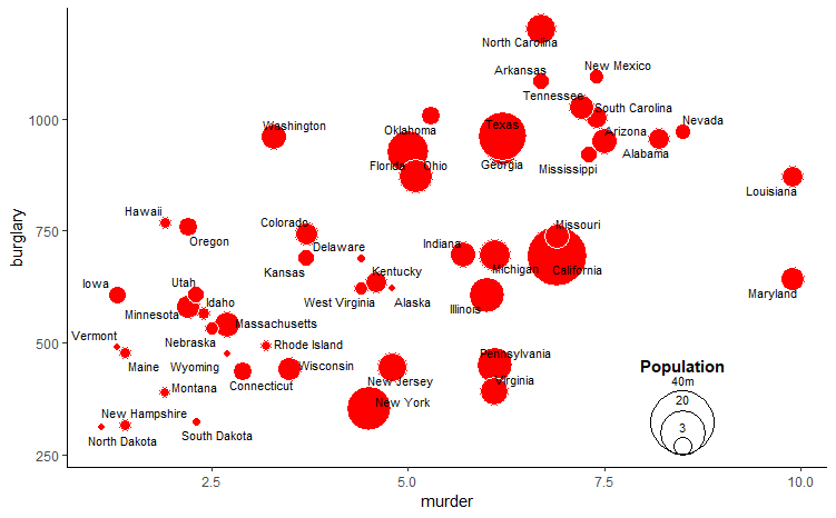
Here's an approach where we build the legend as imagined from scratch.
1) This part slightly tweaks your base chart.
Thank you for including the source data. I missed that earlier and have edited this answer to use it. I switched to a different point shape so that we can specify both outside border (color) as well as interior fill.
gg <- ggplot(crime,
       mapping= aes(x=murder, y=burglary))+
  geom_point(aes(size=population), shape = 21, color="white", fill = "red")+

  ggrepel::geom_text_repel(aes(label = state.name),
                           size = 3, segment.color = NA,
                           point.padding = unit(0.1, "lines")) +
  theme_classic() +

  # This scales area to size (not radius), specifies max size, and hides legend
  scale_size_area(max_size = 20, guide = FALSE)
2) Here I make another table to use for the concentric legend circles
library(dplyr); library(ggplot2)
legend_bubbles <- data.frame(
  label = c("3", "20", "40m"),
  size  = c(3E6, 20E6, 40E6)
) %>%
mutate(radius = sqrt(size / pi))
3) This section adds the legend bubbles, text, and title.
It's not ideal, since different print sizes will require placement tweaks. But it seems like it'd get complicated to get into the underlying grobs with ggplot_build to extract and use those sizing adjustments...
gg + geom_point(data = legend_bubbles,
             #  The "radius/50" was trial and error. Better way?
             aes(x = 8.5, y = 250 + radius/50, size = size),
             shape = 21, color = "black", fill = NA) +
  geom_text(data = legend_bubbles, size = 3,
            aes(x = 8.5, y = 275 + 2 * radius/50, label = label)) +
  annotate("text", x = 8.5, y = 450, label = "Population", fontface = "bold")
![enter image description here]()


