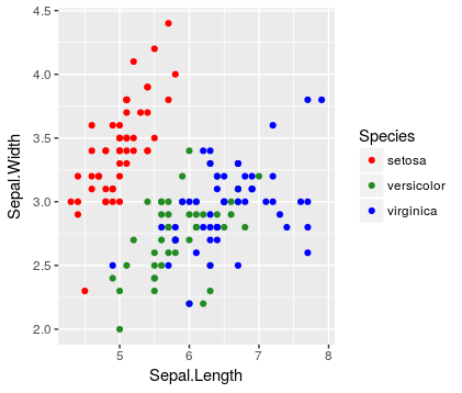
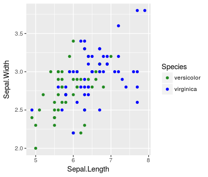
I want to compare some sub-groups of my data in one plot and some other sub-groups in another plot. If I make one plot with all sub-groups plotted, the figure is overwhelming and each individual comparison becomes difficult. I think it will make more sense to the reader if a given subgroup is the same color across all plots.
Here's are two things I've tried that almost work, but neither quite works. They're as close as I can come to a MWE!
Wrong because all three levels are shown in the legend
library(tidyverse)

# compare first and second species
ggplot(data = iris %>% filter(Species != 'virginica'),
       mapping = aes(x = Sepal.Length,
                     y = Sepal.Width,
                     color = Species)) +
  geom_point() +
  scale_color_discrete(drop = FALSE)


# compare second and third species
ggplot(data = iris %>% filter(Species != 'setosa'),
       mapping = aes(x = Sepal.Length,
                     y = Sepal.Width,
                     color = Species)) +
  geom_point() +
  scale_color_discrete(drop = FALSE)


Note that the un-plotted level still appears in the legend (consistent with the idea of drop = FALSE).
Wrong because the second plot doesn't maintain the species-color mapping established by the first plot
# compare first and second species
ggplot(data = iris %>% filter(Species != 'virginica'),
       mapping = aes(x = Sepal.Length,
                     y = Sepal.Width,
                     color = Species)) +
  geom_point() +
  scale_color_manual(values = c('red', 'forestgreen', 'blue'),
                     breaks = unique(iris$Species))


# compare second and third species
ggplot(data = iris %>% filter(Species != 'setosa'),
       mapping = aes(x = Sepal.Length,
                     y = Sepal.Width,
                     color = Species)) +
  geom_point() +
  scale_color_manual(values = c('red', 'forestgreen', 'blue'),
                     breaks = unique(iris$Species))


Note that in the left plot setosa = red and virginica = green, but in the right plot that mapping is changed.


