Plotly Sunburst chart with percentages
Asked Answered
M

1

9

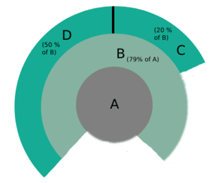
I would like to create a Sunburst chart, corresponding to the following:

enter image description here

Where:

  • B is 70% of A
  • C is 20% of B
  • D is 50% of B

I looked at the plotly documentation but the examples provided only used either use a dataset or a values argument which I don't understand how it works.

Do someone have an example I can rely on, that is similar to what I'm looking for?

Moya answered 17/4, 2022 at 14:14 Comment(0)
F
10

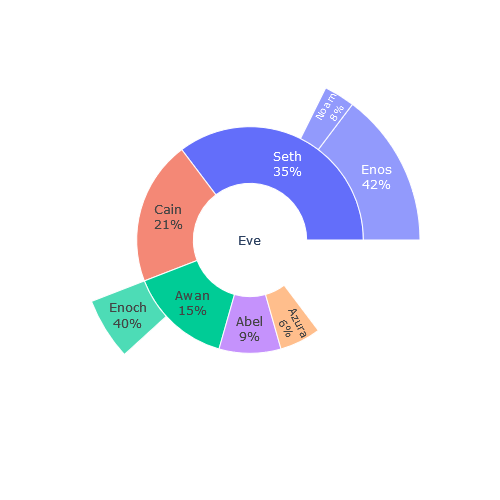
There is a setting that allows percentages to be added to labels, which would make this possible. fig.update_traces(textinfo="label+percent parent") The answer is a modified code based on the example in the official reference.

import plotly.express as px
data = dict(
    character=["Eve", "Cain", "Seth", "Enos", "Noam", "Abel", "Awan", "Enoch", "Azura"],
    parent=["", "Eve", "Eve", "Seth", "Seth", "Eve", "Eve", "Awan", "Eve" ],
    value=[10, 14, 12, 10, 2, 6, 6, 4, 4])

fig = px.sunburst(
    data,
    names='character',
    parents='parent',
    values='value',
)

fig.update_traces(textinfo="label+percent parent")

fig.update_layout(
    autosize=False,
    height=500,
    width=500
)
                  
fig.show()

enter image description here

Foliaceous answered 18/4, 2022 at 5:19 Comment(0)

© 2022 - 2024 — McMap. All rights reserved.