I have a Cox proportional hazards model set up using the following code in R that predicts mortality. Covariates A, B and C are added simply to avoid confounding (i.e. age, sex, race) but we are really interested in the predictor X. X is a continuous variable.
cox.model <- coxph(Surv(time, dead) ~ A + B + C + X, data = df)
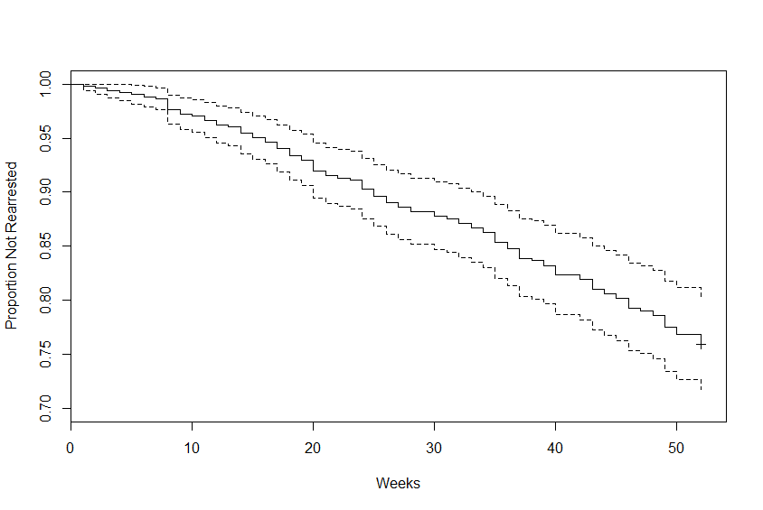
Now, I'm having troubles plotting a Kaplan-Meier curve for this. I've been searching on how to create this figure but I haven't had much luck. I'm not sure if plotting a Kaplan-Meier for a Cox model is possible? Does the Kaplan-Meier adjust for my covariates or does it not need them?
What I did try is below, but I've been told this isn't right.
plot(survfit(cox.model), xlab = 'Time (years)', ylab = 'Survival Probabilities')
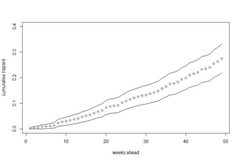
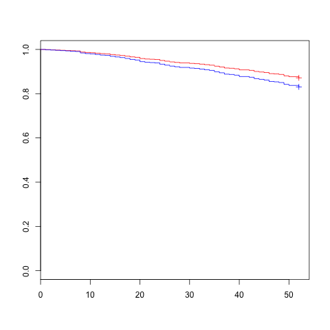
I also tried to plot a figure that shows cumulative hazard of mortality. I don't know if I'm doing it right since I've tried it a few different ways and get different results. Ideally, I would like to plot two lines, one that shows the risk of mortality for the 75th percentile of X and one that shows the 25th percentile of X. How can I do this?
I could list everything else I've tried, but I don't want to confuse anyone!
Many thanks.


