Why are margin/padding percentages in CSS always calculated against width?
Asked Answered
P

5

147

If you look at the CSS box model spec, you'll observe the following:

The [margin] percentage is calculated with respect to the width of the generated box's containing block. Note that this is true for 'margin-top' and 'margin-bottom' as well. If the containing block's width depends on this element, then the resulting layout is undefined in CSS 2.1. (emphasis mine)

This is indeed true. But why? What on earth would compel anyone to design it this way? It's easy to think of scenarios where you want, e.g. a certain thing to always be 25% down from the top of the page, but it's hard to come up with any reason why you would want vertical padding to be relative to the horizontal size of the parent.

Here's an example of the phenomenon I'm referring to:

<div style="border: 1px solid red; margin: 0; padding: 0; width: 200px; height: 800px;">
  This div is 200x800.
  <div style="border: 1px solid blue; margin: 10% 0 0 10%;">
    This div has top-margin of 10% and left-margin of 10% with respect to its parent.
  </div>
</div>

http://jsfiddle.net/8JDYD/

Pincers answered 12/6, 2012 at 19:58 Comment(18)
The vertical size of the page or the window? They're almost never the same height. I imagine that this ambiguity is a big part of why.Contrarious
The vertical size of the containing element (potentially the body, of course.) I added an example in JSFiddle to help illustrate.Pincers
I don't know. But this question earns a "Favorite" star from me, a +1, and time spent researching (and maybe, if I can't find anything suitable, emailing somebody like Eric Meyer).Friedman
My initial thought is that it would cause ambiguity as to what margin: 25% actually means. It would not be an even margin, even though the code suggests it is. I have no evidence to back this up, but it seems reasonable.Friedman
What would you rather the padding be relative to?Doorstop
jsFiddle of my thoughts. The height is much more changeable than the width, so it would make the margins shift around in difficult-to-predict ways whenever content changed.Contrarious
@gmeben: I would rather the top and bottom be relative to the height (maybe.)Pincers
@Ryan: That's true, it wouldn't be an even margin, but then again, if you say height: 10%; width: 10% you won't get a square element, either.Pincers
@mquander True, but that's less ambiguous as well.Friedman
According to dev.w3.org/csswg/css3-box/#the-margin-properties it states Note that in a horizontal flow, percentages on ‘margin-top’ and ‘margin-bottom’ are relative to the width of the containing block, not the height (and in vertical flow, ‘margin-left’ and ‘margin-right’ are relative to the height, not the width). So it goes both waysEatton
@Richard: Good point, that's true; it takes advantage of the fact that even "under-utilized" block elements like paragraphs with no text always take up 100% of their container's width by default.Pincers
@Ryan I think we have a winner. Looky here for a demo - jsFiddleContrarious
@Ryan although I guess the same is true of width for inline elements - jsFiddleContrarious
Side note: In most situations you could probably use position: relative and top: 10% as percentage values for top and bottom are calculated based on the parent height.Pollaiuolo
@Contrarious Not really. You can't set a percentage width on inline elements, so the width of the inline is not dependent on the width of its parent.Friedman
That dependence described there is an algebraic equation with one unknown (the parent height) and one equation (parent height = sum of children heights + padding). Its not ill-defined at all and has a solution that can be found quite simply. If you write this down on paper, and don't code first, it'll become apparent. See my comment on @Ryan's answer.Defeat
This is very useful when making square images: #23400732Outnumber
@Outnumber it's also very useful when you need to control aspect ratioCaputo
F
62

Transferring my comment to an answer, because it makes logical sense. However, please note that this is unfounded conjecture. The actual reasoning of why the spec is written this way is still, technically, unknown.

Element height is defined by the height of the children. If an element has padding-top: 10% (relative to parent height), that is going to affect the height of the parent. Since the height of the child is dependent on the height of the parent, and the height of the parent is dependent on the height of the child, we'll either have inaccurate height, or an infinite loop. Sure, this only affects the case where offset parent === parent, but still. It's an odd case that is difficult to resolve.

Update: The last couple sentences may not be entirely accurate. The height of the leaf element (child with no children) has an effect on the height of all elements above it, so this affects many different situations.

Friedman answered 12/6, 2012 at 21:3 Comment(11)
Note that there are exceptions to this rule - section 10.6 of CSS2.1 covers nearly all instances of calculating heights for various types of boxes. And indeed, cases which involve a codependency between parent and child in height tend to lead to undefined behavior.Melleta
I don't understand why this is the case still. CSS is Cascading, right? So why don't they doesn't the new total height just override the old one? Isn't that how width is calculated?Feune
@sanjaypoyzer: Yes, but height can't always be calculated the same way as width simply because of the nature of how content flows.Melleta
@sanjaypoyzer I'd guess in the simplest case that browsers calculate block widths from the outside in (root to tips), then flow content into those blocks to determine their heights (tips to root).Parette
Doesn't box-sizing: border-box change this?Regularize
@Regularize Logically, I don't see why it would. Experimentially, it looks like it doesn't.Friedman
Why does W3C constantly do this? Apparently 'semantic' to the W3C is the equivalent of having to cater to people that can't think logically, which makes no sense. It's like complaining about how confusing and dumb people are in the world then spreading more confusion and stupidity. The reasoning you've provided doesn't make sense: the same argument applies to widths, yet that works just fine. All that would be needed is to set a context and direction that the heights are determined, unless the height of the parent is set in pixels or something immutable, then there's not much of a problem.Sable
@Sable I'm not sure the same argument does apply to widths. By default, the width of a block-level element is the width of its parent, rather than the other way around (this, of course, changes when floating elements). When an element runs out of width, it doesn't extend the width of the parent - it extends the height instead (think text wrapping). So, under normal circumstances, the height of an element is dependent on content while the width is dependent on viewport.Friedman
That dependence is an algebraic formula which has a solution and will not result in an infinite loop unless you choose to solve it in a way that doesn't respect this. Say parent height is h_p. A padding top of 10% will make the child height h_c = h_ci + 0.1h_p, where h_ci is the inner height of the child and doesn't depend on parent height. For one child you simply find the parent height from the equation h_p = h_ci + 0.1h_p => h_p = h_ci / 0.9. You can always do this, no matter how many children you have, even for differing padding. Its just one unknown (h_p) and one equation.Defeat
I do not think the infinite calculation is the reason. A simple reason is that: using width results in the same problem horizontally.Judicator
@Judicator Sorry to necro this 5 years later, but how does it result in the same problem horizontally? A containing block's width is not affected by the width of its children. A div, for example, is 100% width by default. If a child is wider, it will simply overflow.Gerson
P
34

For "n%" margin (and padding) to be the same for margin-top/margin-right/margin-bottom/margin-left, all four have to be relative to the same base. If top/bottom used a different base than left/right', then "n%" margin (and padding) wouldn't mean the same thing on all four sides.

(Also note having the top/bottom margin relative to the width enables a weird CSS hack that allows you to specify a box with an unchanging aspect ratio ...even if the box is rescaled.)

Phonetic answered 18/8, 2013 at 2:40 Comment(3)
...a surprisingly simple answer. Though all the conjecture above has merit, this is a pretty good point. It seems possibly a case where multiple solutions would be correct so they just chose the most likely to be used one.... maybe?Veiling
I suppose that it would be nice to have an extra element in the syntax so that you could write say padding: n [type]. So you would have padding: 5% logical (what the OP suggests) as opposed to padding: 5% width with the second parameter defaulting to "width" for backwards compatibility.Defeat
"n% margin (and padding) wouldn't mean the same thing on all four sides" - But why that would be a problem?Alexaalexander
J
5

I vote for the answer from @ChuckKollars after playing with this JSFiddle (on Chrome 46.0.2490.86) and referring to this post (written in Chinese).


A major reason against the infinite calculation conjecture is that: using width faces the same infinite calculation problem.

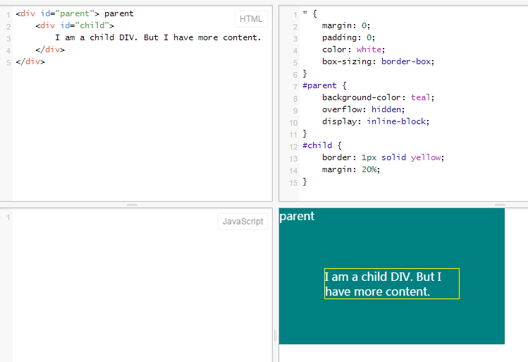
Have a look at this JSFiddle, the parent display is inline-block, which is eligible to define margin/padding on it. The child has margin value 20%. If we follow the infinite calculation conjecture:

  1. The width of the child depends on the parent
  2. The width of the parent depends on the child

But as a result, Chrome stops the calculation somewhere, resulting:

enter image description here

If you try to expand the "result" panel horizontally on the JSFiddle, you will find that the width of them will not change. Please note that the content in the child is wrapped into two lines (not, say, one line), why? I guess Chrome just hard-code it somewhere. If you edit the child content to make it more (JSFiddle), you will find that as long as there is extra space horizontally, Chrome keeps the content two lines.

So we can see: there is some way to prevent the infinite calculation.


I agree with the conjecture that: this design is just to keep the four margin/padding values based on the same measure.

this post (written in Chinese) also proposes another reason is that: it is because of the orientation of reading/typeset. We read from top to down, with the width fixed and height infinite (virtually).

Judicator answered 26/11, 2015 at 3:19 Comment(1)
This is because web pages scroll vertically in a generally infinite direction; so the width can be calculated from the width of the browser window. The only way elements are wider than the screen is if you specify their width to be larger. Typical block elements are width 100% and expand automatically in the vertical direction (unknown). That's why width doesn't have the same problem.Ironsmith
E
3

I realize the OP is asking why the CSS specification defines top/bottom margin percentages as a % of width (and not, as would be assumed, height), but I thought it might also be useful to post a potential solution.

Most modern browsers support vw and vh now which lets you specify margin numbers against the viewport width and viewport height.

100vw/100vh equals 100% width/100% height (respectively) if there's no scrollbar; if there is a scrollbar the viewport numbers don't account for this (while the % numbers do). Thankfully, nearly all browsers use scrollbar sizes of 17px (see here), so you can use css calc function to account for this. If you don't know whether a scrollbar will appear or not, then this solution will not work.

For example: Assuming no horizontal scrollbar, a top margin of 50% of height, could be defined as "margin-top: 50vh;". With a horizontal scrollbar, this could be defined as "margin-top: calc(0.5 * (100vh - 17px));" (remember that the minus and plus operators in calc require spaces on both sides!).

Edwinaedwine answered 5/1, 2016 at 17:16 Comment(1)
It's a useful workaround in many cases, but there are plenty of examples where it doesn't work (e.g. if you're trying to make content fit proportionaly to the size of a flexbox container that grows to fill available space while there's another box with variable content).Piecemeal
G
3

I know this question is a bit old, but I'd like to refresh it for CSS3. While it's true that the CSS2.1 specification says that percentage padding and margin are defined relative to the width of the containing block, this is not always the case. It depends on the writing mode. This comes straight from the CSS3 specs:

As a corollary, percentages on the margin and padding properties, which are always calculated with respect to the containing block width in CSS2.1, are calculated with respect to the inline size of the containing block in CSS3.

I cover this in my tutorial on aspect ratios with CSS.

Specifically, there's a section on Percentage Padding in Horizontal vs. Vertical Writing Modes. By default, an element has a horizontal writing mode, where text flows horizontally (in the "inline" direction) from left to right. However, using the writing-mode CSS property, you can actually set the mode to be vertical (with text either flowing from right to left or left to right). Here are some diagrams of horizontal vs vertical writing modes:

A horizontal writing mode, with text flowing vertically from top to bottom. An arrow points from left to right at the top of the document and is labeled as the inline direction. Another arrow points from top to bottom and is labeled as the block direction.

A vertical writing mode, with text flowing horizontally. The horizontal axis is labeled as the block direction, whereas the vertical axis is now labeled as the inline direction. Text is rendered sideways.

These are taken from the MDN docs on writing modes.

In vertical writing modes, percentage padding will be relative to the height of the containing block, not to the width.

Here's proof:

.document {
  writing-mode: vertical-rl;
  width: 100%;
  height: 100vh;
}

.parent {
   width: 100%;
   height: 200px;
   background-color: black;
   color: white;
}

.child {
  padding: 10%;
  background-color: white;
  color: black;
  border: solid 1px;
}
<div class="document">
  <div class="parent">
    <div class="child">
      Child
    </div>
  </div>
</div>

The child gets 20px of padding, which is 10% of its containing block's height (200px).

As to the why in the question, this was covered well in the other posts here.

Gerson answered 24/9, 2020 at 12:19 Comment(0)

© 2022 - 2024 — McMap. All rights reserved.